The foundations of using pattern, the Neptune way
The foundations of using pattern, the Neptune way
There are some designers (and homes) for whom pattern is something to be draped across many surfaces, a design tool to be bold and expressive with. And then there are others who prefer to weave it softly and sparingly throughout the home, with the occasional foray into statement-making. Here at Neptune, we’re most definitely the latter, generally preferring to err on the side of subtle in everything from the patterns themselves to how we use them. If you’re the same, then read on for our take on the principles – from where and when to use pattern in your home, to how to mix and match different styles.
Pattern versus texture
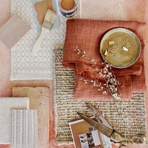
Before we dive into the ins and outs of pattern, it’s worth stopping for a moment on the subject of texture. Next to colour and light, texture is one of the key elements to consider in any and every room. More specifically, using a variety of textures, because this is one of the things that will make your home feel layered and interesting – and therefore, welcoming.
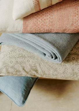
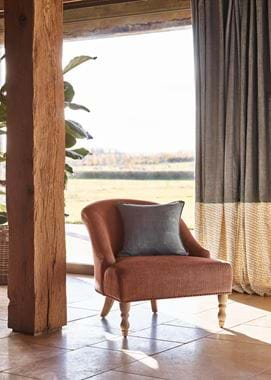
You’ll probably find, when you first start creating a sample board for your room, or simply as you build it up over time, that you’ll lean towards linens and cottons. That’s completely understandable: they’re excellent fabrics to use on upholstery, cushions and curtains because they’re hardwearing, soft and supple, and because they come in a wide variety of colours. But, even when you choose several different weights, linen and cotton are naturally smooth textiles, so using them exclusively can fall a little flat. Mix in a few pieces in wool, velvet or even leather though, be they cushions or a small piece of upholstery like a footstool or chair, and you’ll instantly have a more dynamic room.
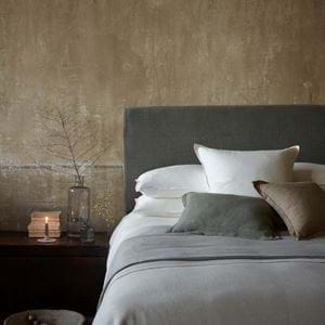
Why are we telling you all this here? Simply as a reminder that, if you’re nervous of pattern, or you’d just like to use it subtly, then including differently textured fabrics (and, indeed, wallcoverings like our Hepworth) will add interest instead.
Our favourite, subtle ways to use pattern
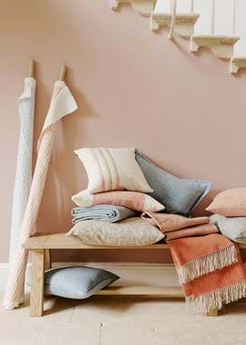
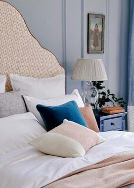
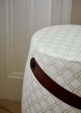
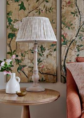
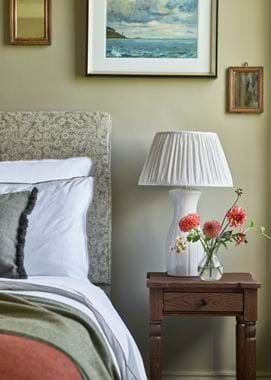
Let’s start first by looking at using pattern in a small way. These could be large or small-scale patterns themselves, but their subtlety comes more in the way you treat them. Scatter cushions are the obvious idea that comes to mind. This could be a large square, patterned cushion layered behind smaller, plain ones. It could be the reverse of that. On a bed, you could use large square cushions in place of square pillows and slip them in behind your rectangular pillows so just a hint of pattern peeps through. Then there are lampshades, like our pleated Henry design which comes in various colourways of our small-scale trellis pattern, Thea. When the lamp is on, the pattern is prettily highlighted by the glow from within, but it’s just as interesting when the lamp is turned off as well. Moving over to the windows, another favourite trick of ours is to have the majority of your curtains or blinds made up in a plain linen, but then to add a border on the leading edge (or the bottom of a blind) in a pattern. Choosing a pattern with the same base fabric or colour as the main material will ensure coordination – Imogen Holkham Sand with Orla Flax Blue or Emma Old Rose for instance, because they have natural, undyed linen threads in common.
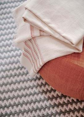
The other way to subtly introduce pattern into your interior is to choose a small-scale or softly-coloured pattern and to use it in a bigger way. Our Longford, Laverton, Chedworth and Alderbury rugs are all brilliant examples of this as, from a distance, their geometric patterns soften and blend. Even bolder Burford and Whytock, with their neutral palettes, can be understated once furniture is layered on top. Fabric-wise, because of its widely-spaced, simple lines and grey-on-grey colour palette, you could use our Ewan Dove wool on a whole chair, headboard or pair of curtains without it making too much of a statement. Likewise with our Samuel Rust striped linen. As a small pattern, Thea will work in a similar way, whereas each colourway of Orla is so harmonious with its unbleached linen ground that you could even go so far as a whole sofa without stepping too far outside of subtle.
Where and when to go bold
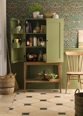
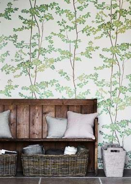
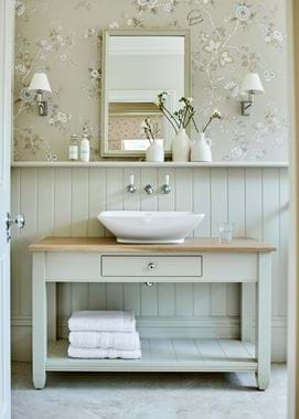
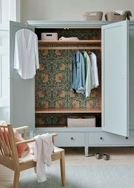
Playing with pattern on a large scale is, undoubtedly, fun. But the concern is usually that you’ll either grow tired of it quickly or it’ll feel like just a bit too much. The answer is to unleash pattern on those spaces you don’t spend a great deal of time in. In other words, downstairs loos, guest bedrooms, hallways and back of house rooms like laundries, utilities and boot rooms. Using pattern in a big way in any of these spaces will also have the effect of enlivening rooms that, either for lack of day to day use or because they’re quite practical spaces, can sometimes feel a little neglected or dull style-wise. Even the inside of a wardrobe can become a thing of joy when it’s papered in a fun print.
Mixing different patterns in the same space
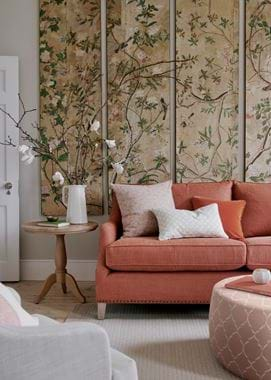
Much like accent colours, patterns can actually feel subtler when you use them in several different places around a room. One patterned chair is going to stand out a lot more in a room full of otherwise plain fabrics than it would if there were also a couple of patterned cushions lying around. You could absolutely simply just repeat the same pattern in a handful of different ways, but that will have the effect of everything feeling like it matches. A good look, for sure, but one to avoid if you want your interiors to feel like they’ve been built up over time. Which means you now need to tackle the subject of pattern mixing.
Using several different patterns alongside each other is something that can make the pattern-wary run for the hills. Which is a shame, because with two simple principles, it can be much easier than you think: the patterns you use together should have something in common and something that contrasts. The something in common tends to be colour, be that the accent colour (the Delilah Pink Geometric cushions with Emma Old Rose), the base colour (Thea Saffron with Lara Burnt Sienna) or both (Gabriela Flax Blue with Lara Flax Blue). From there, you can bring in contrast with the scale (a big print with a small one), how busy the pattern is (a widely-spaced pattern with a tighter one), the type of pattern (Gabriela geometric with Orla floral) or the textile itself (wool with linen). Et voila, perfectly imperfect pattern mixing.
Herringbone: the non-patterny pattern
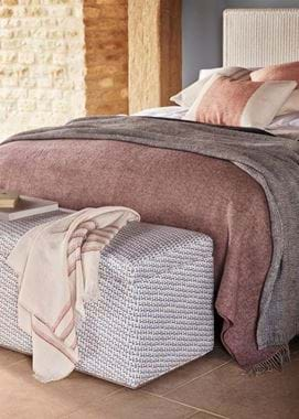
Bringing us nicely round in a full circle, herringbone is the pattern that’s also very much a texture. Herringbone designs are generally created during the weaving process. Together with other woven patterns (such as that on the Grace Geometric cushions), they can be quite bold, for sure, depending on the contrast between the colours of yarn used on the warp (up and down) and weft (left to right) of the loom. But very often you’ll find herringbone bringing subtle pattern and plenty of texture to textiles through the use of tone-on-tone colour. Our Elliot wool is a case in point, and you could happily use it across a whole chair or even a sofa without it ever feeling like you’re making a pattern statement. Likewise with our Melford throws (we haven’t touched on throws yet, but it’s worth saying that patterned ones, herringbone or otherwise, can be bold or subtle depending on whether you spread them out or fold them up). Instead, what herringbone patterns will do is add lots of depth and interest. You could even go so far as to say that they’re the ultimate textile for the lover of subtle pattern.
There are lots of ways you can bring pattern into your home with our collection, from scatter cushions, lampshades and throws, to fabric by the metre (on window treatments and upholstery) and rugs. You could even dabble in patterned crockery.
