Understanding the colour wheel
Understanding the colour wheel
Best friend of designers, the colour wheel is an essential starting point in decorating your home. Although the subtleties in paint, fabric and timber shades go beyond the idea of primary, secondary and tertiary colours, the principles of how they work together are still important to understand. And, as fashion journalist Lisa Armstrong explains, they’re just as crucial when it comes to our wardrobes.
Colour in fashion is as much a supernova power these days as it is in interiors, which is quite a radical change from all those years when black was the de facto choice on the front row (just as white was the uniform for walls at home).
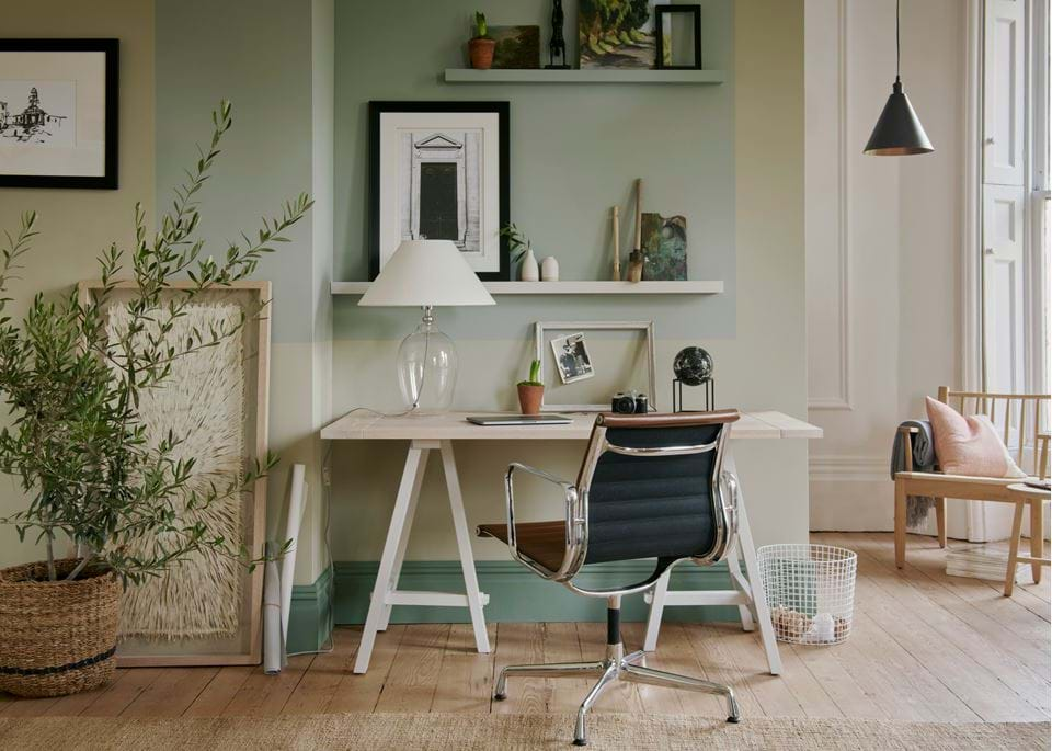
Colour is visceral. I’m fascinated by just how intensely walls can change moods. I recently had my home office repainted – a subtle tweak (that took me months to decide) from a yellowish pale green to a blueish foam green – and I definitely feel more calmly focused, cool and collected. This isn’t psychosomatic: when we process information from rays of light in our brains and then re-interpret them as colours, we do so via our nervous system.
There’s so much more understanding of how profoundly colour can affect our mental health, as well as transform the way we look. There’s even a nascent revival in that most ‘80s of services – the colour therapist. It was those Color Me Beautiful experts who first introduced many of us to the notion of warm (red, orange, yellow; think fire) versus cool (blue, green, mauve; think stormy skies) tones.
This isn’t a terrible idea, although it’s simplistic, because if you add a blue pigment to red, it becomes cooler. Conversely, mauve with a dab of red heats up. What is helpful is seeing how warm colours can cosify a room or prettify a complexion. The right shades can intensify the colour of your eyes, shave five pounds off your thighs and ten years off your face. Discovering what colours suit you really is one of the biggest favours you can do for your appearance. From there, you can create your own palette of ‘neutrals’. They really don’t have to be white or camel. They could be tangerine or violet. All that matters is that they make your skin sing and your mood dance. Wallis Simpson made her own skin colour her neutral. She used to dab her powder puff on the walls of each new house she and the Duke of Windsor moved to and instruct her decorators to colour match – flattering, if solipsistic. Mind you, after I’d had my office painted, I realised it was the exact shade of my eyes. Perhaps there’s a bit of the narcissist in all of us.
Why didn’t I realise I’d shade matched my irises before? Perhaps because so much of the way our brain processes colour has to do with context, which is why there was so much disagreement on social media over the blue and black (or was it white and gold?) dress in 2015. Because the image was poor quality and didn’t show much skin, we didn’t have any of the normal ambient cues required to ascertain colour. The picture looked bleached out, so our brains made instinctive calibrations to our readings. Some brains nudged the information to a darker shade, others lighter.
That’s why scrutinising a colour swatch – of paint or fabric – in isolation, away from the room or wardrobe it’s intended for, isn’t necessarily helpful. Is it destined for a corner, a basement? North-facing? All those factors will affect its final hue. Similarly, a cerulean dress that looks adorable in Portofino in July can look sickly in Edinburgh in February. And the other colours you mix it with will dramatically alter its impact. A scarlet dress with shocking pink shoes looks playful. With jet, it’s more vamp. With white, maybe a bit pop art. This is potent alchemy.
There’s a lot to know. The primary colours – so often misunderstood – are those that cannot be produced by mixing others together, i.e. red, yellow and blue. Secondary colours are the ones that result from mixing primaries. There are only three secondaries: violet (red and blue) green (yellow and blue) and orange (red and yellow). Tertiary colours are what happens when you combine a secondary color with a primary color: red-orange, yellow-orange, yellow-green, blue-green, blue-violet, and red-violet. Handy to know if you’re into DIY paint mixing or dyeing your clothes (I love giving clothes a new lease of life or making them more flattering by dyeing them, and it’s more or less foolproof these days).
A reasonably intimate knowledge of the colour wheel is a must. Isaac Newton can take most of the credit for this genius development in the history of hues. Sir Isaac took the spectrum of colours – from dark to light – that had been in existence for centuries, and arranged them in a circle, thereby introducing the world to the radical idea of attractive opposites. So, sky blue and scarlet, or lime and purple, both pairs on opposite sides of the wheel, brighten each other, creating a high-impact combination.
If you want something subtler, go for three shades of the same colour: taupe, sand and beige, for instance. Very Max Mara or The Row, and like being permanently cloaked in a cloud of aromatherapy (as well as a good way to make a budget outfit or room look luxurious). A dash of ginger could then be the accent in this particular ménage a trois. Orange would be more of a statement. In your outfit, try it on a patterned silk scarf – the kind Princess Margaret tied under her chin. Set to be one of fashion’s biggest accessory trends, they’re a fabulous way to accent and statement to your heart’s content – fashion’s answer to the scatter cushion.
The wheel’s usefulness extends way beyond opposites and harmonies though. Colours that sit evenly apart on the circle (cobalt, lime and scarlet for instance, but you really need to look for yourself) are called triads. Using triads is another way to guarantee a visual splash whilst ensuring your colours complement each other.
This is tremendously important for fashion designers intent on making a big splash on the catwalks. While some – such as Yves Saint Laurent who mixed bubblegum, lime and sapphire, or Christian Lacroix who loved to throw chartreuse, imperial yellow and plum into an already febrile melting pot of shades, and Roksanda, whose recent shows teamed bubblegum with pink and sand – are natural colourists, others need help.
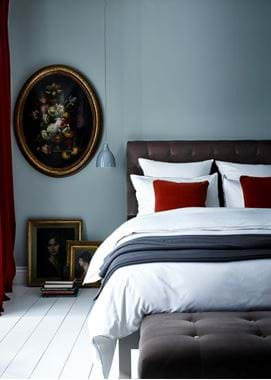
In real life, some of these mixes can be overpowering. But make no mistake, colour is huge news again – at Bottega Veneta, ex-Celine designer Daniel Lee is creating heat with subtle pops of unexpected shades in sumptuously soft leather. He may even succeed in making baby blue one of the most modish colours around, which would inevitably have ramifications in our homes (baby blue looks amazing with bottle green or chocolate brown, by the way). I like this gently, gently approach. As a shorty, I find toning shades rather than retina-rocking clashes the most elongating, slimming way to go.
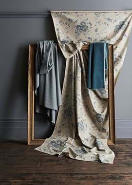
Meanwhile, during Milan fashion week recently, former Marni designer Molly Molloy, now at Colville, explained to me how garment dyeing – where the finished garment is dyed, rather than the bolt of fabric being dyed before it’s cut – creates a different, more weathered effect. In other words, the same colour can look dramatically different depending on the texture. Another valuable lesson, whether you’re mulling over cashmere jumpers and silk dresses, or velvet sofas and hessian blinds.
See how intertwined fashion and interiors are?
If you’d like a helping hand in combining colour and texture in your room, why not book a consultation with one of our in-store home designers?
