Ways with Ink
Ways with Ink
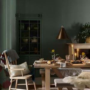
Borderline-black shades of grey, abyss-deep blues and greens so dark that it’s only when the light hits them that you detect their underlying verdancy. All colours you might be conditioned into thinking only look best on feature walls. Kitchen cabinets, too, are another part of the home where it’s common to unleash your dark side. But we say, let these shades loose, and allow them to contribute confidently and calmly to your home’s interior design. Taking the darkest of all our paint colours, Ink, here we show you how.
All-over Ink
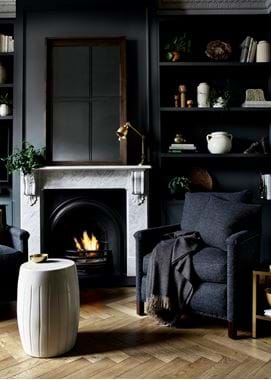
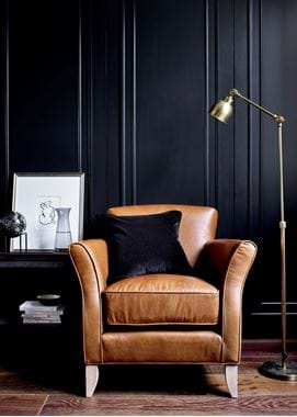
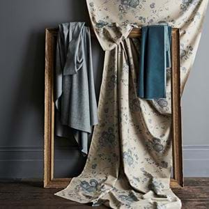
Beginning with the most daunting of colour applications, spreading Ink over all the walls in one particular room is a way to ensure your space feels larger and calmer. Colourists claim it’s about giving your eye less to read and the room fewer interruptions that makes it feel bigger than it actually is. The theory rings true whether the colour in question is light and bright or intense and moody. Include any furniture in your colour wash and the effect is greater still. Whether fitted or freestanding, colouring them in the same Ink tone as the walls behind helps them to melt into the background, giving the illusion of more floorspace. Knowing that the darker end of the spectrum will in fact help you to achieve everything that you think it might not, immediately helps Ink to feel approachable, open and inviting. Go one step further and involve upholstery in the Ink conversation and you’ll benefit from rich, tonal layers. The same colour it might be, but Ink paint versus Ink on wool, velvet and linen reveals hidden depths. It will bind the elements of your room but also celebrate your chosen signature shade and all of its subtle differences.
Low-lying Ink
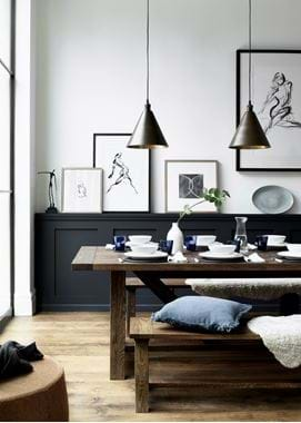
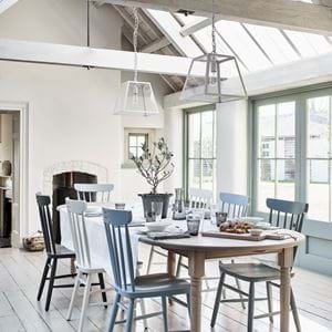
There’s no escaping the fact that Ink is bold. If you’re somebody whose palette preferences tend to be on more neutral territory, or if all-over Ink feels simply too heavy for you and your home, then taking Ink to the lower portion of your walls is a good way to ease you into using darker colours. Whether you choose period-style wall panelling on the bottom half or third, a traditional dado rail, or you take the contemporary route of simply marking off the bottom section with colour, by painting this area of wall in Ink, it won’t be the first thing that strikes you when you enter the room. This effect is about a low profile and finding a way to slowly weave colour into your interior without going down the feature wall path.
Ink in the kitchen
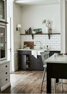
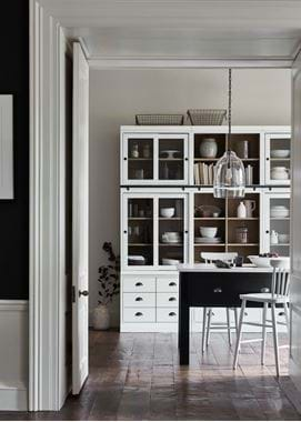
Kitchen cabinetry remains a worthy area to experiment with colour, because it presents the opportunity to use a little or a lot and to be a touch playful. If you’ve fallen for Ink, then allow it to seep across all of your cabinetry, setting it off with brass hardware for contrast or black-bronze to stick with tones deep and dark. Or, flow it on just a run – don’t be lead to believe that all of your fitted cabinetry has to share the same shade. Similarly, try Ink on the base cabinets and a different colour on wall and countertop cabinets (or vice versa). Common practice is to paint a kitchen island in a colour different to the main cabinetry too – either tone down Ink by using a lighter colour on your kitchen’s anchor, or leave the cabinets light and punctuate the heart of the room with a puddle of Ink topped with crisp marble or quartz, as our Charlecote scheme goes to show.
Ink accents
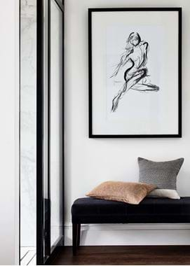
This final colour story is one with chapters to pepper throughout your home. Ink works well in small packages as much as those large and statement-making. If you’ve used it in one room, don’t just leave it there. Colour palettes should be felt as you roam from room to room, so nod to Ink with a velvet hallway bench here and an Ink pillow-strewn bed there, while in the living room drape an Ink-threaded throw over an armchair or sofa. And remember that Ink accents are not purely a case of small colour references dotted about your interior, but that Ink can be used to accent other colours. Team it with crisp Salt or soft Snow for a modern take on monochrome or sit it side by side with punchier tones like the tans of Marmalade tweed or our St James Saddle leather, the russets of Rust linen and Fox velvet, and the ochres of our Emma print in Mustard. It’s through these colour couplings that Ink shines ‘brightly’ as an easygoing, forever elegant new wave of neutral.
Ready to take the plunge? You can order sample pots of Ink here.
