How to uplift your interiors with a touch of red
How to uplift your interiors with a touch of red
The story goes that when, in 1832, Turner found his painting ‘Helvoetsluys’ exhibited side by side at The Royal Academy with Constable’s ‘The Opening of Waterloo Bridge’, he wasn’t prepared to be upstaged. To redress the balance between his watery-toned seascape and Constable’s richly coloured work, he strode into the gallery, added a red buoy to the centre of his painting, and walked out. Outraged, Constable is said to have remarked that Turner ‘has been here and fired a gun.’
What Turner understood is that the colour red need only be used in small doses to pack a powerful punch. And, in the art world, he’s not alone. From John Singer Sargent’s ‘Portrait of Mrs Robert Harrison’ to the clothes worn by many of the women and girls in Laura Knight’s paintings and illustrations (‘A Dark Pool’, ‘The Bathing Pool’ and ‘Summer’s Joy’ to name just a few), many an artist has used small doses of red to lift muddier or softer palettes (and, indeed, create a gentle bit of controversy. Think of the scarlet woman).
Things are much the same in interiors. Red (along with orange and yellow) is an advancing colour – it appears to come towards you. Which is why it’s so successful when used against cooler, receding colours and neutrals. Take a look at the interiors of the Bloomsbury Group at Charleston in East Sussex, for instance. Alongside that backdrop of drab tones, lilacs, greens and blues, the red screen in the garden room and the dining room’s red chairs positively glow. An effect heightened as the surrounding colours have faded over time.
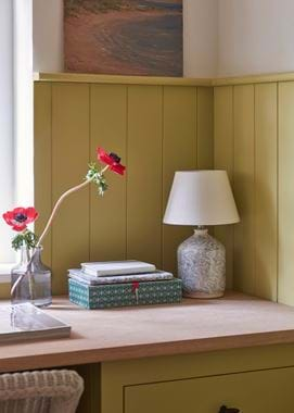
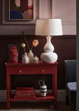
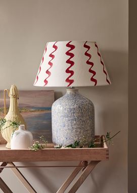
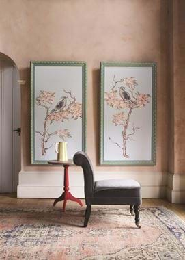
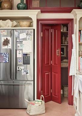
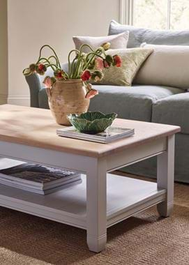
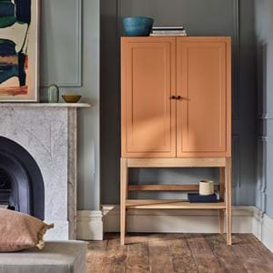
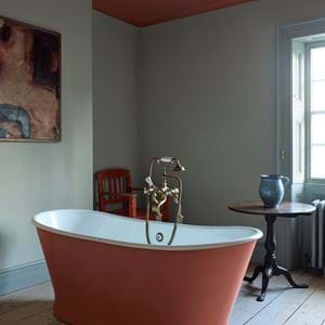
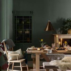
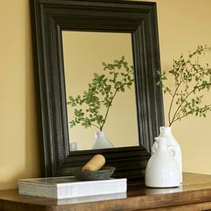
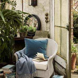
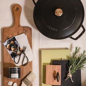
Red has also made an unexpected appearance in the photography for our spring 2022 season. As the images trickled back to us in the grey and stormy days of February, the red that ran through from one scene to the next was a very welcome jolt of energy. Used by our styling team to counterbalance the equally zingy Quince, each touch of Burnham Red paint and each vaseful of vermillion-hued flowers sung with personality. Not quite unbridled fun but definitely a joyous sort of decorating that feels very in-keeping with the mood right now.
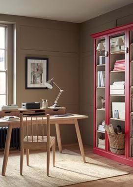
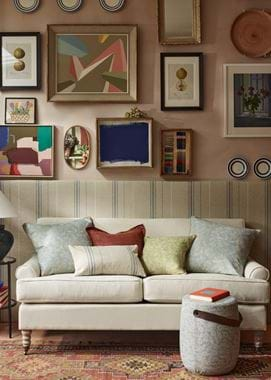
So how to go about using red in your own home? Firstly, take your cue from these images and establish a ‘red thread’ throughout. A little in every room will create cohesion. Secondly, vary the amount of red, making it stronger in some spaces than it is in others according to the room’s character. The Burnham Red Pembroke bookcase in our photography is stimulating in the home office (as are the Aldwych console in the hallway and the door in the kitchen) but for other spaces such as living rooms, bathrooms and bedrooms, you might like to use red in smaller ways so the effect is less energetic. Lamp bases, lampshades (our new designs from artist Jane McCall have the tiniest amount of red in them, or you could do as our stylists have done and hand-paint a simple pattern using a Burnham Red tester pot onto a plain shade), throws, cushions and patterned antique rugs are all possibilities for red on a small scale.
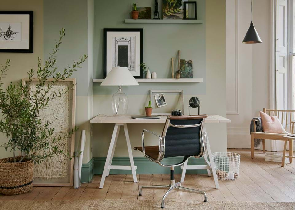
Finally, for a touch of red to work well, it needs contrast, so keep the rest of the room either muted or on the cooler side. The clay-like colours in our Fossil palette are perfect if you prefer neutrals and will create a cocooning atmosphere. Layer in earthy yellows and greens like Saffron and Olive as well as a dark such as Warm Black to round the palette out. On the flip side, if you lean towards more colour or fresher schemes, try Aqua or Flax Blue, Quince and steely blue greys such as our new Chloe and Harry fabrics in Mineral, plus Isla Steel if you feel you need the grounding influence of a deeper tone. Added to all these, red will uplift, enliven and maybe even raise a smile.
