Three summertime bedroom looks
Three summertime bedroom looks
If you’re thinking of having a bit of a bedroom makeover and are looking for a hefty dose of inspiration, then here you’ll find a trio of bedroom looks that have summer at heart and that can be adapted to suit every type of home, from country cottage to modern townhouse. All three are light, fresh and airy, but look closer and there’s plenty of hidden warmth and texture to suit every season.
1. Warm and gentle
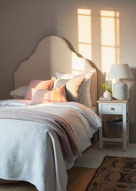
This first bedroom takes its inspiration from summer’s softer side – think pastel petal hues but without straying into the realms of saccharine. It’s a scheme that’s largely white (crucially: a warm white like Salt), but in a way that’s more gentle than fresh (we’ll get onto that look next), with a warmth that’ll be especially flattering in north or east-facing rooms that have a cooler evening light.
So how to do pastel in a grown-up way? Choose colours with more depth, like Flax Blue (which we’ve added through our Olney lamp) and Old Rose (the Melford throw), for instance, which both have a touch of grey about them. Be sure to add in grounding elements as well – in our bedroom, we’ve used a vintage rug with deeper blues in it, and a Milo stool with a rich brown leather handle. Natural textures are important too: our Whittington hemp rug and oak Highgate lamp in this case.
2. Bright and white
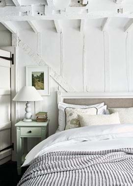
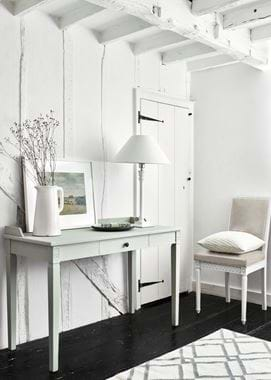
A white-centric palette has to be one of the most classic summer looks, and is a good choice for a south-facing bedroom that benefits from lots of sunlight (we’ve used bright white Snow here for the freshest feel).
But to stop your white scheme from feeling too one-dimensional, be sure to bring in lots of contrasting textures as your first point of difference, and then at least one tonal difference too.
Look closer at our white bedroom and you’ll straight away see how the walls have more than paintwork going on. There are original beams running vertically across every wall, which we’ve painted white so they stand out without shouting for attention. You could add panelling from skirting to ceiling (or just halfway up your wall) or shiplap boarding to your ceiling if your home doesn’t have any old character like this.
It’s not all about crisp white though. The little bedside table is in pale and pretty Sage green. The throw is in a muted shade of grey. The headboard of the Larsson bed is in a stone-coloured linen (Chloe Trellis). And the floor is a starkly contrasting deep walnut brown. Differences like these help the white to stand out more, rather than distracting from it.
3. Classic with a twist
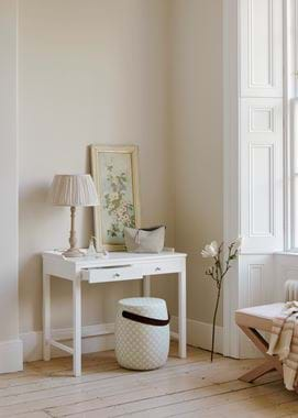
Blue and white together can’t help but bring to mind a summery coastal setting, but you can absolutely use this palette at home without wandering into cliché.
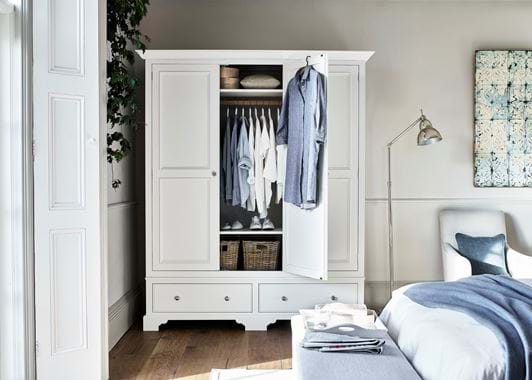
Firstly, instead of the traditional combination of navy and white, opt instead for a mix of grey-blues. Flax Blue from our paint palette would be a good starting point, and then you could layer in textiles like Harry Mineral, Chloe Denim and Samuel Dove. Choose softer whites as well, such as our Shell paint and Hugo Pale Oat or Linara Warm White fabrics.
Finally, like the other two schemes, natural textures and colours are an important balancing force, rounding out the palette so it’s not one-dimensional. In our room, the floorboards, the baskets, and even the oak hanging rail in the wardrobe provide that, along with the touch of stone-coloured Driftwood on the skirting.
