Adding character with grand scale pattern
Adding character with grand scale pattern
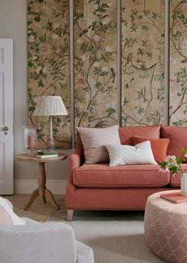
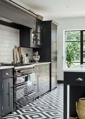
Walk into a room that has ‘wow’ factor and there’s usually an element of scale involved. It might be a soaring double-height ceiling, a show-stopping chandelier, or a vast expanse of window capturing an idyllic view. Or it might be the skillful use of large scale pattern in the decorating scheme. Introducing pattern into a room can be challenging, but when it comes to making an impact with a large floral or extra-wide stripe, there are a few design considerations which will make the process so much easier.
Scale sense
Scale refers to how an item (like a sofa or bedhead) fits within a space (as opposed to proportion, which refers to how different elements of a room relate to one another). So, the first question to consider is whether the design’s size, and the visual space it takes up, make sense in the room? In other words, does its scale suit the scale of the space? Large-scale pattern tends to be appreciated best in a large space where the drama of the design can be seen to full effect.
Be aware that when applying a big pattern to smaller pieces like cushions, you want to be sure the surface where you’re applying the fabric is large enough to take in the full effect of the pattern, otherwise it will feel a little cramped.
It’s also important to remember that, if you’re introducing large-scale pattern, the room will require some ‘negative’ space – an area where there’s nothing going on, allowing the eye to rest, to make it feel comfortable.
In balance
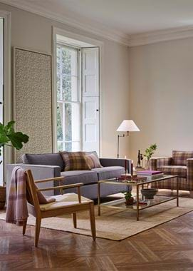
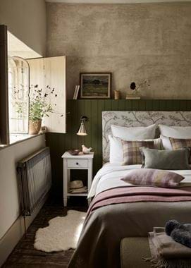
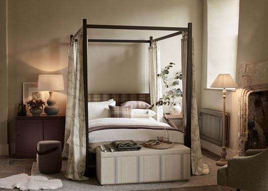
There’s no two ways about it: however interesting and characterful a scheme might be, when mixing large-scale pattern, you need balance. Stick with one striking, bold print, say on a sofa, rug or headboard, and consider bringing in one or two smaller-scale, tonal patterns or solid colours for harmony.
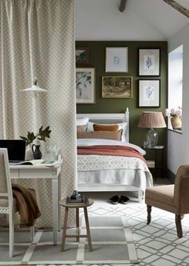
It’s also important to look at the room as a whole. Distributing patterns evenly throughout the room will keep things in harmony, so for instance, offset large scale patterned curtains with bold cushions on the opposite side of the room.
Colour theme
The decorator’s foolproof way of making a statement with strong pattern is to choose one colour and try three or four different patterns all in that same shade. You can even use the patterns in equal portions without them feeling overwhelming, because they’re all in the same colour family.
Mixing bold pattern
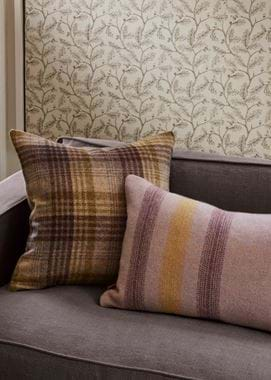
A wonderful, large print fabric will add instant dynamism and individuality to a space, but it will need to work alongside other patterns within the scheme to feel like it belongs. A good rule of thumb is to use at least three patterns in a room. Herringbone, stripes and paisley sit well together; florals pair nicely with stripes, geometrics or ikats; or you could consider two different-sized plaids with a floral. If your starting point is an elaborate toile, then pair it with regular stripes but don’t introduce other small scale, detailed patterns as it becomes too finicky. In fact, stripes are the decorator’s secret weapon because they go with almost any other pattern and will always guarantee an impact – which is exactly what you want.
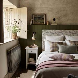
Our new patterned fabric, Francesca, comes in two different scales, making it ideal for experimentation. Its colourways are harmonious with the other patterns in our collection to make things easier too. Explore our fabric library, including Francesca, here to get started, or order free swatches here.
