Pairing patterns with plains
Pairing patterns with plains
Pattern. For some, it’s a thrilling world to dive into and unleash on their homes. For others, the very word brings on decorating dread. No matter which side you fall on though (or even if you sit somewhere in the middle), follow one of our three looks below – combining patterns with plain fabrics and paint colours – and you can’t go too far wrong.
Patterns and plains with colours in common
This is the look you’re likely already familiar with, but it’s a very effective one none the less: pick out colours from within your pattern and use those as your plains in the room. It’s an easy way to create a cohesive scheme, and a good way to make a bold pattern easier to live with.
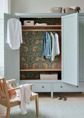
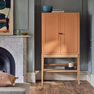
Case in point: in our Larsson wardrobe scene, the mossy greens in the pattern (a Morris & Co wallpaper, ‘Pimpernel’ in ‘Bayleaf/Manilla’) are reflected in the wardrobe’s exterior painted in our own Moss shade.
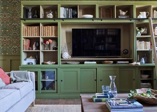
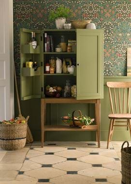
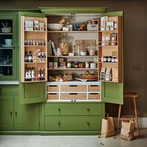
If you look to our our living room scheme you can see how this works when the pattern is on a large scale as well. Here, we’ve used another Morris & Co wallpaper, ‘Blackthorn’ all across the walls. But, by taking its green tones and using them on the panelling and the Chawton storage piece, and by continuing the hints of pink-red through to the Harry Rosehip cushion and even the flowers and some of the books, it feels like a very harmonious part of the space. Imagine if Chawton were painted in a pale neutral. It wouldn’t be half so successful. The same goes for the Ardingly larder image where, again, the Olive paint tones nicely with the wallpaper, and this time the red and yellow details in the pattern are picked up by terracotta accessories and even the richly-stained timbers.
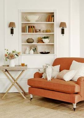
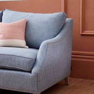
This is a look that can apply just as well to a more subdued and restful scheme, which you’ll see in the scene with the Olivia loveseat. We’ve used pattern subtly here, opting for terracotta-tinged neutrals (the Grace scatter cushions in Thea Natural and geometric Burnt Sienna) and echoed them in the Salt-painted walls and the plain Harry Rust upholstery on the loveseat.
It won’t always work out this way, but it’s easier to choose your pattern before you choose your plains, especially if the pattern is a main feature of your room such as a wallpaper. There’s a whole wide world of paint colours and plain fabrics out there which means you can very easily find one that works, whereas patterns are a bit more restricted, especially if you’re after a particular style or theme. Don’t feel you have to match perfectly either, but do compare good-sized samples side by side first.
Contrasting patterns and plains
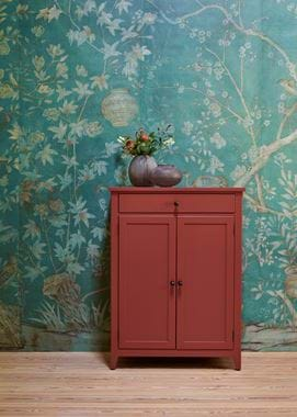
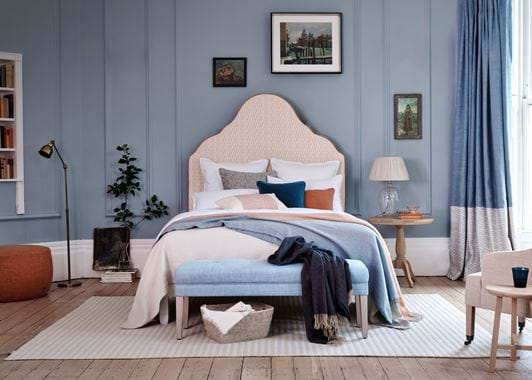
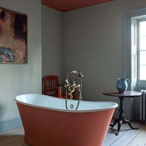
You’ve fallen head over heels for a particular pattern and you want to really make it sing. Turn to the colour wheel and choose a colour opposite (or sort of opposite – don’t get too hung up on that) your pattern’s main hue, then apply that judiciously as a plain in the same room. It’s a bold look, and one that’s certainly not for everyone, but using complementary colours in this way will make both pattern and plain sing. Our Sunbury sideboard scene is the perfect example: this room is papered in a hand-painted de Gournay design, ‘Askew’, whose main colour is green-blue, so for the adjacent sideboard we’ve opted for Paprika red which creates a strong contrast. You can see the same thing again in our Clemmie bedroom, where the terracotta-hued Lara Burnt Sienna fabric on the headboard contrasts with the plain walls painted in Flax Blue.
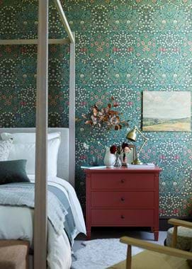
Often within a multi-hued pattern, there’ll already be examples of complementary colours which will give you a way in. Going back to the Morris & Co. paper and looking at it instead in the four-poster bed scene, rather than focusing on the greens that are the primary colours of the pattern, we’ve chosen to make more of the red – their complementary – that’s a smaller detail in the pattern, painting the Larsson chest of drawers in Chestnut. Look again at our Morris & Co. living room shot and picture Chawton in red with the cushion in green instead, and you’ll see just how swapping monochrome for complementary will create a more dramatic space.
Neutral patterns, colourful plains
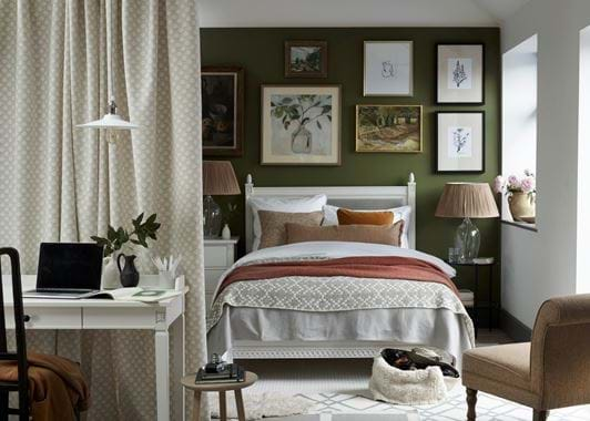
This final look is a great way to use several patterns together in the same room and for it not to feel overwhelming. You can see just what we’re talking about in our Olive-walled bedroom scheme. Here, we’ve combined four different patterns – the dividing curtain in Thea Natural, the Eira throw, and the Whytock and Burford rugs – but because they’re all based on a neutral palette of whites and stone colours, leaving the stronger colour to the wall and fabric accents, things don’t feel too busy. (In fact, we tell a lie: there are five patterns in this scheme, with a cushion in Orla Apricot that ties in with the other rust-hued textiles. Don’t feel you can’t use the occasional more pigmented pattern too in this look.)
Ready to start creating your own scheme? You can discover all our paint colours and textiles online, as well as order samples. And if you’d like our help working with patterns, find out more about our Home Design Service here.
