Teaming with Saffron
Teaming with Saffron
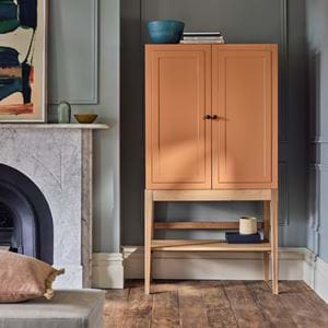
With the turn of every new seasonal collection here at Neptune comes a new seasonal shade, and for spring 2020, that shade is mood-boosting, sunshine-enhancing Saffron. A colour we all very much need in our lives right now. Here, our stylist Meaghan shares three yellow-themed moodboards that make it as easy-as-pie to paint and pair with. Your new spring/summer colour scheme awaits…
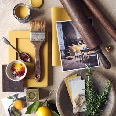
Palette #1 Saffron with neutrals
You can always rely on neutrals.
While there’s plenty of talk these days about ‘the new neutrals’ – whereby you treat more pigmented shades with the same confidence as you would a neutral, taking them all over the room and even onto ceilings – there are still a collection of shades that are the originals, the real deal.
Classic neutrals that have a touch more depth to them than pure whites and yellow-based creams such as Driftwood and Silver Birch are a match made in heaven for Saffron. They help to pare it back but also play up to Saffron’s rich, earthy side – it’s a colour that can be taken down a few different avenues.
If you go for this approach, try weaving in a few darker wood accents, ideally antiques or those pieces that are designed to look and feel like they’re from times gone by. Medium-toned woods work well too but it’s helpful to have some contrast and some texture. Our new Wycombe dining chairs and benches are just perfect at achieving both – a wholesome mid-tone oak and woven seat.
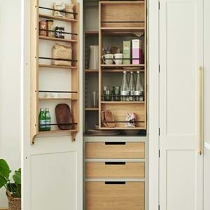
This is exactly the moodboard we followed for our Provençal-style kitchen where Saffron yellow cabinetry combines with an aged flagstone floor, timber furniture and both gnarly walnut chopping boards and garlands of garden herbs to love, to look at, but also to use.
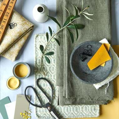
Palette #2 Saffron with hints of green
Blending any shade is far from straightforward, but yellow is one of the trickiest of all to get right. Too bright and too blue and it becomes contemporary, too orange and sunny and it encroaches on Mustard’s territory (a shade that we love and can be found in our paint archive), too shy and too pale and it risks becoming lacklustre magnolia.
With Saffron, we’ve been sure to have grey-green undertones that help it to be at once full of period and rustic charm. And so, a secondary colour group that pairs with it remarkably well are those in the green camp.
In this moodboard, we bring in paints such as Lead Light (alongside Salt for something lighter or Cactus for darkness) and fabrics such as Chloe Moss that is akin to khaki. Layer in fabrics in other hues and textures such as our new Orla linen in Saffron or a rug underfoot that has a quiet grey-green note too, like the Alderbury Geometric rug in Soft Teal.
The resulting scheme will be very English country house but without anything twee about it. If you’re feeling a bit bold, why not add a dash of a more piquant yellow velvet, such as a Isla Finch.
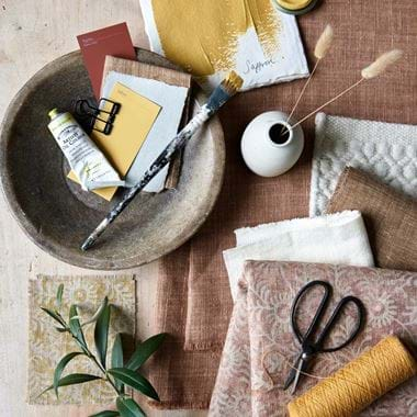
Palette #3 Saffron with terracotta tones
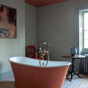
In-keeping with the rustic notion, Saffron’s other, perhaps unlikely, bedfellow is anything along the terracotta track.
Quickly dispel any dated memories of tangerine orange and sunshine yellow colour schemes, and dial down the colour intensity to those warm, brown orange hues that have a back-to-nature feel to them. Similar to the green and Saffron palette in moodboard two, these terracotta tones are another way to play up to Saffron’s wholesome side.
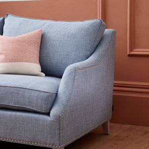
How we’ll be doing is to look at textiles and timbers rather than paint colours. Lots of easy-going oak, an abundance of cushions and upholstered occasional seating in fabrics such as the Orla and Harry linens in Apricot, Samuel – a linen with a Rust-coloured stripe, and our new sheer fabric, Ida, also in Apricot. It’s important too though to not only have terracotta-themed textiles but to have a medley with plenty of textured neutrals too – the Longford and Elgin rugs, we’re looking at you.
If you’re itching to add another paint to the party, don’t rule out Paprika from our Spice palette if you’re the adventurous sort. Otherwise, keep your secondary paint colour on the quiet side with Shell or Salt.
For more home decorating advice, you can arrange a phone or video consultation with one of our home specialists. Simply contact your nearest store to book yours.
