How to decorate with shades of blue
How to decorate with shades of blue
In light of our newest seasonal shade, Flax Blue, interiors writer, author and all-round fountain of design knowledge Kate Watson-Smyth, of the multi award-winning blog Mad About the House, muses on how to develop a blue palette in your home.
Blue is the world’s favourite colour. Time and again in opinion polls, it emerges as our most popular shade. That said, blue can be a hard colour to get right when it comes to interior design. Too pale and it can appear cold, too bright and it doesn’t work in our northern hemisphere. But when you find the right shade, blue is calming and relaxing, warm and soothing. It’s also surprisingly versatile as it’s friends with most of the other colours on the spectrum. That means you can integrate it into the overall colour palette of your home without too much difficulty.
Neptune’s new seasonal colour for their spring collection is called Flax Blue, inspired by the petals of the plant from which linen is sourced. And this soft pale shade, with a hint of grey, is versatile enough to suit any room in the house.
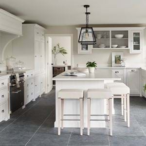
Let’s start with the kitchen, where the Victorians felt that blue kept the flies away and often added a bag of laundry blue (a form of detergent that made clothes appear whiter) to the distemper to colour the walls. Over one hundred years later and it’s still a popular kitchen colour, although perhaps for different reasons. Flax Blue is the perfect friend to Neptune’s soft white Salt shade – use that on the walls and oak on the work surfaces for instant crispness. Or, with Neptune’s Henley kitchen, let wood be more of a colour in your scheme by having some cabinetry in oak and some painted in Flax Blue. You could even consider the Suffolk kitchen with Flax Blue for the base cabinets and Mustard or an ochre tone for the top – very modern. If you want your blue to be subtler, just paint one key piece in the kitchen in Flax Blue, like a dresser or larder, and then pick up on the blue tone in a tiled splashback, perhaps.
Moving into the sitting room and the softness of Flax Blue can bring a warm, relaxing feeling – think of Provence in the summer holidays. In here, you might add a sofa in one of Neptune’s Mustard-coloured fabrics and then some denim or navy cushions to anchor the scheme. Try painting the walls in Lily. If you want a room to always feel relaxing, then make sure you keep to a relatively symmetrical design – a candlestick at either end of the mantelpiece, a picture in each alcove (mix up the style so it’s not too coordinated) and a mirror between to bounce the light around. And if you want to create something a little bolder, then consider adding a sofa in Harry Rust linen with patterned Emma cushions in Teal and Mustard. Flax Blue is a tone that laps up other colours.
It goes without saying that Flax Blue is a perfect colour for the bedroom. The best way to create the most relaxing feeling is to paint all the woodwork the same colour as the walls. This stops the eye being distracted by a white outline of doors and skirting boards. To really intensify this feeling of calm, you could go up over the ceiling as well. Then you can either add strong colours in the form of the bedding and rugs, or keep it pale and light depending on whether you’re a night owl or a morning lark. I’d use the Tolsey or Elgin rugs in a Flax Blue bedroom. For the rest of the room, you can keep to shades of soft blue and off-white, or spin the colour wheel to the other side and bring in more rust, orange and mustard for a contrast. It comes down to how soothing you want it all to be. Flax Blue’s always going to keep things mellow though.
If, at this point, you’re asking, should I be using Flax Blue in every room then? It’s a fair point. One of the question that I’m often asked is how to create a cohesive tone throughout the house, and this doesn’t mean having the exact same colour in every room. You do need to pick your hero shade, however. Soft or strong, you’ll want to reference it in ways big and small throughout the house, even if it’s only on all four walls in one room. If we were to take Flax Blue as your home’s hero shade, and for the sake of argument, let’s use it for our imaginary hall. From there you might continue it through to the sitting room walls but adding splashes of mustard, oak accents, rust and patterns – both floral and stripes. Moving to the kitchen, you might use it on the lower cabinets only, giving you freedom to bring in pale shades of Salt, Old Chalk, Lily or Silver Birch to upper cabinets – and if you match the cupboards to the wall colour, it’ll open up the space and make it feel bigger. Oak flooring throughout your downstairs rooms will add to the sense of continuity and flow. Upstairs, you might reference the colour simply in a painting, a candle or a chair on the landing. Or maybe you’ll go the whole hog in the bedroom. But you don’t need to worry about it too much. Once you’ve fallen in love with a colour, you’ll find it cropping up again and again without you even really making a conscious decision. It’ll become second nature.
Hear more from Kate
If you haven’t already subscribed, Kate’s now into the second series of her own interiors podcast. Together with TV presenter and designer Sophie Robinson, in each episode of The Great Indoors, they dissect a design topic, sharing their advice and expertise on all things homely.
Something from Stories
This article is from the latest volume of interiors anthology, Stories. Order your free copy for more pieces on design advice and inspiration for your home.


