Underground. Overground.
Underground. Overground.
The story of Neptune Wimbledon
Wimbledon is known for many things, from Wombles to a little-known tennis tournament. It’s lovely, it’s leafy, it’s laidback.
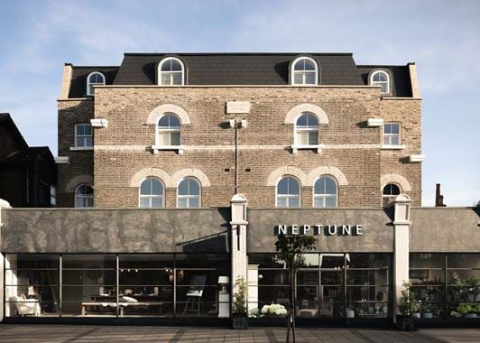
In February 2017, we were finally able to call it home, opening our third store in London. You can find us just a ten-minute stroll from Wimbledon’s overground and underground stations; a ten-minute cycle from Wimbledon Village; and less than two miles from centre court…
Neptune Wimbledon took some time to find. Tim, who heads up our Neptune Store Development team, has had his eye on Wimbledon for years and years. “I’d been looking into a few London locations – Richmond, Dulwich, Blackheath. Central London locations, in so far as they’re within the North and South Circular, but generally ones that feel a bit more suburban and village-like. But Wimbledon had always felt like the right place for the Neptune brand,” Tim explained. He heard that a shop called ‘Gerry’s of Wimbledon’ was going on the market. This was in September 2015. And so the bidding began. The competition was fierce, as it often is, but three months later, we had the keys.
Gerry’s of Wimbledon had been run for years by the same family as a fisherman’s tackle shop. Generations came and went until the time eventually came for the family to move on. “It’s on The Broadway – pretty much the far end of the high street. Our neighbours have a very different offering to us, but the area is up and coming; the high street is extending. Of course we’d love to be nestled in amongst the independents of Wimbledon Village, but it’s almost more important to us to invest in the store environment and architecture than a prime location that’s next-door to a tube station. We pick buildings and choose spaces that we can completely reconfigure, and we hope that we can draw people to us. And it works. They know that we’re doing something really quite different in our stores to anyone else,” Tim continued.
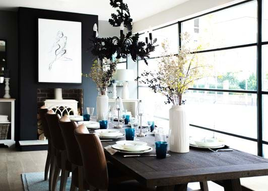
That comment rings especially true with Neptune Wimbledon. Our team of store designers have created a space that’s by far the most contemporary of all of our locations, starting with the exterior. “It took a long time to figure it out, but we’ve been able to front the entire store with Crittall windows (the metal-framed design first invented in the 1800s). It’s such a striking look and it creates a really exciting pace before you’ve even stepped over the threshold,” said Lizzie, the store designer behind Neptune Wimbledon. “The building was pretty much a large rectangular box once it had been gutted. Usually, I’m working with large former pubs or barn-style buildings and so this was a very different space to work with. I felt I could push the design boundaries slightly to create something that was representative of Neptune, but that was also finely attuned to its London location.”
Lizzie went to and from Wimbledon across a three-month process, sketching out numerous design concepts before developing ‘the one’ alongside Fred (who heads up the retail design team) and John (one of our founders). “Every aspect of the store design is considered over and over again so we can be certain it’s our definition of perfect. Above everything though, we’re always striving for our stores to feel like homes, and to do that properly, we need to do so much more than build living rooms and bedrooms, we need to create that ‘feeling’ of wanting to kick off your shoes and just relax.”
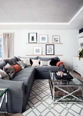
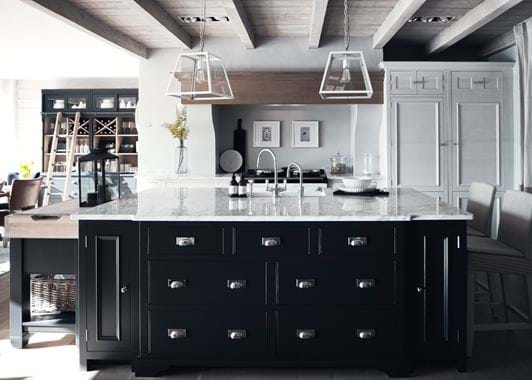
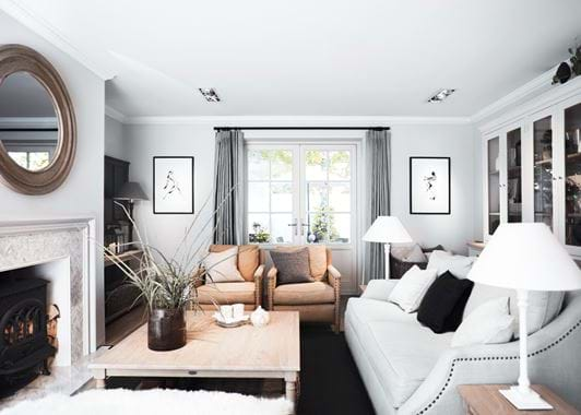
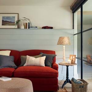
Lizzie also explained how Neptune Wimbledon was once upon a time probably two houses that were knocked together and developed into a shop. There were a few residential features that survived – a sash window on one side of the chimney breast and a “funny little archway” that she was never able to trace back to its original purpose. Despite the overriding feeling of modernity, the interior reflects our established style of presenting our collections in different room types for different styles of home, from the traditional country Chichester kitchen to the contemporary Limehouse, to the townhouse-like section at the back with a living room, dining room and Suffolk kitchen that feels a bit more Georgian in influence. Lizzie then manipulated the store design to reinstate that original sash window so that it could be part of the office and staff kitchen, allowing in natural light and fresh air.
There was one final original feature that Lizzie found on one of her site visits. It was an old brass pull-bell on the wall where the entrance used to be. She kept it, polished it up, and plans to reinstall it sometime soon. “It has a beautiful patina and hammered finish. It’s lovely to bring together the old and the new,” she said.
