21, all grown up
21, all grown up
This year, this July in fact, we turn 21. And to mark the occasion, House & Garden’s David Nicholls wrote a 21st-birthday article for us in the magazine’s June edition. For those of you who missed it, here’s an edited version.
Neptune has come a long way since it was founded 21 years ago. To celebrate this special anniversary, we take a look at 21 products, people and places integral to the journey.
The traditional gift for a 21st-birthday is the key to the front door, something that’s seen as a sign of earned trust and responsibility. It seems an appropriate image to bear in mind as Neptune turns 21, because trust and a sense of responsibility are values that Neptune holds dear. People have long opened up their homes to the fruits of Neptune’s labour. Why? That question was the starting point for this celebration of Neptune’s 21st anniversary. The following blog traces the highlights of its formative years and standout creations; the inspiration behind the design; and asks, what’s the DNA of a brand with such an instantly identifiable signature look? Read on to find out…
No. 1 First things first, here’s where it all began. Neptune’s very first product – the hammock. Made around a kitchen table, stitched with careful hands, a trusty sewing machine and a large dose of optimism. Not a lot has changed in the last 21 years. Within its first year, more than 5,500 hammocks were sold and it was stocked in Harrods.
No. 2 Into the garden. The hammock led to Neptune setting its sights on the great outdoors, with products embracing al fresco dining, from large family dining tables for supper parties under a sky full of stars, to neat solutions – such as the Boscombe tea for two set – perfect for a city balcony or small section of a sprawling garden.
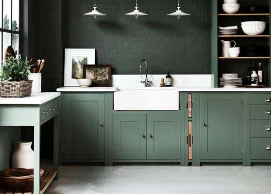
After the garden, it didn’t take long for Neptune to broaden its focus and channel its energy to inside the house, tackling bathrooms, upholstery and furniture for in-between spaces like hallways and landings. It’s fair to say that kitchens are now the area for which Neptune has become best known. Today, it offers four kitchen design families: Chichester, Suffolk, Henley and Limehouse.
No. 3 Family values. Chichester was Neptune’s first design family, and now includes pieces for throughout the home. It seems to express what Neptune is really about: classic English style and refined elegance. The Chichester dresser, one of their first freestanding interior pieces, gradually evolved into Neptune’s debut kitchen collection.
No. 4 Classic with a twist. It’s not easy to improve on perfection, but the stately, and already lovely, Henley kitchen has just had a revamp that includes more than 1,000 updates to advance existing cabinetry. New pieces have also been added to the collection, such as the Black-Bronze hardware and sultry, matte black worktop.
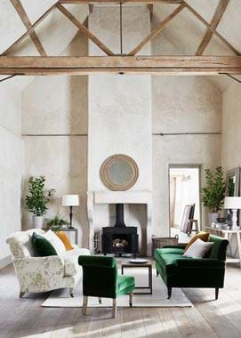
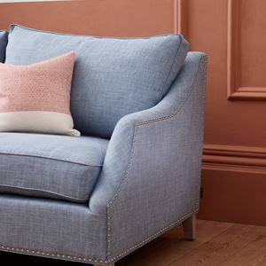
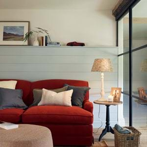
No. 5 Got it covered. A clever use of textiles – where colours, textures and patterns are combined – is one of the ways Neptune creates a cohesive look in a room. Their layering technique gives the space a feeling of having evolved over time.
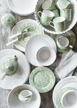
No. 6 A sense of individuality. While Neptune has a strong signature look, the scope of its collections and accessories also allows for a real sense of personal style. You like the rustic Bowsley plates and the prettily patterned Winsford series? Then team them together for an individual feel.
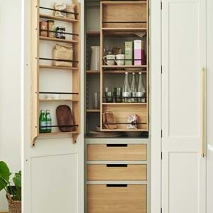
No. 7 Details, details. Tradition and innovation combine in Neptune’s Limehouse larder, with its four tiers of storage and a dual-door folding system. It’s hugely technical to make: around 15 processes go into the creation of a single, beautiful door. As they say, it’s all in the detail.
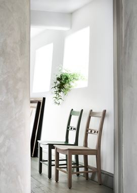
No. 8 Inspiration. The creative team at Neptune are always on the lookout for interesting ideas that can inspire a new design. The story goes that the Suffolk kitchen was inspired by a beautiful old English chair that Neptune’s creative director found and fell in love with. It developed into a Shaker-style kitchen that has also become one of its most popular styles.
No. 9 Come together. The best times are spent around a kitchen table with family and friends – and flexible solutions help accommodate for different occasions. That’s why soon after launch, the extendable Sheldrake table, with its slim profile and elegant legs, became a Neptune kitchen icon.
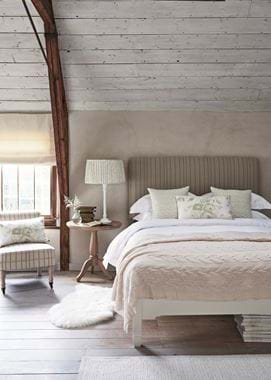
No. 11 Sweet dreams. Airy spaces, a simple backdrop, gentle pops of accent colours and a mixture of woven, pleated and knotted textures to please the senses. Neptune has become an expert in creating the environment for a good night’s sleep. Its Chichester bedstead is a case in point.
As Neptune grew, so did its remit. It created ‘design families’ – collections of products for all over the house. Today it’s hard to think of a part of the home that Neptune doesn’t have covered.
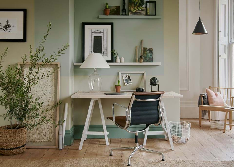
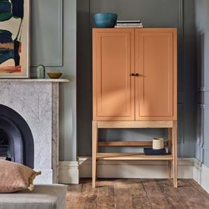
No. 12 Soft modern. More recently, Neptune has developed a range of designs that have a sharper, more contemporary feel. A case in point is the Carter collection which teams powder-coated metal frames with solid oak tops. Such pieces add interesting layers to an interior.
No. 13 Cleanse and tone. When a company becomes known for creating spaces that are calm and quiet, understated and elegant, you know they’ll excel when turning their hand to creating bathrooms. The Chichester washstand, with its Carrara marble top, captures Neptune’s signature grace.
No. 14 Foreign affairs. Although classic English is very much Neptune’s guiding inspiration, look closely and you’ll also see hints of influence from some of the world’s other great design aesthetics. The Larsson bedroom collection is the perfect example of Swedish refinement combined with English style, and so is the Lavenham mirror, which has a slight Gustavian flavour.
No. 15 As you like it. Printed and plain linens, wool and velvet, all in myriad shades and patterns, comprise Neptune’s fabric-by-the-metre collection, launched to give customers freedom to create their own interior. Buy a coordinating fabric to match a Neptune piece or to recover an existing item of furniture.
Neptune understands that intuitive and clever design can transform people’s lives. Accessories have become a huge part of the Neptune story: furniture gives our homes a framework but accessories are what make a room feel lived-in and loved.
No. 16 Perfect palette. Neptune’s idea of creating a ‘whole home’ collection evolved into the development of an edited paint palette. The colours started out pared-back and muted, but now include bolder shades as part of the seasonal collections. There are 28 core colours as well as their ‘archived’ shades (which they can still mix on request), from neutrals to Navy via Pink Peppercorn and Sage – Neptune’s seasonal shade for its spring/summer 2017 collection.
No. 17 Up close and personal. Wander around any of Neptune’s stores and you walk from living rooms to kitchens, and bathrooms into bedrooms. They’re styled like real homes, allowing you to get up close and explore – to find inspiration.
No. 18 Nuts and bolts. Neptune’s founders, John and Giles, said from day one that they wanted to make furniture that was “as safe as boats, not houses”. That’s why all of Neptune’s kitchens and furniture is made from proper timber, just as it has been for cabinetmakers – and boat makers – for generations. You won’t find any MDF or chipboard. Wood is an integral strand of the company’s DNA. What’s not to love about that? It has a timeless quality, an innate sense of longevity, and can be applied to designs that are classic and incredibly modern.
No. 19 In bloom. Neptune has helped dispel the odd myth as well. Life-like flowers? Why not, when they’re this convincing. In fact, being hand-painted, they’re works of art in themselves. The point is, something beautiful can jolly up more than just a room – it can do the same for the people who inhabit it. Most recently, Neptune has also added potted succulents to the collection which are every bit as convincing.
No. 20 Mood enhancers. The power of good lighting is something that should never be underestimated. But even better if it’s also good-looking lighting. Neptune caught on to this idea early, and has created and grown a collection of lights to suit the needs – and look – of every room in the house.
No. 21 Going forward. Neptune was founded by John Sims-Hilditch and Giles Redman who came up with the idea for the garden hammock. John’s wife, Emma Sims-Hilditch, now the creative director, made the first sample. They’re all just as involved today – and busy planning tomorrow for Neptune.
David Nicholls is features director at House & Garden, the magazine that showcases some of the finest examples of design and decoration from around the world.
