Kat Farmer & her living room redesign
Kat Farmer & her living room redesign
With over 200,000 followers on her Instagram account, @doesmybumlook40, style blogger and TV presenter Kat Farmer lives near Sevenoaks with her husband and three children in a converted 1930s Arts and Crafts cottage. Whilst Kat, who co-presented BBC One’s series ‘You Are What You Wear’, is a specialist in fashion styling, she sought expert help for her sitting room’s makeover.
The space
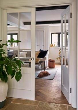
Renovation works carried out seven years ago enabled the family to change the layout and function of each room. They wanted their new sitting room – previously the kitchen – to be square and symmetrical, so they doubled the existing space lengthways whilst retaining idiosyncratic features such as low ceilings and small windows. But while the space was beautiful, the furniture had seen better days. ‘We had the worst cushions,’ Kat recalls, ‘they were begging to be released.’ The furniture had seen the family through their early years but now the children were older, Kat wanted to create something more sophisticated and luxurious.
The project
Kat turned to our Home Design Service and the expertise of Vicky and Georgia, home designers at Neptune Tonbridge, to translate her vision into a reality. The brief was to create an elegant space which was also cosy and practical. The new sitting room needed to house enough comfortable furniture to accommodate visiting friends and family, whilst incorporating ample storage space and occasional lighting.
Kat wanted a neutral scheme of greys, blacks and whites – ‘I love colour! I wear colour,’ Kat tells us, ‘but when it comes to my interior style, I find a neutral palette cosy and calming.’ Georgia suggested using more textures to add interest and detail. So, in the initial design phase, mood boards featured velvets, linens, sheepskin and herringbone, alongside Ink and Shingle paint samples. ‘It brought the room to life on paper,’ Kat explains. ‘It’s a unique process. The customer is involved every step of the way. The designers encouraged our feedback and were so receptive to it. It was a relief talking to people who immediately understood what we wanted.’
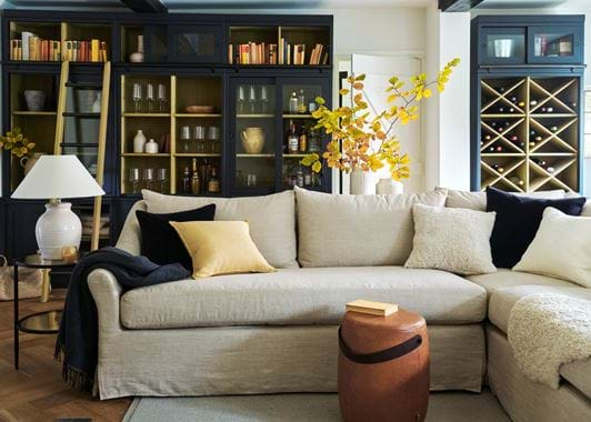
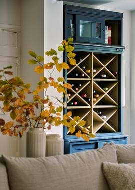
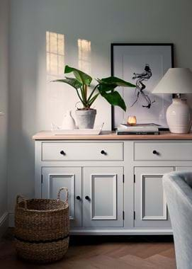
The back of the room had been a wasted space; no furniture seemed to fit. Now, Chawton cabinets, painted in Ink and tailor-made to reach the height of the ceiling, sit so perfectly there that they seem to have influenced the shape, size and feel of the room. ‘The cabinets look like they’ve been there forever,’ Kat comments, ‘but with such a modern, fresh feel.’ Kat’s glassware has found a home in Chawton’s glass-fronted sections and the couple’s wine collection is stored in crisscross storage boxes. The dark Ink shade with a soft grey on the walls introduces warmth and elegance which is echoed in the surrounding furniture and accessories.
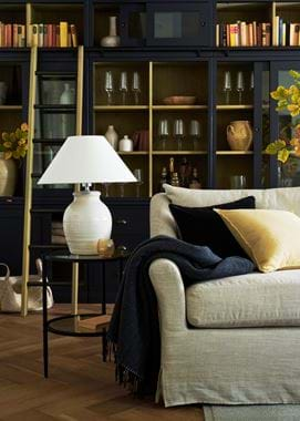
A Long Island corner sofa and loveseat take centre stage. ‘The L-shape uses the space more efficiently,’ home designer Vicky comments. ‘It avoids the bulkiness of two separate sofas and creates seamless continuity.’ Thoughtfully placed floor plug sockets, installed during the renovations, allow an abundance of lamps and side tables to help create mood through layered lighting. ‘We’ve got more furniture than we had before, I don’t understand how the room looks so much bigger. It’s a design feat,’ says Kat, laughing.
The result
‘The whole process was flawless,’ Kat says. ‘It’s as though the shape of the room was designed around the furniture, rather than the other way round. It ticks every box and has gone above and beyond our expectations. The only downside is I’d like to update all the other rooms in the house now!’
