Ways to: use Flax Blue in the kitchen
Ways to: use Flax Blue in the kitchen
Soft shades of white and grey are amongst the most-loved colours to use in the kitchen. As are, at the other end of the scale, the bolder, more dramatic tones of deep green, inky blue, and nearly-black browns and greys. But what about the middle territory? Colours that are calming like a neutral but with more pigment? Colours like Flax Blue.
Flax Blue with oak
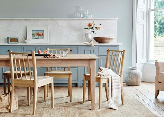
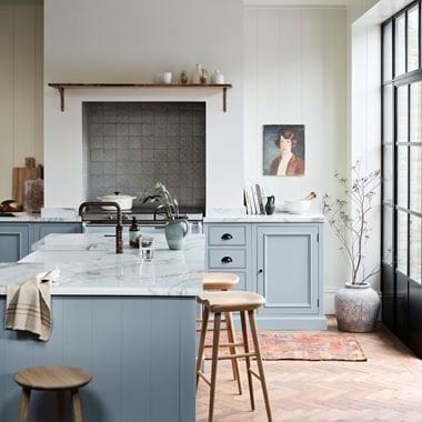
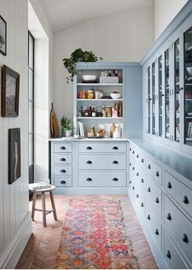
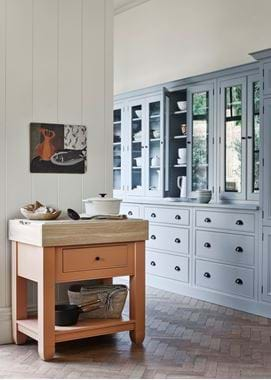
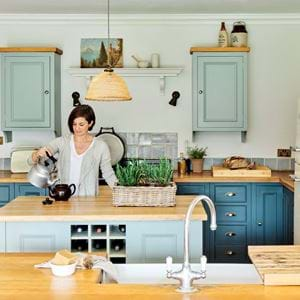
One of the characteristics of Flax Blue that we appreciate the most is how well it pairs with our favourite timber, natural oak – a combination of cool tones with warm ones, both soft and subtle so neither dominates the other, creating soothing balance and harmony in a scheme (never forget that timber is a colour as well as a texture). In this first, Chichester kitchen pictured, you can really see what we mean. With the cabinetry painted in Flax Blue and the walls in the slightly paler Powder Blue, and the work surface and splash back in marble, this space could feel cold if it weren’t for the grounding effect of the oak Moreton table and Wycombe chairs. Oak flooring would work in a similar way, as would using a combination of exposed oak cabinets and painted ones, which you can do with our Henley kitchen collection, or you could opt for an oak work surface like we’ve done in our second kitchen pictured.
It’s not just oak that works in this way with Flax Blue either: going back to our first kitchen, you can see how the similar tones of the Stanton teak root bowl, the Whittington hemp rug and the Arbroath jute basket come into play as well to make this a welcoming space that balances the clean and cool with the characterful and warming.
Flax Blue with neutrals
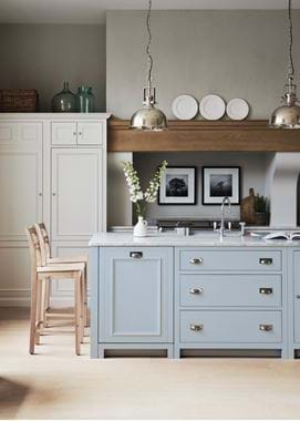
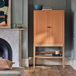
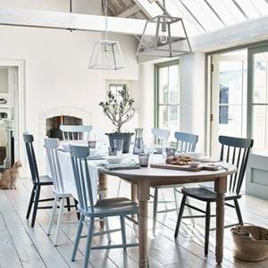
If you like the idea of using a combination of colours on your kitchen’s cabinetry, try painting a central area in Flax Blue, such as an island. This is a good idea if you’re keen to bring in colour, but only want a small pocket of it. Flax Blue suits our palest neutrals particularly well, especially if you want to create a restful and timeless scheme. In our third kitchen, we’ve used Shell on the main run of cabinetry, but Salt, Snow and Silver Birch would also work beautifully with Flax Blue and we’d recommend testing out all four at home to find which suits your room’s light best. We’d then suggest adding depth with a colour one or two shades darker, like Driftwood, Grey Oak or Shingle, as well as with natural materials like oak.
Flax Blue on the walls
Remember that adding colour to your kitchen’s scheme doesn’t have to be kept to the cabinetry. Take Flax Blue to the walls instead; it’s worth considering as a way to update an existing kitchen too. As we’ve seen, it’s a look that’ll suit cabinets painted in white tones or oak cabinetry. Darker cabinets can suit Flax Blue on the walls too – try Walnut or Ink. If you’re unsure of whether Flax Blue walls will match your cabinetry though, just speak to a home specialist at your local Neptune store and they’ll be happy to help.
Flax Blue with colour
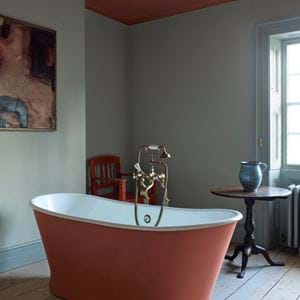
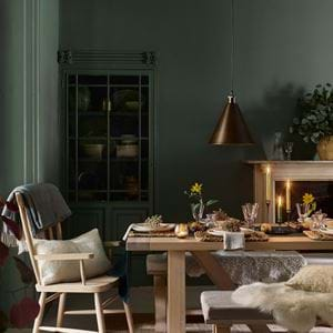
Just as Flax Blue is so suited to warm, natural materials like oak and jute, it stands to reason it’ll work equally as well with paint and textile colours on the red/yellow/orange side of the spectrum. Like Burnt Sienna, which is a shade of terracotta – together they are a balanced yet dynamic meeting of the earthy with the airy. How bold or subtle you go with this pairing is up to you. Going back to our first kitchen again, you can see that we’ve used only hints of Burnt Sienna in the painting, the flowers and the throw. Likewise, in our last kitchen, there are touches of russet hues here and there in the vintage painting and rug. Whereas the scene with a run of Chichester cabinetry in Flax Blue is more boldly contrasted by the Chichester chopping block in Burnt Sienna. You could do the same thing with a dresser or dining chairs, or blinds in Harry Rust or Apricot.
If you’re after a softer palette but still one with more colour than the Flax Blue and neutrals pairing, then consider other pastel shades. Pale pinks, greens and yellows, like our Oyster Pink, Saffron and Sage fabrics, can all be used to create a delicate scheme. The trick to stopping them from being saccharine is to include a good dose of something more grounding. Brown will do the trick and, again, oak is the perfect choice. We’d just choose natural or vintage oaks over anything too light and chalky, although you could also quite happily go down the dark-stained timber route with a reclaimed floor or our Darkened Oak Arundel dining table.
To start planning colours and cabinetry for the kitchen you’ve always wanted, arrange a free virtual consultation with the designer at your closest Neptune store.
