Classically eccentric
Classically eccentric
At a time when we are treated to a visual cacophony of interior styles and influences, providing a veritable feast of options and inspiration for our homes, it is the classic, English eccentric country house style with its timeless quality that endures, as Paula Sutton of Hill House Vintage discovers.
So what is country house style and how is it achieved? Firstly, the country house look isn’t a trend, but a way of life. It’s about being relaxed and not too precious. It’s about mixing and matching style, eras, fabrics and colours - but not being a slave to fashion. It isn’t about buying everything on a single shopping trip, but about taking things slowly and steadily and savouring the evolution of a rich tapestry of layers and styles within our homes.
The original country house look evolved from several generations of a house inheriting and collating furniture and objects handed down within families. For me, that now translates into sourcing my own vintage and antiques. Add to that some carefully curated new and contemporary items and you are left with rooms that are filled with personality, humour and individuality.
Above all, it’s about combining casual elegance with lots of comfort, and contrary to the staid, traditional stereotype attributed to country house style, it’s about allowing yourself the freedom to experiment and be a rule breaker.
Faced with the task of furnishing my home of ten years, a Georgian house built in 1822, I was fortunate enough to already have the assistance of perfectly symmetrical proportions to work with; the Georgians were particular masters at creating an elegant backdrop.
However, as much as square symmetry in any age of house is pleasing to the eye, it can some-times be devoid of enough personality and lacking in punch for the ‘seasoned’ country house look.
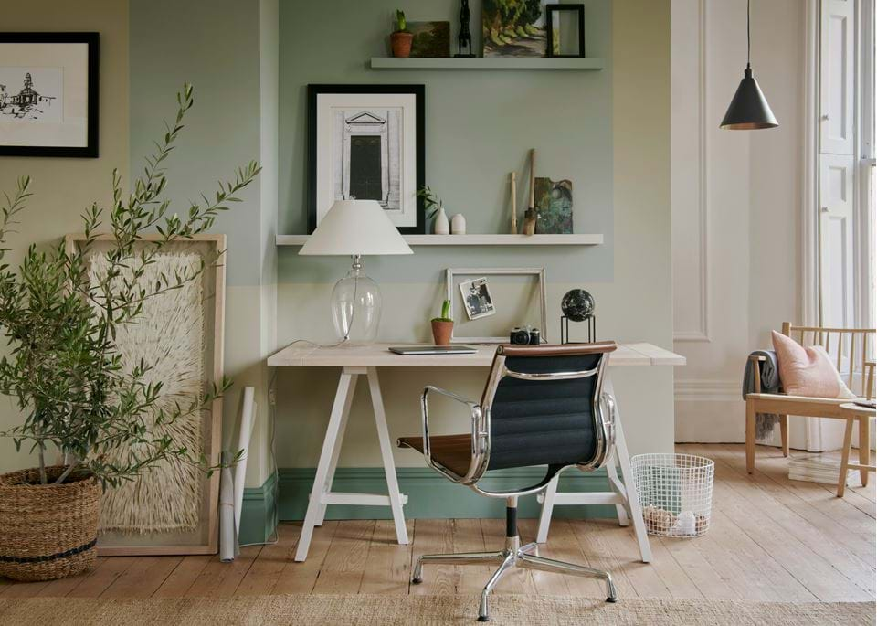
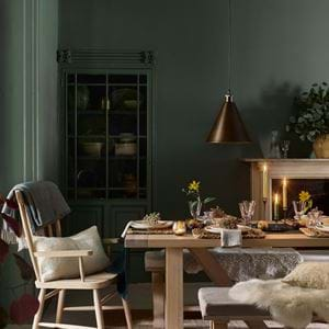
I’m known for my eclectic use of colour, but in fact the backdrop for many of my rooms are neutral and pared back. I use sage greens, muted blues and chalky greys combined with creamy matt woodwork in off-white or eau de nil. It is the colourful accessories, soft furnishings and furniture that provide the layers of texture and interest, which means that the rooms can be ever evolving, without feeling the need to redecorate too often.
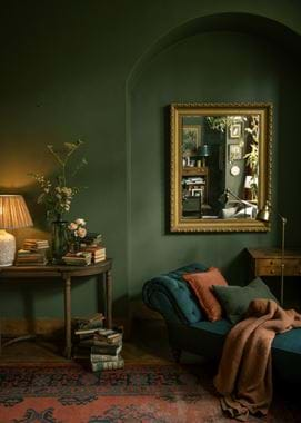
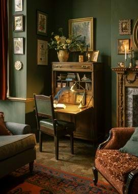
Gallery walls filled with irregular sized vintage floral art, and a mix of painted and brown wood furniture are a signature. However, I avoid a lack of cohesion by adopting a series of loose themes that run throughout the house, connecting rooms and significant pieces together without resulting in an overtly matching style. For example, much of the seating upholstery is button back, based on a traditional Chesterfield style. It’s a mix of antique and new, but the collective use of this traditional look allows each piece to intermingle seamlessly and happily. It’s never about attempting to conceal the age of a piece - I’m as happy to rest upon my Edwardian tub chair as I am a modern sofa. It’s about creating a sense of harmony amidst the eclecticism, and tying visual ends together.
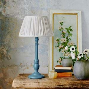
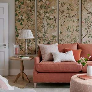
Large windows provide a focal point with which to frame outside views. Mismatched chairs flanking a central pedestal table, or lamps placed atop slightly irregular tables that at first glance look the same, but are in actual fact different versions of a similar style - create interesting tableaux in the sitting room.
My mantra is ‘similar - but rarely the same’ and I adapt this everywhere. It is these irregularities that add a quirky element of interest to an interior. Symmetry is always pleasing to the eye, but a slight mismatched version of symmetry, makes the mind work a little bit harder and can be just as pleasurable.
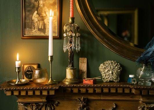
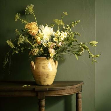
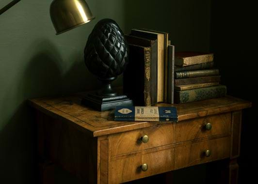
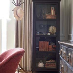
Collections form a large part of my interior style. I collect creamy hued ceramic vases in classical shapes, vintage blue and white china and other more unusual objects and accessories . A hunting horn casually adorns a side table - it serves no particular purpose and I have certainly never been master of any hunt, but it adds a touch of humour to the decor, and is a nod to a bygone era. Vintage food domes hang against my dining room wall, and are as beautiful and pleasing to the eye as sculpture, turning a group of once practical kitchen paraphernalia into artwork. Once again, it is a nod to the past - but with a contemporary almost surreal, take on usage. My modern version of country house style is intended to give the illusion of beautiful disarray - but without resorting to chaos, and therein lies the secret to its English eccentricity.
