The evolution of an armchair
The evolution of an armchair
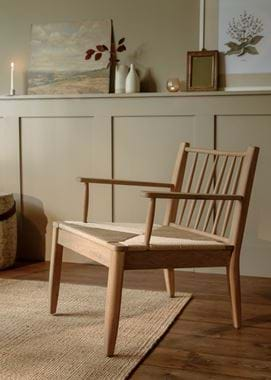
At Neptune, we take the design process very seriously. That’s not to say there isn’t room for fun (creating pieces that we know are going to be loved and used for generations is what we enjoy most), but it does mean that every single design is considered and perfectly suited to its purpose. We know that these things are important to you as well, especially when you’re investing in furniture, so we sat down with one of our design team, Henry, to give you an idea of just how much goes into our pieces, and in particular, our Wycombe oak armchair.
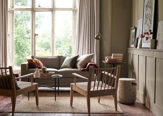
‘A question that we ask ourselves a lot at Neptune is “why?” and it underpins every design we make,’ Henry begins. ‘Why do we need this piece? Why are we making it? It’s all about giving our designs a reason for being.’ And we’re certainly not the first people to follow that way of thinking. Purposeful and well thought through design was a central idea of both the Arts & Crafts movement and the work of many modernist designers in the 20th century, so it’s no surprise that both had a part to play in the Wycombe armchair’s conception. ‘We actually found the inspiration for this piece in a hotel,’ explains Henry. ‘There were two, timber-framed armchairs arranged together with an upholstered sofa in a sitting area, and it was a bit of a lightbulb moment. Here was something we never knew we were missing, but that really felt like it had lots of reasons to be in our collection – notably that it cuts through the visual heaviness of upholstery. And, it was a concept that could translate easily to our existing Wycombe design family, which blends the mid-century Scandinavian aesthetic with a British Arts & Crafts one.’
With its clear-cut ‘why’ decided, next came the lengthy process of refining and perfecting. It wasn’t just a case of taking our Wycombe dining chair, adding arms and shortening it to armchair height. ‘Sometimes, a design can scale up or down without too much in the way of changes. But with Wycombe, we were changing its purpose completely, from dining chair to seating that needed to be much more relaxed and hold its own alongside upholstered pieces, so it went through lots of different incarnations to get it just right.’ That included, at one point, a woven cord back for comfort. But, as Henry explains, that was quickly decided against: ‘The spindle back is such a big part of Wycombe’s character, and a visual clue to its journey from Arts & Crafts to mid-century to now. Not to mention that one benefit of Wycombe over an upholstered piece is that it looks really great from behind, and especially with a scatter cushion. Because it’s such a simple design, Wycombe can really take the colour and texture of a textile, and with a woven back, you wouldn’t be able to see that so much if the chair were facing away from you as you entered the room.’
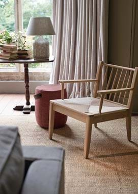
So, how have we created comfort? ‘If we were sticking with the spindle back, we knew we needed to make sure it as comfortable as can be,’ says Henry. ‘Luckily, we’d already partly ticked that box when we designed the dining chair. The vertical arrangement of spindles fits around your spine rather than cutting across it as horizontal ones would. And the top bar is curved, to wrap around your shoulders, with soft edges so it doesn’t dig in too much. Then, of course, we had to adjust the rake – that’s how reclined it is – and the backrest height to suit how you sit in an armchair. There were lots of tiny tweaks, and lots of sitting in prototypes!’ Wycombe will never be the kind of chair that you settle into to watch a movie, but it is one you might sit in for a time while chatting to friends. ‘That’s why it was important we made it deep enough to fit a scatter cushion – even if you’re long-legged (handily, we have a couple of tall people on our design team to test that out!). We took the comfort of the chair itself as far as we could, and then a cushion takes it the rest of the way.’
And speaking of digging in… ‘By adding arms, there was also the problem of those being uncomfortable against your legs. The first thought is usually just to have the arms extend to the edge of the seat, so you have the maximum space to lean on. But, actually, we found when we were testing it out that this didn’t leave much room for knees. Lots of people are more comfortable sitting with their legs curled up on a chair too, so reducing the length of the arms a little made room for that as well. This way, you’re less inhibited, but they’re still long enough to support the majority of your arm and, most importantly, your elbows when you’re reading a book.’ We then increased the seat width as much as we could, but not so far as to take away from the compact nature of this chair – a feature we felt was important in its usability. ‘That’s another of those “whys”!’
