Olive's perfect partners
Olive's perfect partners
Take a look through our paint collection and you’ll find that our 28 core colours are designed as seven palettes of four shades each, all made to go together perfectly. But what about our archive of seasonal colours? Which other tones and tints do they pair best with? Here, we’ve taken one such colour – Olive – and picked out four of the hues in paint and fabrics you could happily pair it with. They’re by no means the only four, but they do go to show just how versatile Olive can be.
Palette no.1: Olive and Honed Slate
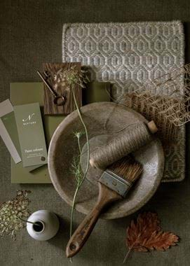
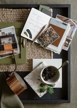
Our first palette introduces the colour that, we feel, is Olive’s ideal neutral partner: Honed Slate. Like Olive, it has a yellow base and could even be considered to have a touch of green about it, so it’s less of a crisp contrast than our white shades would be, and more of a tone on tone pairing.
One way to use it is simply as the woodwork colour to walls in Olive. Although the first thought with your room’s skirting, coving and doors is to reach for a shade of white – which Honed Slate, although neutral, decidedly isn’t – if you were aiming for a muted scheme like the one in our moodboard, any white, however soft, is going to stand out as bright when directly against the deep and pigmented Olive. (Although that’s not to say there’s anything wrong with that if your palette is a cleaner, bolder one.) So, while on its own Honed Slate is quite dark, side by side with Olive, it takes on that role of the muted woodwork neutral perfectly. You could even take it up onto the ceiling, although if you feel it’s too dark for that, we’d suggest Old Chalk, which comes from the same colour family as Honed Slate, instead.
The other course you can take is to flip things around and make Honed Slate your dominant colour with Olive as an accent. We might use Honed Slate across both walls and woodwork and then add in Olive on painted furniture or through our Harris Tweed textile. The effect would be very similar to Olive with accents of Honed Slate – still soothing, warm and cossetting – albeit lighter.
You can then leave things at that, like we’ve done in our moodboard, and continue the subdued palette with undyed linens, natural and darkened timbers, and other stone-like hues, or you can see the Olive and Honed Slate pairing as your jumping off point from which brighter colours can really sing.
Palette no.2: Olive and Clove
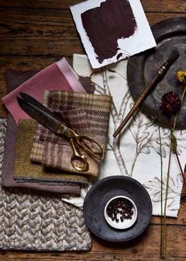
And speaking of brighter colours, our next palette brings Olive together with equally rich Clove, our damson-like shade for autumn 2021. It’s a pairing that immediately suggests an autumnal setting, hinting at berry-laden hedgerows and the rich leaf colours of a city park.
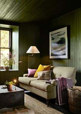
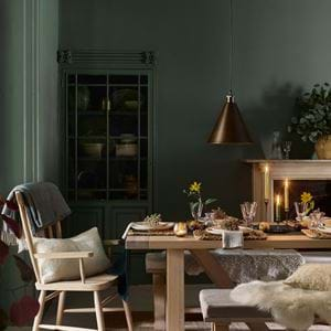
As you’ll also see in the other two palettes later, when you combine two strong colours like these in one space, making it a success is all about how you balance them. If both colours had equal weighting, they might feel like they were fighting for attention, so allow one precedence and let the other take the role of accent colour. You can see this both ways in our moodboard and living room scene: in the moodboard, it’s Clove that is the dominant colour, with ‘Olive’ hues confined to the greens in the Harris Tweed Fig Check and Lichen swatches; in the living room, Olive paint is used on the panelled walls and ceiling for an enveloping cosiness – with the George sofa in Harris Tweed Lichen – while the Clove-like purples of the cushion and throw act as the accent.
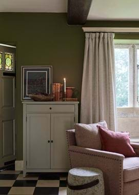
Two colours alone don’t really make a palette though, so you have a few choices in where you go from here with the Olive-Clove combination. Firstly, if you wanted a neutral, Honed Slate would again make a great option, as would Old Chalk and Dove Grey, which are also in Honed Slate’s palette, Fossil. Or, for something lighter and crisper, try a white with a pink base – like Salt, the off-white in Clove’s palette, Spice. Then, if you wanted a third ‘colourful’ colour, we’d suggest giving Old Rose a go, be it through paint or fabric (like Isla Old Rose or Francesca), like we’ve done in our moodboard. Or, as with the living room scene, inject a jolt of energy with zingy yellow Isla Finch. A small dose is all you need of this potent shade though.
Palette no.3: Olive and Chestnut
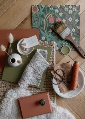
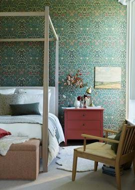
If ever there was a colour palette that said ‘autumn’, it was this one – when Olive met the fiery russet of Chestnut. That’s not to say though, that this is a pairing which would feel out of place in your home come next spring. Rather, it’s one that imbues the space with welcoming, homely warmth and which, as you can see from our moodboard, can easily be made fresher with pale neutrals and perhaps a touch more verdancy when March rolls around (the zesty greens and yellows of a bunch of daffodils would feel perfectly at home in this room). In fact, the wallpaper we’ve opted for in this scheme – Morris & Co.’s Blackthorn – depicts the spring blossom of blackthorn and the May meadow bloom, snake’s head fritillary, within its green and russet palette.
This scheme, especially with the richly-detailed Arts & Crafts wallpaper, can feel wonderfully traditional – a real British heritage kind of look. In the bedroom we’ve used it in though, we’ve paired it with furniture (the Wardley four-poster and Wycombe armchair) that has a clean and pared-back character, and instantly, the space feels more contemporary. In fact, you can see the same thing in this moodboard, with the simplicity of the bud bottle and the hemp rug, the playfulness of the curly sheepskin and the precision-cut engineered Savernake flooring. You could even so easily take this palette in a mid-century direction, depending on the patterns and pieces you opted for. This is truly a palette both for traditional homes and those that just want to hint at it.
Palette no.4: Olive and Ink
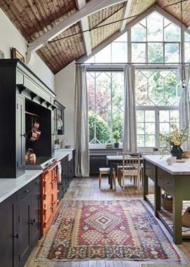
Our fourth Olive palette was inspired by the third Suffolk kitchen in our ‘One kitchen, three ways’ shoot. For these spaces, our team were tasked with creating three versions of our Suffolk kitchen painted in almost-black Ink (which is actually a very deep blue) to show how, over time, you can add to, adapt and even move homes with your Neptune kitchen. While the first was bright and bold, with its Saffron-Ink combination, and the second smart and contemporary but family friendly, this third kitchen welcomed in Olive to create a space that’s sophisticated yet warm and lively.
This is a palette that builds on our previous one, taking those russets and yellow-based greens, and adding Ink’s contrasting coolness for a good balance of warm and cold. Orange doesn’t have such a big part to play here (well, maybe it does if you opt for an orange Everhot as we’ve done) but it is important to the palette, so even if you don’t include Rust fabrics and Chestnut paint, do make sure to introduce richly-coloured timbers, tan leathers, brass, bronze or copper metals, and undyed natural textiles.
This palette is also another which goes to prove that you can create a harmonious space using three strong colours – like with Clove and Olive, it’s all about how each one is weighted. In our kitchen, Ink was the dominant colour, used on the main run of base and wall cabinetry and the impressive cooker hood, followed by a little less Olive (on the Charlecote island and, on the other side of the room, a Chawton bookcase). The most vibrant orange was then just confined to the stove and to small sections of a vintage rug.
Don’t feel you can only apply this colour scheme to a kitchen though. In a living room, especially a north-facing one, Ink on the walls (see this post and this post from our journal archives for an idea of how this might look) with accents of Olive and orange through painted furniture and soft furnishings would make an incredibly cosy space. Or, flip the weighting, choosing lighter, neutral walls in Honed Slate (remember palette one?), a Harris Tweed Olive sofa with an armchair in Harry Rose Hip or Rust, and the inky-black frame of a Coniston coffee table. There are so many creative possibilities when it comes to Olive and its palettes.
To find more inspiration on how to use our colours in your home, or to get the expert advice of one of our home designers, head to your nearest Neptune store. Can’t make it in? Arrange a virtual consultation or store walk-and-talk here.
