One kitchen: three ways
One kitchen: three ways
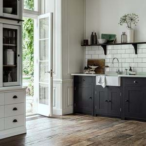
The Suffolk collection is our most pared back kitchen – drawing on the refined simplicity of Shaker design with a less-is-more approach to decorative details. And its purity of design means it’s also the most versatile of kitchens, able to adapt to different interior styles and fulfil different family needs.
The affordable family kitchen
Designing a stylish kitchen for busy family life that ticks all the boxes but still comes in at under £10K for the painted cabinetry is surprisingly achievable when you know where to spend and where to save.
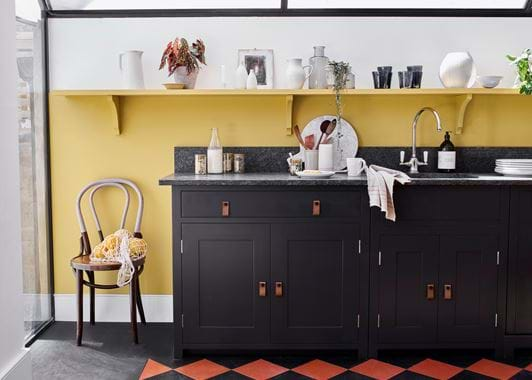
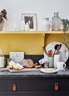
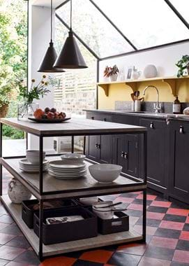
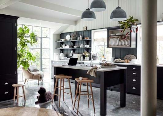
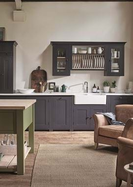
This project, led by our designer Becky Smith, started with a simple run of Suffolk cabinets, painted in Ink, and a clean line of cost-effective open shelving which allowed us to incorporate all the important things that a practical, working kitchen needs – easy access storage, a 1.5 bowl sink, an integrated bin and even a statement stove. The built-in cooker hood was kept simple (and thus affordable) while the Dylan leather toggle handles gave a contemporary spin and made the open-plan kitchen-diner feel less ‘kitchen-y’. The metal framed Carter island added an industrial edge and provided plenty of useful storage, while we offset the cost of the granite worktops by extending them with a small up-stand to avoid the expense of a full splash back or tiling. As Becky explains, “We tailored this kitchen for a young family, making it fun with our contrast of Saffron walls and Ink cabinets and that show-stopping Everhot stove in mustard.”
The modern kitchen with Shaker heritage
How do you give classic Shaker lines a thoroughly modern interpretation? That was our challenge in this kitchen which saw us use the same Suffolk cabinetry, painted in Ink, to create a fresh, contemporary space that delivers plenty of character with minimal fuss.
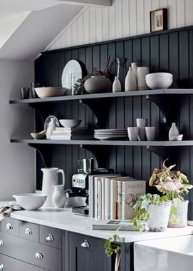
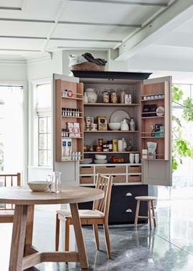
Awkward architectural details meant this kitchen needed extra thought to create an interesting and workable space. As the room didn’t lend itself to a symmetrical approach, we built out from one focal point – the sink under the window – and then balanced this with a Charlecote island and a sleek, modern induction hob which created three, well-spaced focal points in the room. To add interest to the main run of closed cabinets, we introduced a break-front cabinet for the oven and kept the lines of the cooker hood simple so they didn’t dominate the space. As the room allowed for an impressive double larder cupboard, we left the area under the Charlecote island free to give a light, airy feeling and chose a muted palette of Ink and off-white to compliment the contemporary, white work surfaces. “Finally,” says Becky, “to pull all the elements together, we used half-wall panelling, open shelving and a plate rack to add visual depth to this modern interpretation of the Suffolk collection.”
The kitchen for cooking, eating and living
A large, high-ceilinged kitchen sounds like a good problem to have, though vast spaces do have their design challenges – but they also offer scope to play with all the ingenious elements in the Suffolk collection.
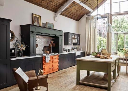
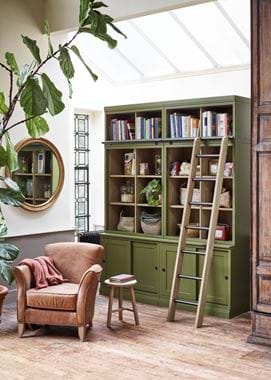
We love a bit of symmetry at Neptune but it’s not always feasible and this barn conversion-style kitchen was a case in point. “If you can’t introduce the discipline of symmetry in a design, then you do need balance,” explains Becky. So finding some visual harmony was a key consideration for the layout. We resolved this by running extra tall cabinets from the Suffolk collection on one side of the tangerine Everhot, with its feature cooker hood, and balancing the space with an impressive plate rack on the other. It meant the broad wall didn’t feel top heavy on one side but also avoided filling the space with a bank of cabinets that would have felt overpowering. Large rooms also need a focal point – in this case that showstopping cooker hood – and an anchor point, here provided by the Charlecote island, painted in Olive. We used colour to visually link different parts of the room so the Olive island is offset by the Olive painted Chawton dresser which houses everything from cookbooks to tableware, on the other side of the room. And while this room is large and lofty, we retained that cosy cottage feel with the hand-painted tiles (from Marlborough Tiles) behind the stove and plenty of room for displays of collections and personal touches.
Find our more about our kitchen collections here.
