How to create a warm and characterful minimalist home
How to create a warm and characterful minimalist home
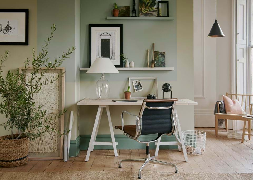
'Less is more’ has always been a guiding principle for us here at Neptune. Understated, edited and pared-back are all words we hope you’d use to describe our look and our collection. But minimal? Doesn’t that word conjure up images of modern white spaces, free from decoration and, well, a bit cold? Not any more. It’s time to rethink minimalism as a way to create interiors that are both tranquil and comforting, with a little help from two cultures that have been getting it right for quite some time.
Belgian and Japanese approaches to minimalism
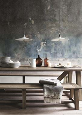
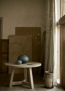
If there’s one country that’s synonymous with minimalism, it’s Japan. From sculptural ikebana flower arrangements to the distilled imagery in haiku poetry, theirs is a culture that seems permeated with restraint. Shibui is a Japanese word used to describe something (usually an object, although it can be applied to other things as well) that displays a certain economy when it comes to its design, but which balances this simplistic beauty with details that, in turn, add a contrasting complexity and interest. Our Arundel table, for instance, couldn’t be much more clean-lined, but the oak timber it’s made from and the dowel joinery details give it a level of intricacy and add new meaning as you notice them. You could go a step further and apply shibui to your whole home as well: a space characterised by its control but filled with the details that add character (more on that to come).
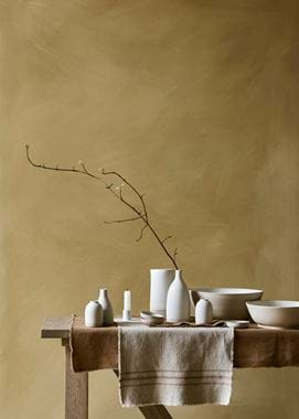
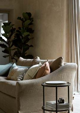
Belgium, on the other hand, might not as instantly spring to mind when you think minimalism, but it’s a rich source of inspiration on how to do it in a welcoming way. The designer Axel Vervoordt is generally considered to be the founding father of this particular look – which draws inspiration from traditional Dutch and Flemish styles and combines them with the modernism of 20th-century Europe; think linen, raw timber and lime-washed walls – and the aesthetic he set down can today be seen in the work of designers like Rose Uniacke and Ilse Crawford, in hotels such as Heckfield Place and Ett Hem, in the pages of Cereal magazine and even in the occasional Instagram glimpse into the home of Nigel Slater (who is also, famously, a big fan of the Japanese aesthetic). In fact, it was a key influence on our spring collection as well.
Achieving the look in your own home
That’s all fine and well – and inspiring – we hear you say, but how can you translate the look into your home when you aspire to minimalistic living but perhaps haven’t quite achieved it yet? Read on for our breakdown of the main principles and how to, realistically, apply them yourself.
Don’t throw everything away, but do curate it
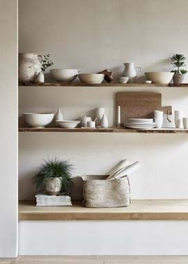
We’re not going to ask you to Marie Kondo everything in your home – we know there will be plenty of things that need to be there but which don’t necessarily spark joy (children’s toys, for one). But it is worth taking a look at what’s out on display and what could be tucked away. It’s perfectly possible to have ‘stuff’ and still achieve the minimal look. Just look at Kettle’s Yard, former home of the collector Jim Eade, for instance. It’s fair to say that Jim and his wife, Helen had plenty of ‘stuff’, from art to plants to pebbles, but the interior still feels understated and restrained. That’s because everything they displayed was meaningful to them, natural or finely crafted. And there in lies the secret to this and all the other homes out there that reflect this aesthetic: curated collections are fine, but clutter is not. You’re going to want to invest in some good storage…
Opt for a few pieces of furniture that are well-chosen and well-made
The same principle applies to your furniture too. Only buy that which is made to last (physically and aesthetically), crafted from natural materials (we’ll come on to why in a second) and which you really, truly love. And if you’re already faced with a home full of furniture? Edit wisely.
Use natural materials for their character, tactility and authenticity
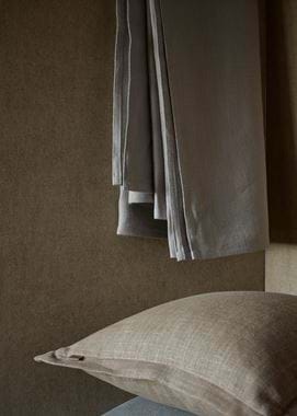
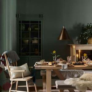
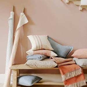
That last part – authenticity – is an elusive quality to pin down, but it’s what makes natural materials like timber, linen, stone and wool so appealing. It’s also a big part of what makes this look go from the cold kind of minimal to the warm and easy to live with sort. And, like we mentioned when talking about shibui earlier, natural materials are also never boring or two-dimensional. They’re slubby, they’re grained and they’re mottled, which adds personality to the simple lines of minimalism.
Mix the old and hand-crafted with the new
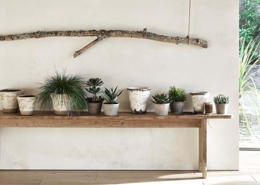
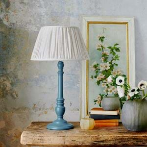
The visual cleanliness and perfection of new pieces – be it a clean-cut piece of oak or a smoothly-painted cabinet – is made all the better when it’s contrasted with a weathered antique or an object that bears the marks of its maker. And a balance of the two is essential for this look: too much new and things will feel too perfect, and not so comfortable to live amongst; too much old or visibly handmade and your space will look busy. A little contrast is necessary, even if it’s just a perfectly-painted wall or a reclaimed timber floor.
Create depth through the use of texture, colour and light
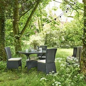
We’ve just touched on the importance of contrast in texture – well the same goes for colour and light as well. All-white isn’t inviting (even when it’s a warm white) because there’s none of the brightness and shade found in nature. Ditto with an overly or under-lit room. Our approach to both colour and lighting is to recreate what’s found in the natural world, be it the way sunlight falls in a dappled way through trees (done indoors with layers of low, mid and high-level lighting) or the earthy palettes created by pebbles, plants, timber and spices that vary from the pale to the rich. Look at an Axel Vervoordt interior and you’ll see the same: light contrasted by dark.
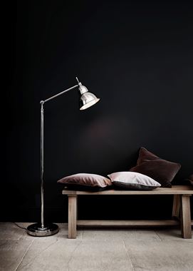
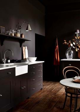
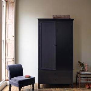
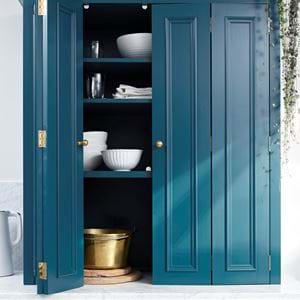
And don’t forget, things can be the other way around too. Turn the white, minimalist home on its head and go for tranquil and soothing top-to-toe dark instead. Just make sure a little touch of light comes through.
