Our paint palettes: making selection easy
Our paint palettes: making selection easy
Everyone’s had the experience at one time or another: thinking you’ve settled on a choice, only to stumble on a fresh idea and wonder if you should reconsider. Having plenty of options is a good thing, but it can be overwhelming, particularly when it comes to picking colour schemes for your home. With an endless number of shades out there, each with its own subtly different tonal character, where on earth should you start?
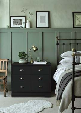
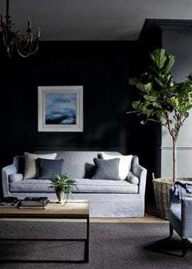
It’s for this reason that we organised our 28 core paint shades into seven easy-to-navigate palettes. Each is a quartet of four harmonious colours, grouped together because they share a natural affinity. Nordic, for example, has three blues, from pale to mid-toned, and a suitably cool white named Snow; Spice brings together cosseting rose and russet tones with Salt, a warm off-white that complements pinks. Some palettes are all about soft shades, while others might include a darker accent that lends them a stronger character.
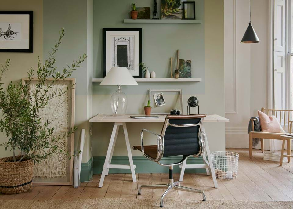
Because the human eye doesn’t perceive colours in isolation, grouping shades together like this instantly makes it easier to home in on what you like. So, if you find yourself with only a vague idea of the colours you want to use in a room, let your eye wander across our core palettes: at a glance, you’ll sense that each has either a cool or warm feel, and you’ll likely be drawn instinctively towards one or two. You’ll start to get an idea of how the various shades might be distributed through a room: as a general guide, the gentler shades usually form a wash of colour in the background on walls, floors and ceilings, while smaller doses of the bolder accents pop up on furniture, woodwork, fabrics and accessories, bringing the room to life.
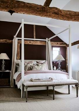
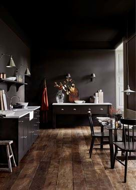
Choosing a palette is partly down to taste and instinct but, at the start of the selection process, you should also study your interior. What kind of natural light does the room have? Instead of deciding whether it’s bright or dark, think about it in terms of warm or cool: a cooler, dimmer space – perhaps one that’s north facing – may feel more comforting decorated in warmer tones, such as the taupes and earthy browns of our Timber palette; a sunnier, south-facing one might cope with a wider range of colour choices.
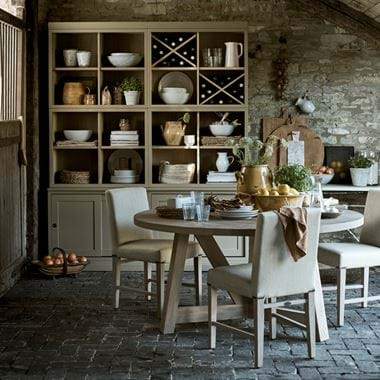
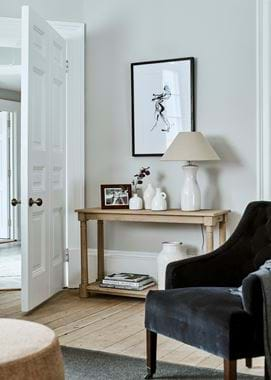
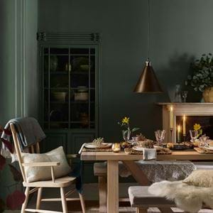
Once you’ve decided which colours you’re drawn to, the next step in the palette-building process is to study the furniture that will live in your newly decorated space. Do you prefer to echo it, or make a contrast? If you have lots of wooden furniture, the earth tones in the Fossil and Timber palettes will create subtle harmony and make it feel cosier. Or, for something fresher and more stimulating, Nordic makes for a clean, uplifting match with wood; think about the blue and golden-brown shades on a sunlit beach.
Something else to consider is colour’s relationship to our emotions. How do you want a room to feel? It’s interesting that during lockdown, the popularity of green and blue paint shades surged, reflecting not just a desire to bring nature indoors, but also the fact that these are the most calming colours on the spectrum (the way our eyes perceive blue relays messages to the brain that reduce blood pressure and heart rate). Furthermore, if you want a room to soothe you, be mindful that the paler variants of any hue are always the most restful; the more intense you go with your main shade, the more mentally alert you’ll be in the space.
Bear this in mind while you’re putting together a moodboard of your chosen palette. There are no hard and fast rules about how you balance colour proportions, but too much of one shade is likely to overwhelm. Plan to devote two-thirds of the room at most to your dominant colour (most likely, this will go on the walls), with the remainder given over to tonal variations on the same theme, and the option of one or two contrast accents. Keep your palette limited: too many accents will result in sensory overload and a room that feels chaotic.
Moodboards are simple to assemble and will help you get the balance right. Paint a large-ish piece of card with your main shade, and pin smaller ones for ceiling and woodwork finishes on top. Then add samples of fabrics and wallpapers – ensure they’re big enough to give you a sense of any pattern repeats, so you can accurately assess their impact in a particular setting. It doesn’t necessarily matter if a pattern contains a colour that’s ‘off message’ – as long as it predominantly matches your palette, it’ll fit. Live with your finished moodboard for a few days, and move it around the room, so you can see it in varying lights and perspectives.
Finally, remember that while our palettes are there to guide you, they aren’t set in stone. You could, for example, take two favourite tones from a palette and marry them with one or two more from our range of archive shades: yellow-toned Limestone paint, for instance, dials up the warmth of our green Plant palette. Equally, the archive has ample inspiration for accent shades: use yellow Mustard or Saffron to give a livelier character to the greige Pebble palette, or Flax Blue to freshen the cool greys of Smoke. Pair like with like – cool tones with cool accents, and warm with warm – and it’s hard to go wrong.
Hopefully, working through this process will make you more confident with colour. And once your cast of perfect colours is assembled, there’s no reason not to play around with different layers and proportions – after all, the best thing about paint is that you can hit refresh whenever the mood strikes.
