Lean back: the other way to 'hang' your art
Lean back: the other way to 'hang' your art
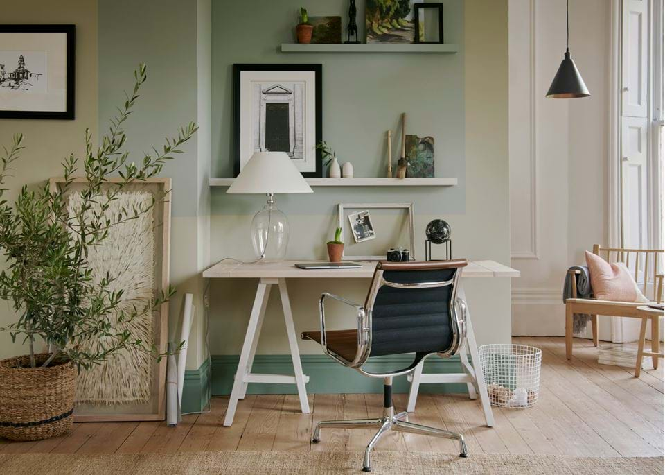
Long gone are the days where hammer and nail were the only way to approach pictures on walls. Whether it’s a canvas or framed art and photography, the move towards leaning your art against a wall has become more popular in pretty much every style of interior – from country cottage to modern townhouse. But, like with most interior design touches, there’s a bit of an art behind it. ‘Un-hung’ art can look incredibly sophisticated, or it can go the other way looking as though you just haven’t quite got around to hanging it yet.
Find balance
If you only lean one or two pieces of art across your home, it’ll look more accidental than a conscious choice. So, commit to the look and think about how you might want to repeat it multiple times in one room, as well as in several others. Don’t go overboard though, or it’ll look staged, a bit too obvious and even a touch messy. As a rough rule of thumb, try not to repeat it in every room and mix it up with some pieces that are mounted onto the wall.
Go for a picture rail
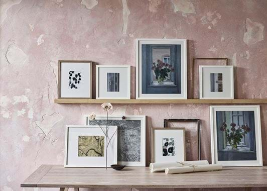
Back in 2017, we launched our oak Buckland picture ledge. It’s essentially a narrow shelf with a channel grooved out for picture frames to sit in, tip back, and rest against the wall behind them. Because there are no nails involved, it encourages you to move your frames about, swapping positions, moving some from upstairs downstairs, and to curate your collection as often as you please.
Overlap frames
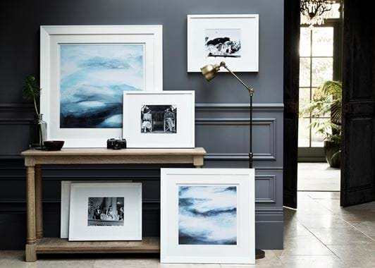
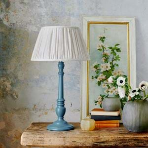
One of the best things about leaning your art, is that you can put one frame in front of another to create a layered effect. That’s just not possible when they’re wall-hung. Again, don’t go overboard and overlap them all, just one or two at the most is plenty. It’s an arrangement that feels much more relaxed, more creative, more ‘arty’.
Mix things up
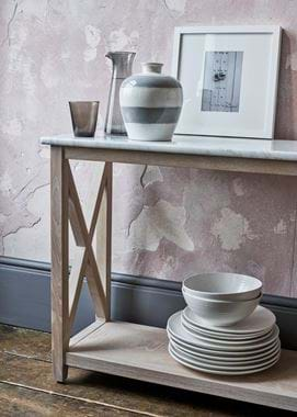
If you’re going for multiple frames, change the style of the frame, the size (like a picture wall, you need a variation in frame size) and the art within. This is a look that works best when there’s a touch of eclecticism to it. If you’re using a console table for your display surface, add in a few ornaments and accessories too. Just be careful to not introduce too many points of difference.
It's not all about art
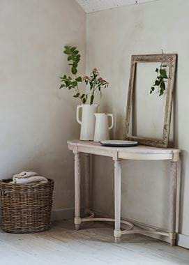
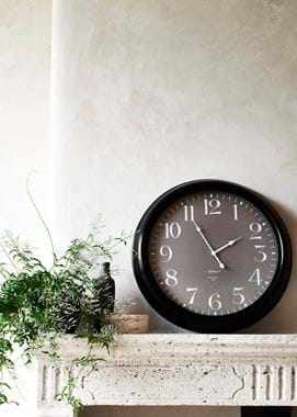
The ‘lean-back look’ isn’t just about displaying art. Wall clocks can join in, as can mirrors. It’s a whole new way to approach your mantel…
