A Saffron story
A Saffron story
An exciting, confident colour sets the tone for our new spring collection. Meet Saffron: a beautiful, bold, life-enhancing shade of yellow that’ll breathe new energy into any scheme.
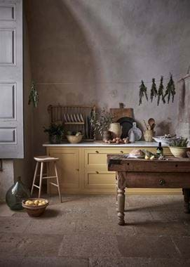
The story begins back in early 2019 when the design team were exploring ways to add authentic colour confidence to the established Neptune palette. The new hue had to be strong, it had to be sophisticated and it had to work in a variety of different schemes and styles of homes, from elegant sitting rooms to country kitchens.
Cue a fascinating research journey that led the team through the grand entrance halls of stately homes (Bowood House in Wiltshire to name but one), to country house hotels and as far away as Belgium with its muted palette of ochre, creamy neutrals and muddy browns. (You’ll be able to read more about the influence of Belgian design on the collection here on the journal later this week.)
After much deliberation, a warm-but-earthy yellow was settled on and christened Saffron by co-founder John Sims-Hilditch. Created to work perfectly with colours in the existing Neptune palette, notably the deep, dark blue of Ink and the off-white warmth of Salt, it also pairs well with fresh whites or a hint of black. And it doesn’t need much more. The new addition is a vibrant hue – so rich it almost glows.
As our product development lead, Amy, explains, “Saffron will help define the foundations of a room scheme. It’s the shade that was missing from our colour palette and its sunniness acts as contrast to the more subdued colours of our core collection.”
But this is no new colour discovery. Saffron has been inspiring creatives for centuries, as far back as 1200 when it was first recorded as being used as a decorative colour. The name comes from the crocus flower, Crocus sativus, which is indigenous to Greece, Turkey and Iran and which produces the world’s most expensive spice, saffron. Back in medieval Europe, saffron-based inks were used in illuminated manuscripts to provide hues of yellow and orange and also for imitating gold leaf. Then, in the 14th century, England became a major supplier of the spice with the production epicentre focusing on the small town of Saffron Walden in Essex.
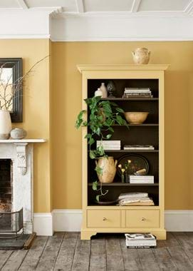
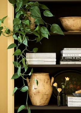
The design team’s interpretation of saffron is far more liveable than the original, orange-hued spice shade. Yes, it’s vibrant, but it lifts a scheme and instantly refreshes it. Keep ceilings and skirting painted in a fresh white to give an element of contrast, but don’t hold back. Extend Saffron onto painted furniture such as shelving units, then follow through with Saffron-shaded throws and cushions, just adding a touch of grounding black or navy blue (that’ll be Ink) as an accent to give the scheme a sophisticated edge.
And the best thing about this new shade? It somehow changes character depending on the light and time of day, so it’ll look fresh and bright as the morning sun streams through the window, but transform itself into a nurturing, cocooning hue as the evening draws in. That’s like having two rooms in one. Thank you Saffron.
