Making a non-Neptune statement
Making a non-Neptune statement
Invite a Neptune design into your home, and you might think that it’ll instinctively seek to hog the limelight. Our aesthetic might be known for its classic elegance, its sense of poise and calmness, its precision and order, but that doesn’t mean to say you can’t have just a soupçon of those character traits rather than a full-blown statement. Here’s how to encourage your chosen Neptune piece to sit back in your scheme…
Go grand in scale
The louder you shout doesn’t necessarily equate to being heard and attention given, but in some instances, it certainly helps. Choose furniture with a large footprint or that’s tall in stance, such as a salvaged sideboard that takes up most of one wall span or a towering dresser that creeps towards ceiling height. It’ll be hard to ignore its dominating presence, commanding your eye first so that your Neptune piece isn’t detected until it begins to wander.
Match finishes to multiply your statement
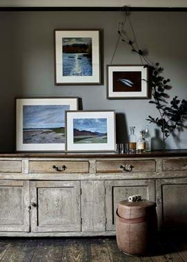
Back to your salvaged sideboard, similar to the one seen in our first scheme, pictured. By having a matching texture and tone on the floorboards, it reinforces the strength of character seen in said sideboard. You can imagine that if there were a Henley oak dresser on the adjacent wall, grand as it may be, the room’s protagonist would remain unchanged, because the sideboard’s presence is almost felt twice through the boards below it.
Consider placement
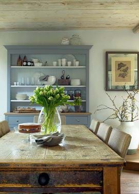
Staging is all part of what makes an element of a scheme statement-worthy. The term ‘centrepiece’ exists for good reason – positioning an item in the heart of the room is one surefire way to grant it feature status. Depending on the piece, this isn’t always achievable of course, but dining tables are an easy example of where this middle-of-the-room placement counts. Look to the rustic farmhouse table scheme where the proof is in the pudding; the painted Chichester dresser is very much a secondary piece in the room, even with its contrasting Flax Blue finish.
Make an unexpected statement
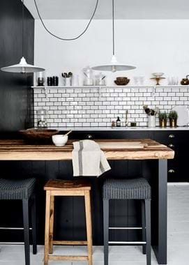
Even in a kitchen, it’s possible to take the focus away from the cabinetry and onto something else. A Neptune kitchen can be pared right back, as the industrial-inspired Suffolk scheme shows. Here, the Charcoal-painted cabinetry, striking though it is, quietly awaits attention in the background, allowing the raw, rough-cut timber work surface to be the real statement in the room. It’s seen on just the side return section of the kitchen, but it leaps out off the page, helped along by the repeated texture on one of the three bar stools (nodding back to point number two).
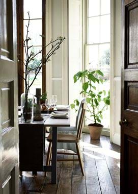
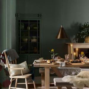
Similarly, the architecture of the room can be more of a statement than what you fill it with. Choose Neptune pieces that are slim in profile, like the second image with our Hebden table, if you have features asking to be celebrated. Hebden has a striking leg design, but the linen tablecloth folded into an overhanging runner, means that you don’t spot it as you enter the room. And by tucking in the Wardley and Havana dining chairs, their presence is masked a little.
With the rest of the room’s styling kept to an understated minimum and the colour scheme a tonal blend of wood and neutrals, the room’s statements become the beautiful dark wood doors and ceiling-to-floor sash windows.
Let colour do the legwork
People say, ‘a pop of colour’ not just because it’s become a bit of an interiors buzz phrase, but because used well, the colours really will clap their hands, pinging out of the palette so they’re more than just an accent.
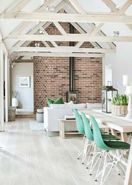
Such bursts can work in the plural sense, but if you keep that ‘pop’ to a single shade, then it’ll feel all the more significant. Look to the home of Jane and her Limehouse kitchen as an example. In her long and light open-plan kitchen living space, complete with authentic oak beams, exposed brickwork, an attention-grabbing log burner, sizeable Arundel oak dining table and sleek Limehouse kitchen, it’s those blade-of-grass green Eames dining chairs that get first glance, becoming the room’s figurehead statement.
Encourage solo acts
And finally, what better way to define a room’s key piece than to let it be a soloist? By this, we don’t mean having not a single other item in the room – because these are homes we live in after all, not museums – but being clever with layout and sectioning techniques so that one object gets to be seen in full-view with little else surrounding it to distract.
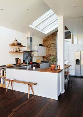
See our final image taken at the home of Jonathan and Rachel and yet another Limehouse kitchen. The peninsula section, painted pure white, conceals the contemporary kitchen from view and allows for the ideal backdrop for the mid-century meets rustic farmhouse bench in front to perform its solo act. The orchestra – the Neptune kitchen and furniture in this analogy – are very much present, but they aren’t at all the primary point of focus.
With the blank canvas set up, the repeats of the same timber texture on the worktop and shelves (again, back to point two), it’s the antique bench that well and truly steals the show.
