How to bring furniture into the middle of the room with Lauren Gilberthorpe
How to bring furniture into the middle of the room with Lauren Gilberthorpe
Whether your room’s big or small, there’s often a real temptation to position furniture around the edges. Sofas against walls, console tables along the perimeter, headboards pushed back and away from the centre of the space, are all layouts that lead you to believe your room will feel larger. But that’s not always the case. In our most recent volume of Stories, Gloucestershire-based interior designer Lauren Gilberthorpe talked through two alternative sitting rooms that show the ways that you can bring your furniture into the middle of the room. Now, she delves deeper by sharing different steps to achieve the same sort of gathered, intimate layout in a bedroom, kitchen and snug, with three room designs out of her portfolio…
In the bedroom
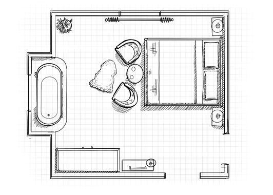
Your bed doesn’t have to be pushed up to the wall. Bring it further forward into the room but then be sure to make use of the space behind it, otherwise you’re wasting floor space and the furniture will seem like it’s floating in the middle for no purpose. A wardrobe with sliding doors that provides concealed storage within the bedroom behind the bed frame is a good way of doing this. It’s a similar notion to moving the seating in a large sitting room into the middle. In bigger rooms, it’s not uncommon to end up with a vast empty space in the middle that’s hard to use, but this approach stops that from happening and means you make better use of the floor space. This layout also improved the views out through the bay window.
Within the bay window, a small and sweet composition of chairs and a round upholstered footstool forms a seating area that’s a perfect spot to curl up with a book or to sit with a coffee. Bringing furniture into the middle of the room isn’t about bringing everything into the centre, of course. You need to form one key zone that’s central and to balance it out with smaller clusters of grouped furniture around the rest of the room.
Because the storage area of this bedroom is hidden from view, I felt the scheme required some strength and structure as it was otherwise heavily upholstered. The reason for this is it helped to form links between the piece that’s the anchor of the room – the bed. By putting a freestanding dressing table within this fireplace alcove, I was able to add that sense of solidity, and then I chose a chair upholstered in the same fabric as the headboard. Little design touches like this help furniture brought into the middle to feel more grounded.
In the kitchen
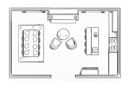
Smaller seating areas in open-plan spaces invite more opportunity for people to gather together while supper’s cooking. Don’t just rely on a kitchen island to do all the work. Here, putting two armchairs and a side table in the centre of the room means you have gathering spots spread through the whole space. These chairs are angled in towards each other to encourage face-to-face conversations (rather than side-by-side). It also groups together this small seating area with the window seat. It’s like a little pod. And the angles soften the pathways in the room too, leading people into the room and towards the kitchen or dining space without meeting a solid back of the chair. Much like the composition in a photograph, where your eye is led around the image by a series of shapes, interior design should have a flow to it, which is created (in part) by combining shapes to make the most of the space and lead the eye (and the person!) effortlessly all around the room.
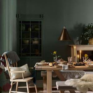
The dining table might not be strictly in the middle of the room, but it’s pulled a good amount away from the walls so, when you’re in the space, it very much feels like you’re in the hub. The oversized rug below helped too, as that enlarges the dining area. The dining table I used links with the kitchen island in its symmetry so there’s cohesion within the room. It makes it feel more balanced and equal so you aren’t pulled in one direction more than another. It encourages people to fill and move about the room.
In the snug
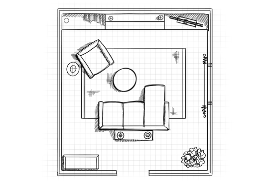
Don’t be afraid to put your sofa in the middle of a room and use it as a divider – it also brings you closer to the television for film nights in your snug. It’s a misconception that putting it against the walls will make your room feel larger. Actually, that can just create a void in the middle of the room that’s more difficult to use, as we touched on in the bedroom. I usually put a slim, long console on the back, which is great as a surface for additional lighting or accessories and breaks up the large expanse of the back of a sofa. Not every sofa has an attractive rear view, so the console trick transforms it into a thing of beauty too. This idea also applies for a sitting room.
When you do move a sofa into the heart of a room, it’s helpful to bring a secondary one with it – if you can fit it in – or an armchair if not. By having two seating elements in the middle, it creates a comforting central zone that’s not only visually balanced, but makes the space far more sociable to live in. This snug really was snug, so I went for a tub chair angled to the side of the sofa in the middle of the room, with a tall, slim side table next to it. If you can have a walkway around all of your furniture then this is ideal, but if not, as was the case here, just make sure the flow around the room still works for you.
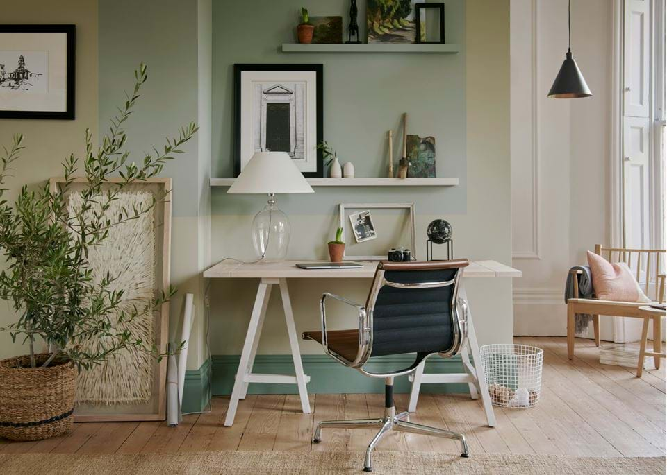
By moving your sofa to the middle of the room, it opens up other pockets, ready to be filled. A small, downstairs desk is a great place to keep household filing and a laptop if you don’t need to dedicate an entire room to a home office. Or welcome in a dresser or drinks cabinet – central furniture positioning is an open invitation to get more creative with what other furniture you have in the room. It really does make you see the room very differently.
