Eclectic versus composed : How many styles of furniture to have in a room
Eclectic versus composed : How many styles of furniture to have in a room
Whenever you’re designing a room in your home, be it from scratch or adding a few new pieces over time, you might wonder whether your core pieces of furniture should all be from the same collection. Or, if not the same collection, from one with a similar perspective, such as all painted timber furniture or all loose-covered upholstery. At Neptune, we’re big advocators of having more than one style of furniture in every room, and here we look at how many is too many.
Why it’s good to have a mix
In almost every magazine, you’ll land at some point on an image of an eclectic interior filled with a mishmash of colour, pattern, fabrics and furniture inspired by different eras. It’s a look that’s confident and exudes a carefree bohemian attitude, but can give some a bit of a headache and can scare many off the word ‘eclectic’. But design approaches are always on a scale, and you don’t need to go right to the extreme eclectic end to mix things up a bit.
When you have a room with just one variety of furniture, the atmosphere will feel much more formal. Compare it to a meticulously coordinated outfit where every item is from the same shop, the same product line, the same colour, and the same material. It gives the impression that there’s not a hair out of place and that’s how it must stay. It can appear a bit too poised, a bit too polished. You’d be afraid to give them a great big hug for fear of crumpling their perfectly put-together look. The same mentality applies with your interior. When every design matches, it soon seems staged and it becomes less inviting to just make yourself at home. So, by adding in a touch of difference, you’re basically loosening up your scheme and letting it – and everyone in it – relax.
Contrast can be subtle or strong
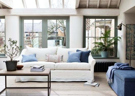
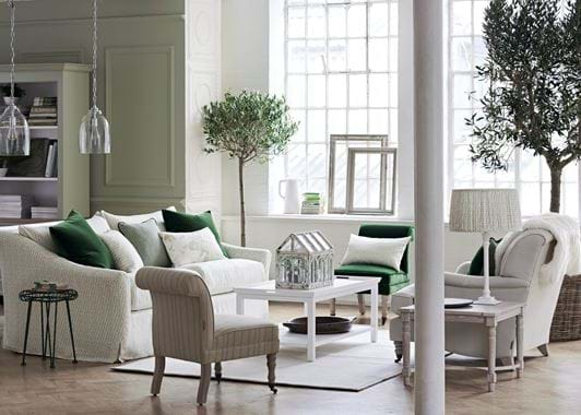
Now to choosing what pieces to combine in the same room. If you want to air on the side of eclectic caution, you can choose furniture from obviously complementary collections. Like Chichester and Suffolk, whose painted finishes and elegant country nature are very much aligned, as are the Olivia sofas, armchairs and headboards with the small Madeleine slipper chair – they share the same scroll-back detail. Or, you can create deliberate contrast by putting crisp finishes next to softer ones, such as in the top sitting room scheme where the rumpled Long Island sofa sits aside the tightly tailored Eloise ottoman. There’s a second contrast at play in the same scene, where the almost industrial Carter coffee table introduces a very different character of furniture. The key is to make sure the design stays balanced by ensuring there’s at least one other piece in the room that’s bringing the same sort of tone. Without the Brompton lamp in the corner and the steely-coloured radiator, the Carter would seem out of place.
Not everything has to be about difference
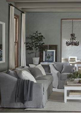
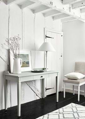
Conversations in eclectic design can lead you down a path of having nothing that matches. This is when your scheme can become disjointed. When a few pieces are from the same collection, it lends your room consistency and a degree of composure that’s reassuring and familiar. The light and airy Larsson bedroom proves this point, by putting the Larsson chair next to the matching dressing table. The difference in colour – Sage against Salt – provides the contrast as would any other furniture in the room such as Chichester drawers or a Wardley bed. Similarly, in the grey-toned sitting room next to it, the repeat of Long Island sofas and dining chairs helps to link the two rooms in the open plan living-dining layout. If there was only Chichester furniture in this dual space then it would have become formulaic, but the simple addition of a third furniture type – the Arundel console table – stops this from happening. The whole look is rustic yet refined, similar yet different.
The magic number
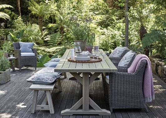
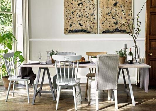
Three is a good guide. As we’ve explored, two different style of furniture isn’t quite enough to mix things up, but as soon as you reach three, it gives you just enough variation to move your scheme away from being overly composed. In our first sitting room scheme, you see three styles of furniture – Long Island, Carter and Eloise; in the next there’s Long Island, Chichester and Arundel; step outdoors and we mix the Harmondworth, Stanway and our indoor Arundel bench; and in our dining room design there’s Hebden, Wardley and Montague. All four schemes show that three styles of furniture is a safe way to play with contrast without fearing your home will seem muddled. Keep upping that number, like we do in our final scheme where the Olivia and Madeleine chairs, Long Island sofa, Blenheim side table and Aldwych coffee table show how five furniture designs can live happily in the same room. But if that feels too varied, remember that three is the magic number.
