Using fewer colours to create a core palette
Using fewer colours to create a core palette
whether you’re about to redecorate your entire home or a single room, knowing which colour to go for is rarely a quick decision. Even when you’ve settled on blue over green or grey over white, each colour has a multitude of tonal differences to pick between. That’s why at Neptune, we believe in an edited approach to colour. And by that, we don’t just mean our paint collection of 28 core shades that makes choosing more straightforward (you can read more about that here). But using fewer colours in your home so that, as a palette, they combine in a way that’s focused and full of flow.
How many colours is too many?
There’s no hard and fast rule or a specific number of colours that’s right or wrong to use in your home. But to us, having no more than four feels like a good balance. It means you can achieve variation and pace, but without the scheme feeling confused or even chaotic.
Colours, hues, tints, tones and shades
Colour theory is complex, and there’s a wealth of words and ways to describe different expressions of colour. But understanding colour for your home’s palette doesn’t need to become overly complicated.
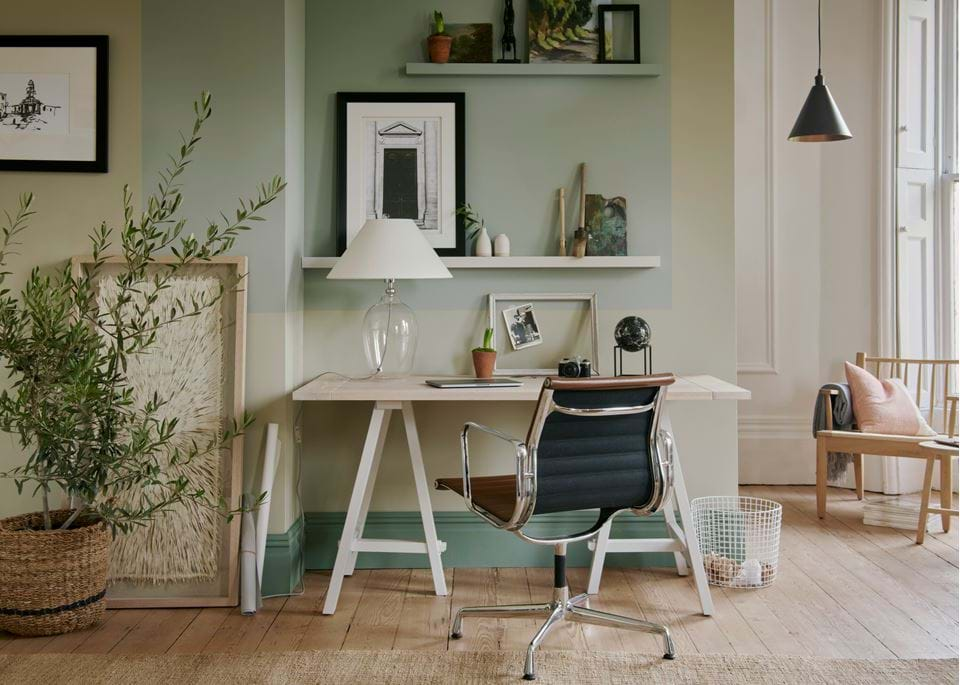
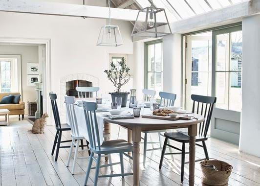
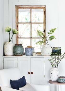
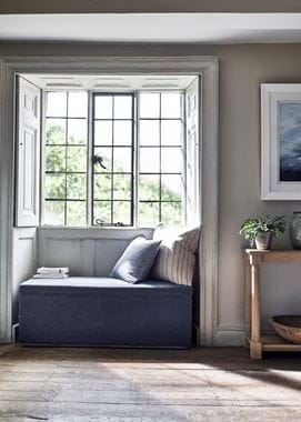
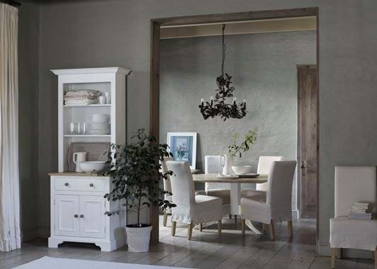
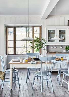
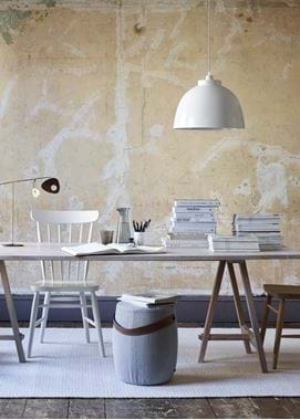
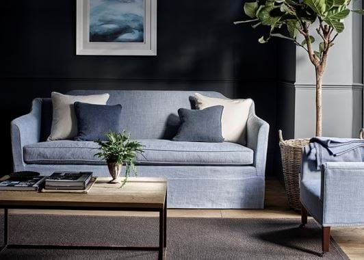
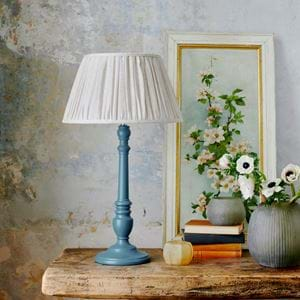
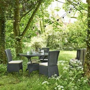
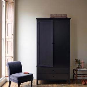
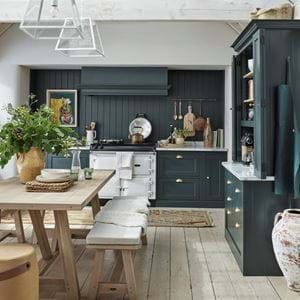
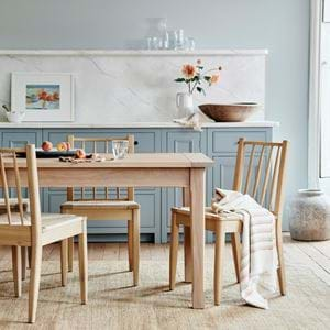
Instead, think of your four or fewer colours as being general themes. Such as in these photos where the overall colour themes are white, blue, grey and a warm brown. But from here, you can explore those colours in more detail to include different types of white, different depths of blue, different interpretations of grey and different depictions of brown. Let’s call those tones. But they all remain united under those central colour themes. They’re all linked. They’re all sympathetic to one another, gathered together to work as one cohesive palette.
Using a combination of tones in your home
Once you’ve decided on your core colour themes, it’s time to start spreading them throughout your rooms. Some people let colour psychology guide them – for example, yellow is deemed too energising for a bedroom, unlike blue that’s linked to feelings of calmness and serenity. Others rely more on what will work best with the natural light available (a crucial point), inspirational images they’ve found and want to replicate, or even gut instinct for what they want and where.
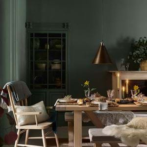
Try not to divide your colours too strictly. Having a single-colour room, even with all of the tonal variations of that hue, will quickly feel contrived. Instead, blend your colour themes so that a little of each is felt as you move about your home. Take our main dining room image where you can see all four colours – white, blue, grey and warm brown – but in different guises. The brown comes through the oak table, the basket to the side, and the golden, honeyed undertones to the brown means you can even afford to bring in a mustard tone, seen on the sofa in the backdrop. Now move to the armchair and vase shot where, this time, you have only three of the four colour themes – white on the Theo armchair, different styles of blue on the cushion and pots, and golden brown on the window frame. Remember that you don’t have to use all four themes in every room – two or three is fine as well. And that building your colour palette isn’t solely about paint and fabric. Your windows, your doors, your floorboards and fixtures all have a role to play.
Your core colours can blend too, which leads you into other complementary tones. In our dining table and dresser image, the wall colour is a brown-based grey, which brings about a tonal difference in the room but one that’s in-tune with the rest of your palette.
Similarly, degrees of tone mean that you can achieve necessary points of contrast that give a room its light and shade without the need to add a new colour entirely. The golden brown from your core colour theme that allowed you to bring in elements of mustard, means that when you apply it in a bigger way, they have impact. It’s what makes the Finian Mustard George sofa in the grey sitting room feel so well-matched. And it’s what makes the ochre plaster wall so in-keeping.
And why it works
Edited colour palettes, when they’re woven throughout your home, when their threads can be just about seen so they’re enough to be felt, are such a success because of their subtlety. You might only have four colours in your entire home, or even just two or three colour themes, but in reality, you could have 10–20 tonal variations. Though it won’t feel that way. The presence of the themes is what you’ll know is there.
By keeping your focus and instilling a touch of discipline into your home’s colour approach, it makes the entire experience of using colour more straightforward and focused, and of seeing colour more harmonious and balanced.
Less-is-more colour is a path to finding out what it is that you really love the most. And then gathering those colours together so your home becomes a celebration of them and an expression of what makes you happiest. It’s the other dimension of colour psychology. Colours might have hidden meanings, but when a palette is finely-tuned, the positive, pacifying effect on your mood and your home’s atmosphere is palpable.
To take the work out of creating your home’s colour palette, book your consultation with one of our in-store home designers.
