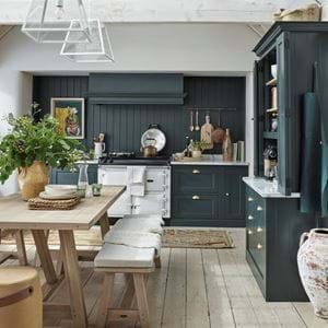
The Neptune design team on: the spring 2019 collection
The Neptune design team on: the spring 2019 collection
Just a week before our spring collection was revealed, we gathered around the kitchen island at Neptune HQ to speak to a few of the faces from our design team about the stories behind our newest pieces. From their favourite creations to the secret backstories behind the designs, here we hear from Amy, Chris, Henry, Nicky and Rebecca in our exclusive Q&A.
What’s inspired the collection?
Nicky: “For us, shaping a new collection always has to have a creative point of view first and foremost. That’s why we always write a seasonal story, which we use as a point of inspiration and a point of guidance to try to make sure everything comes back to that. For spring 2019, that story’s gathering. The notion of bringing everybody together has such an inherent tie to Christmas, and so we wanted to take it into the lighter months. We thought about all of the different things that gathering can mean and really liked how it resonates in all sorts of ways. Whether it’s how to gather people in your home or how to gather things, like furniture arrangements, colour palettes, and even ideas for how you want to decorate, gathering just has this sense of pulling close everything and everyone that you love the most. And that’s what we channelled when creating the entire collection.”
Why blue?
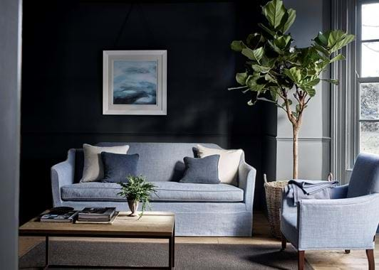
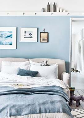
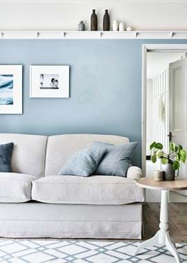
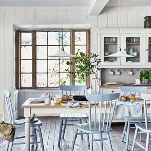
Amy: “On one of our design trips to Belgium where a number of our linens are grown and made, we saw the fields of flax with their pretty, pale blue, slightly dusky petals. They only bloom for one day a year so we were really lucky to have seen them, even though a lot of them had begun to drop. It was such an easy, calming colour that really suited what we believe in, about being inspired by nature because it helps you to find a timelessness in colour. It works in upstairs spaces because it’s calming and downstairs rooms because it’s not cold like some blues can be, or too highly saturated. It just works everywhere.”
Nicky: “Importantly, Flax Blue is also completely tonally sympathetic with the rest of our edited paint palette. All of our colours are about ease of use and ease of blending, so you can find a set of tones for your home that work well together.”
What was the most exciting piece to design and why?
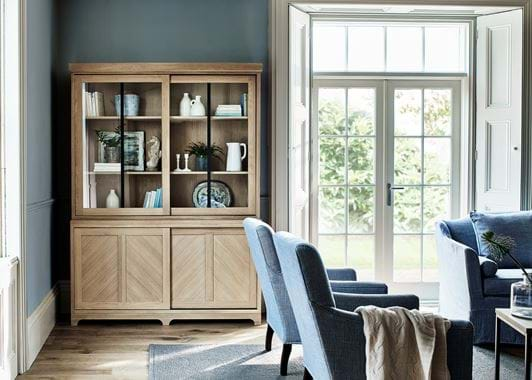
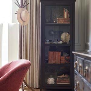
Henry: “The Holborn dresser and sideboard. It was an interesting challenge to find a way to bring a contemporary aesthetic into traditional values. It’s our first example of doing a sliding door too, which might not sound so exciting, but it presents ways to use these larger, investment pieces in apartment living – confined spaces mean doors can be a hindrance. Playing with the chevron detailing on the front was both fun and complex. We considered whether they should be in a positive or negative direction [upwards or downwards facing points] and what reaction they both incited and how well they translated to different sizes of Holborn. We wanted to be able to future-proof it in case we decide to do more sizes of Holborn one day – another notion that I find quite exciting.”
Rebecca: “I agree. Holborn is the ideal partner for Arundel too and that combination of the two pieces together makes me feel very excited indeed. Holborn has extended the breadth of what we can offer our customers. Our Suffolk dressers have indeed become more contemporary, but Holborn is another level.”
And which was the most challenging?
Henry: “The Olivia sofa bed or the Neve lamp. Getting that textured band around the middle of the lamp to work in the first instance was far from easy, but getting it to work in the exact same format across each size was a real challenge. The idea came from one of our Christmas baubles. We wanted to scale that up so that it had the same effect of catching any glimmers of light from a bulb in the room.”
Amy: “Yes, Neve wasn’t simple to make. Because it’s hand-crafted, the nature of the work is incredibly fine and delicate. Our makers use a foot-pedalled grinding stone and methodically rotate it to achieve the hundreds of little lines. If you measure them, they’re so consistent, and you can imagine how tricky that is to achieve!”
Nicky: “I couldn’t agree more, but the Olivia sofa bed is also a really good example of Neptune at its best. We said, this needs to be the best sofa bed it could be, and it goes without saying that it brought us challenge after technical challenge. Everything about it, from how it looks to the engineering we’ve used, has come together. I think it’s the perfect example of us setting the bar at our typical Neptune sky-high standards and not stopping until we’ve made it work in every which way.”
Which is the piece that you think people will be most pleased to see added to our collection?
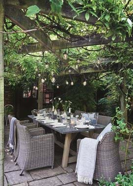
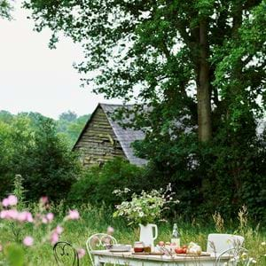
Amy: “Perhaps our Stanway garden table. It brings a style and shape of furniture that we know a lot of people love but with a new material on the tabletop. It’s a new texture, a new colour and it’s very practical. Or our Eloise ottoman, because it’s so helpful. [At which point everybody chipped in, agreeing.] It’s the sort of piece that works in hallways so you can keep shoes inside and sit down while you tie your laces, in bedrooms at the foot of the bed with spare linen and towels, on a landing area beneath a window or in a sitting room as a footstool and subtle storage space.”
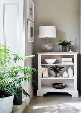
Nicky: “Yes, Eloise was one of the designs that got lots of smiles and positive murmurings when we showed it to all of our stores. But also the Olivia sofa bed again has to be up there. A sofa bed is one of those things that’s brilliantly useful, but you always have to compromise somewhere, be it the comfort or the look of it. But now, you don’t. I also think the little Chichester bookcase will get a good reception because it’s so easy to pop everywhere.”
Do any of the new designs have an interesting backstory?
Rebecca: “Our new Mabel fabric has an unusual making story.”
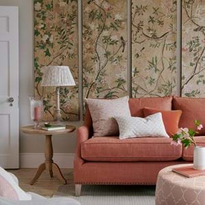
Amy: “It’s screen-printed with a light-reactive dye that draws out hidden depths in the colour rather than adding extra pigments. It’s not something we’ve done before and it’s quite a different approach to how printed fabrics are normally done.”
Henry: “There’s an antique backstory to the Theo armchair that’s worth sharing. [More nods of agreement.] We’d seen an antique version in London that inspired our own design, and disassembled it completely to see if there was anything we could learn. We wanted to replicate certain aspects in honour of the traditional design, such as the modest proportions which aren’t the stereotypical ergonomics you’d see in a contemporary piece. But we also improved and brought other aspects up to date.”
Nicky: “Our thinking was along the lines of making your own antique. How can you make it tell a new story? I imagine putting a new fabric on it and, in 150 years’ time, my own little armchair will be considered as an antique of my making. There’s something very lovely about how investment pieces of furniture are all about storytelling.”
If you each had to pick one piece from the new collection to bring into your home, what would it be and why?
Rebecca: “The Holborn dresser. It pushes me into a more contemporary space, but it still weeps of traditional craftsmanship, which I love. I’ll be spacing the shelving equally inside because then, with the black-bronze stiles, the glazed section reminds me of a lovely window pane.”
Henry: “The Olivia sofa bed. My wife and I are soon to move house and the basement has a space that we can use as a guest bedroom or sitting room with an adjoining bathroom. It’ll be perfect for down there, where they can use it as a sofa by day and somewhere to sleep at night.”
Nicky: “The Theo armchair, easily. I can’t decide whether to have it in Harry Flax Blue or Mabel – and that’s unusual for me as I’m not a print person. Or maybe I’ll have it in Chloe York Rose with a Mabel cushion. It’ll be going in the bedroom, away from the dog. I want it all to myself!”
Chris: “The colour – Flax Blue. I have to admit that when I first saw it, I wasn’t sure if it was a colour I’d use in my own home, but I really do love the partnership between it and natural oak. For me, timber is a colour as much as it is a material in a room, and I think Flax Blue lets oak be part of your home’s palette.”
Amy: “I’d have said the Theo too I think, but seeing as Nicky beat me to it, I’d choose the Maltby and Borough serving boards. The different sizes look really nice stacked upright on the kitchen work surface, so I’ll be doing that in my own kitchen in ash and marble.”
If you had to pick one product that sums up the season, what would it be?
Rebecca: “I’d have to say Mabel again. It’s all about newness, the bridge between what’s both classic and contemporary, freshness and spring rejuvenation and colour. It’s a delicious melding – or gathering – of lots of things that are true to our new collection.”
Nicky: “And I’d say Stanway, for similar reasons to Rebecca. It’s outdoors-y, which is what spring immediately says to me. It’s so gather-y, which is what spring is for us this year. And, of course, it’s beautifully, beautifully blue.”
Explore our spring collection here.
