A different perspective – an edited approach to colour Part III
A different perspective – an edited approach to colour Part III
A phrase that means a lot to us. A phrase that we think best sums up our ethos and our way of thinking. A phrase that we use as our compass, to guide everything we do.
We believe in a different perspective, from the way we design our products to the way we build our stores. Every few months, we’ll be writing a short article for our journal because we’d love to share our perspective with you. We hope it sheds a little more light on what makes us tick.
The latest in the series sees our creative director, Emma Sims-Hilditch, talk about our approach to edited, curated colour...
“When we first started to develop our in-house colour collection, we always knew it would be as carefully considered and timeless as everything else we do – they’re two fundamental elements of Neptune’s design DNA. I’ve worked in interior design for so many years and sometimes, I still feel overwhelmed with the choice of colour available to us. I realised though, that despite being faced with palettes of a few hundred shades or more, I would always veer towards the same few. With clients and friends, I learned they did the same. I questioned whether there was a genuine need for so many if we could truly capture timelessness and enough choice within our collection. So that’s precisely what we set out to do – to develop an edited approach to colour.
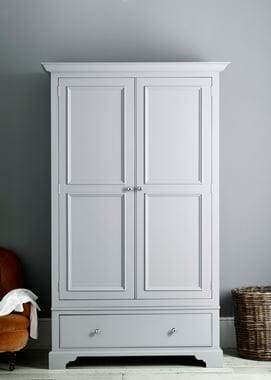
There were two main reasons why we decided to venture into paint. Our first furniture collection – Chichester – was in the process of being designed and we wanted to paint the tulipwood with one of our own colours rather than borrowing the tone from somebody else. And, while this was many years ago, our aim of creating a brand that makes for the whole home had long been born. Colour that could be used on furniture, walls and any part of a room’s architecture felt like a natural progression. We wanted to do the hard work for you though, to do the thinking, and to present a usable palette that works in traditional and contemporary settings.
Our very-first shade was called Limestone. We lived close to the Cotswolds and were inspired by the local vernacular of Cotswold stone’s warm, earthy tones. It had slight undertones of green, but was fundamentally a warm neutral. Honed Slate and Lead Light followed, two more colours inspired by nature and within the neutrals category, though with more depth than Limestone. I knew that I wanted us to focus more heavily on neutral colours, because people gravitate more often towards easy-going, tonal shades than bright primaries in their homes. That being said, we certainly wanted some ‘colour colour’ in our palette, and started to experiment with pigments, testing them in our family home first. Paprika and Aqua Blue were some of our earliest stronger shades. Aqua Blue was the Charcoal of today once upon a time.
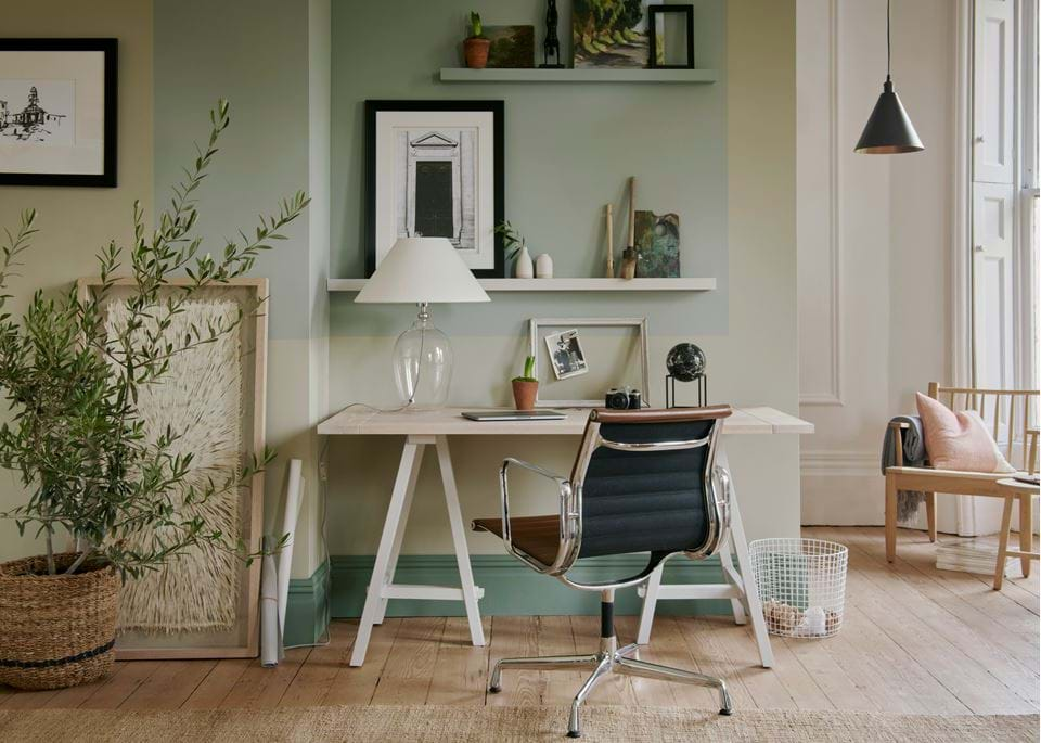
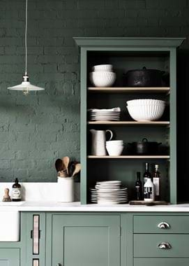
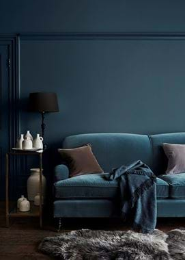
As our palette started to steadily take more shape, we were careful to remind ourselves of the rigour that we had promised to instill. It’s easy to get carried away when you’re surrounded by so many beautiful colours, be it in the changing light of the day, the landscapes close to home and on travels, spices that we cook with or vegetables that we grow. We agreed on a core palette of 28 shades. John (Sims-Hilditch, co-founder of Neptune) believes in the ‘rule of seven’ (also known as Miller’s Law) – essentially that the optimum number of things that we can process are in groups of seven. This helped to guide our colour collection, dividing it into seven palettes – Fossil, Nordic, Plant, Smoke, Spice, Timber and Earth. The four colours within each colour family all pair together perfectly, but we’ve developed them so that they’ll also work with shades from other palettes. Salt from our Spice palette, for example, is lovely with Mist and Smoke from the Smoke palette. Effortless, timeless, calm and cossetting were all words that I wanted every shade to be described as.
What we don’t want ‘edited choice’ to do though is limit new ideas. That’s why we have our seasonal shades and our paint archive. It gives us room to create new colours twice a year – we typically develop a signature shade for our spring/summer and autumn/winter collections – without disrupting our core palette as they move into our archive afterwards. This basically means that the colours live on, but somewhere quieter, away from our main collection, but ready to be mixed upon request. The archive also allowed us to develop an entirely new palette in spring 2016 – the Pebble family of soft greys. While we loved our Earth palette, and aren’t led by trends, we do have to take notice that colour choices have changed significantly over the last eight years or so. The colours were still beautiful, but there were new tones that felt more relevant, so we moved it into our colour archive to keep it safe. I like to think of it as a premium pair of jeans. You know they’re timeless, and that you’d never want to throw them out, but for a period of time, you may move them further back in your wardrobe, knowing though that one day, you’ll come back to them with a full heart. It took a long time to develop the Pebble palette. I had to be so sure that those four colours were unquestionably perfect, offering lightness and depth, promising contrast and coordination, soothing but also exciting the room that they’d be used in.
Our perspective when it comes to colour is that less is more. Brands whose sole focus is paint and colour, such as Little Greene and Sanderson, are so wonderful at what they do. Perhaps if we weren’t a whole home company we might do more, but editing down options so we can present our customers with a carefully curated collection that makes decisions easier and life a bit simpler is paramount to who we are. The difference between each of our colours isn’t miniscule.
They too have a clear perspective.”
Emma Sims-Hilditch is creative director at Neptune. She leads the artistic side of our designs and development, and is also the founder and creative director of the international interior design studio, Sims Hilditch.
