Jonathan and Rachel & their Limehouse kitchen
Jonathan and Rachel & their Limehouse kitchen
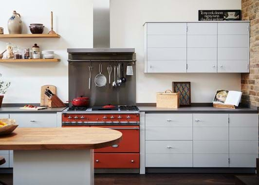
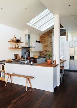
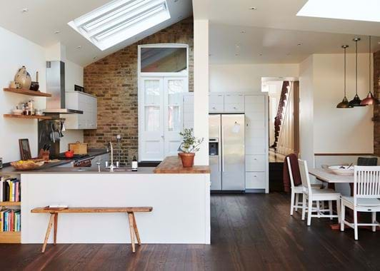
Our Limehouse kitchen is our most contemporary of all, and is often designed in a linear layout. But here, Jonathan, Rachel and their family bring it into a space with a return peninsula, as well as a burst of vibrant colour.
Home profile
Not too far away from London’s Ealing Broadway tube, lies the three-storey, 1880s-style semi-detached home of Jonathan, his wife, Rachel and their two children, Calum and Lilly. Both accountants (out of necessity rather than personality, Jonathan quips), this creative household have lived in the property for over a decade, and have recently set about renovating it to reflect their love for contemporary clean lines and playful relationship with colour.
The project
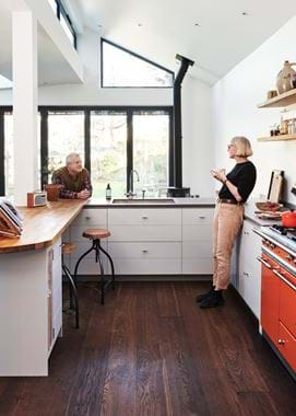
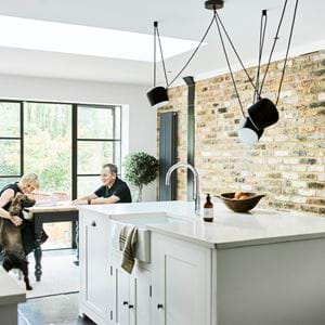
Jonathan and Rachel’s kitchen project began with a sizeable extension. They added height and depth to the property, with the kitchen area having an 11ft-high ceiling and five overhead windows that flood it with sunlight and moonbeams, as well as a length that stretches across the back of the building. Choosing to live in an open-plan way, they also fitted five glass sliding doors on the back wall so the one-acre garden becomes part of their living space. Inside, there’s a mixture of exposed London brick, stark white walls and dark Norwegian hardwood floorboards. It’s a crisp, sharp and abundantly bright kitchen that makes sense for a family that favours contemporary-style interiors.
When deciding how to fill their newly-created shell, Jonathan knew he wanted cabinets that mirrored the design direction that he’d taken the rest of the room in. “I was new to Neptune. A friend had a Neptune kitchen and urged us to go look. So, the four of us went to Neptune Chiswick and it was actually a very easy decision,” Jonathan told us. “We liked the offering and it was very helpful to be visually presented with a fully-designed kitchen in the store. We weren’t expecting to see something so thorough. We could see, quite easily, how everything would work in our home as soon as we came across Limehouse. Fundamentally, it was the simplicity of the lines that got us, and the breadth of cabinet styles. We knew when we left that we’d be able to fill what was a very large space at home in a very beautiful way.”
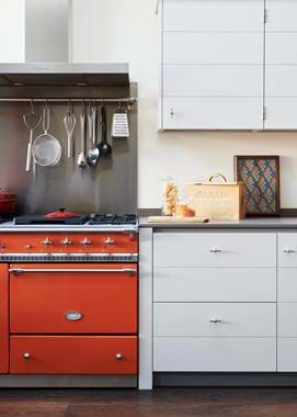
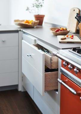
Their architect and build team in charge of the extension and remodelling of the downstairs worked closely with another of our Neptune stores, this time a partner store called Woods of London with whom they’d completed numerous kitchen projects before. But, like with any kitchen renovation, Jonathan and Rachel had a number of aspects that they wanted to include, which Woods of London’s designer, Alicia, incorporated into the kitchen design. Their wish list began with colour and hardware rather than cabinetry styles. “The Lily colour of the cabinets at Neptune Chiswick jumped out immediately. So we knew we wanted to keep that palette,” said Jonathan. “The simplicity of the Limehouse handles appealed to me as well. I felt they really added to the design and was sure I wanted to have those featured on the cabinets. The work surface in the store was a deep grey colour and had scratch-proof and heat-resistant qualities that we knew we’d find very useful, so we requested that as well as one area in timber too. And we wanted to have a French gas stove in tangerine orange.”
Lifestyle was a key factor in determining the design of this family kitchen. While the aesthetic was focused on understated details, simple lines and repeated shapes rather than lots of different ones, the layout and the choice of Limehouse cabinets had to suit the way in which they would use the space. “We enjoy cooking and being able to have conversations while doing so. We like having eight people sat down together and to be in a space where you can sit and look outdoors. Our Limehouse kitchen understands our lifestyle choices, and I like that even using our Neptune sink means an opportunity to see outside,” Jonathan continued.
The family’s preference for a contemporary kitchen design needed to take into account ample storage space that would allow them to keep the surfaces clutter-free. Jonathan didn’t want anything to distract from Limehouse’s smooth flow of perfectly-lined up channels in the cabinet fronts. “We have no temptation to fill the surfaces because we simply don’t need to. There’s room to keep virtually everything away. The pan drawers are a godsend because we have all of our knives and cutlery in the hidden inner drawer and all the big stuff in the spaces below. It’s all there and there’s no need to go hunting for things. We only keep things out when we’re using them, if they’re something we want to see or need to see. Like Tommy, our elderly, nine-year-old guinea pig whose cage is out on the side.”
Before we left, we asked how they found the whole kitchen experience with us. “It was simple. That captures everything. The design is beautifully simple, as was the process and as is the way it feels to use it every day. Our kitchen is the anchor of our house. This is where we always choose to hang out.”
Life in their new kitchen
What’s your favourite thing to do in your new kitchen?
“Just having the two children and my wife all in here together. No-one’s on top of one another. We can each get on with our independent activities but be together at the same time. And I love to cook and serve for big groups in here.”
What’s your favourite part?
“The lines. The ones across, the ones down the side. I find their meticulous nature very soothing.”
What could you now not live without?
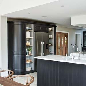
“The cabinetry around the refrigerator is a colossal help with its storage space. It lets all of the mess melt away because every item has a place of belonging.”
What’s next?
“In this space, nothing. It’s perfect. In terms of the rest of the house, we’re onto one of the bedrooms and bathrooms next, as and when we’re ready to.”
