The secret of symmetry
The secret of symmetry
Symmetry is known to have a calming effect on our mood and on a room’s atmosphere. In psychology, it’s proven that most people will deem a human face more attractive if their features are perfectly mirrored on each side. Even in the worlds of animals and fine art, symmetry’s aesthetic appreciation is always at play. There’s an innate sense of balance and order in symmetry that makes us feel happy and at ease.
But symmetry isn’t so simple. No surprise there – the human mind is a fickle thing. Perfect symmetry might satisfy one part of your mind – the bit that loves stability and predictability – but that’s likely to be jostling with the other part of your mind that’s saying – wait, nothing is ever that spot-on. You might’ve read this article by Giles Kime (interiors editor at Country Life) in our first-ever volume of Stories, where he interviewed our founder John Sims-Hilditch on his views. As John says, symmetry needs to be broken.
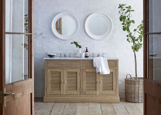
And that brings us onto this image. It’s been one of our most-liked images on Instagram so far this season. The first comment we got was about how calming it is. Yes, the setting, the light, the ceiling height, and those beautiful timber and glass doors open wide have something to do with it. Yes, the pale colours of the shiplap ceiling and textured plaster wall help as well. But, without doubt, symmetry is up to something too. The mirror-image of louvered oak cabinet and drawer on each side, the double sink, the double taps, and the repetition of two soothing circles, side by side, thanks to the Buckingham mirror. They’re the parts that encourage a deep, yoga-like sigh.
Without getting too many fingerprints on your screen, try to cover up the tree extending out of our Somerton log basket with the length of your right hand, then use your thumb to mask the towel draped by the sink. Then ask yourself if it still feels as calming and appealing? It doesn’t for us. They might be adding extra texture to the room, but more importantly, they’re the key bits of asymmetry in this scene. Without them, it feels artificial, staged, and even boring…
Symmetry – it’s at it’s best when it isn’t quite so… symmetrical.
