Dean Keyworth & his Limehouse kitchen
Dean Keyworth & his Limehouse kitchen
No two Neptune kitchens are ever quite the same; each customer and each home has its own personality and so it’s always exciting to see how our kitchen designers can reflect that. When we heard that our Limehouse kitchen was heading to the incredible West London home of interior designer Dean Keyworth to create a colourful galley kitchen, we couldn’t wait to hear more and see the end result…
Home profile
This is the sort of home that reminds us of the ‘whoops-a-daisies’ scene in Notting Hill – the private gardens that belong to the surrounding Victorian terraced properties with white stone or pale brick facades and gleaming black front doors. The home of Dean Keyworth – who is also the former president of the British Institute of Interior Design – is a listed, Victorian building in London’s South Kensington. A garden apartment, he lives there with his husband, Gavin; daughter, Georgia; and Freddie the Cavapoo.
The project
Dean got the keys to his London flat two years ago. Before moving in though, he set about a total refurbishment project, putting his stamp on the interior’s every nook and cranny. Being an interior designer, you might think designing a kitchen would be a breeze, but Dean decided to work up the floor plan and pass it onto his kitchen designers to develop into his dream kitchen. ‘I knew how I wanted it to look and how I wanted it to act as a working kitchen, but Neptune and Sims Hilditch know their cabinetry better than anybody, so I wanted to leave that element to the experts,’ he explained.
Dean enlisted the help of interior design studio Sims Hilditch, choosing the Limehouse collection for his small London kitchen. ‘Deciding on Limehouse was easy. I knew I wanted a Neptune kitchen, and I knew I wanted something that had undertones of tradition and craft, but with a very modern aesthetic that reflected the century. Our apartment building is a period property, but as it was the last to be built in the square, the architects went to town and a touch “off-piste”. It has something of a French chateau vibe to it – quite the contrast. There’s an element of the unexpected to the building so I wanted to continue this throughout my interior,’ he continued. ‘I love the use of natural timber and the traditional making methods and carpentry in Neptune’s kitchens. Limehouse feels like a crafted kitchen but it has such a sleek aesthetic. The end posts are a classic touch and nod to freestanding kitchens, but they’re very architectural too. It’s a great combination and one that fitted my brief to perfection.’
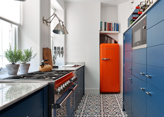
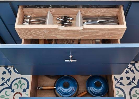
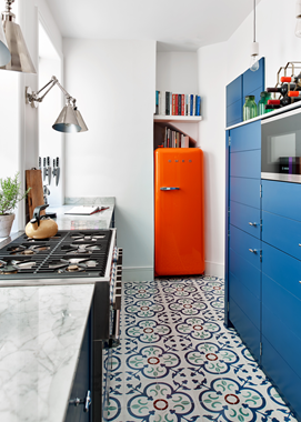
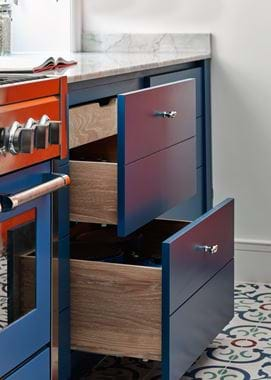
The idea of doing something unexpected can be seen in more ways than one in Dean’s Limehouse kitchen. As it’s a listed building, he wasn’t able to knock down walls and reconfigure the space. His narrow, galley-style layout stayed as it was, and Dean and Sims Hilditch decided to have some real fun with it. First, the cabinetry. Because of the room’s dimensions, a number of the cabinets were used in a more unusual way. ‘My kitchen is thin, so there wasn’t the space to have two runs of base cabinetry. Instead, my Limehouse is adapted to have on the right-hand side a shallow larder-style setup with a microwave housing. They’re actually six wall cabinets on a plinth with Neptune’s adjustable oak shelves inside. Opposite, I have a mixture of “standard” Limehouse cabinetry – like the sink base which is one of my favourite parts, and the drawer base with the pullout cutlery drawer and those gorgeous quartz dividers. I also have a washer/dryer-style cabinet, because I loved the Chichester laundry collection, made using standard Limehouse cabinetry. It’s just so versatile.’
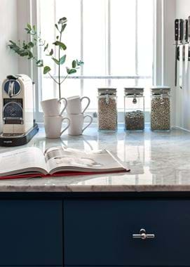
When it came to the work surface, Dean chose polished Cararra marble. ‘We took the marble all the way back to the window reveal to give maximum surface area – it’s great for plating up,’ Dean said. He chose to have his larder section topped with marble too so that he could use the top of his cabinets for attractive storage space – he uses it for wine and dog biscuits. ‘We have marble flooring and pillars in the hallway so I wanted to bring the marble through to the kitchen for continuity. The larder top was templated in the same way Neptune precision makes all of their worktops. The way it follows the shape of the end post too is such a small detail but one that I really notice and appreciate.’
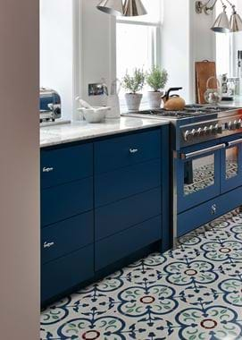
The colour palette is one of the most unexpected parts of the whole kitchen, and is what hits you when you first walk in. ‘I could’ve played with lighter tones to find one that might make the room feel bigger, but in the end, I thought adding a sense of drama would be a better use of colour,’ he told us. The colour palette is a bold one – Dean chose to use our bespoke paint finish service, choosing bright but balanced Blakeney Blue on the cabinetry. To that, he added hand-poured concrete tiles from Turkey, a statement tap from The 1810 Company (‘The electric blue hose section is rubber and can be swapped to a different colour when you fancy a change. I just love the burst of colour,’ he continued), a STEEL Cucine cooker (‘An Aga was too deep so I chose this range design. There’s a lovely choice of colours so I was able to find one that was very close to my Neptune paint. Even better, there was a collaboration with Le Creuset at the time so I was given a casserole pot in the same colour as well!’), and a brave SMEG fridge in bright orange. ‘I had wanted a much bigger fridge-freezer, but there’s a lowered section in the ceiling that got in the way. I asked my neighbours if it could be part of their stair support, but they thought not, so we started to remove it, and found ourselves in their fireplace! It meant I had to have a much smaller fridge and once again, I thought, let’s just have some fun with it.’
Dean’s kitchen is far from ordinary. It brings together age-old and avant-garde, less-is-more and bold-as-you-like, and it shows how to find a way around the troublesome. ‘Neptune and Sims Hilditch just made it work. I knew this would be a stretch and that it was a less than usual project, but they approached it with charm and ingenuity,’ he told us.
The underlying brief in Dean’s whole kitchen? If something gets in the way, or feels a bit restrictive, spin it into a positive and make it a proud feature.
Life in his new kitchen
What’s your favourite thing to do in your new kitchen?
‘To make roast lunch. It might look small, but I have so much room compared to what I’ve had before in London kitchens. I can easily make and plate up for six and not get stressed.’
What’s your favourite part?
‘The sink cupboard. It’s lined with stainless steel so I can store sponges in there rather than having them on the surface. I keep dusters and recycling bags in there too. It genuinely makes me happy every day.’
What could you now not live without?
‘Apart from the work surface space and my sink cabinet, my electric blinds. They’re not part of the cabinetry, but they’re a huge part of my kitchen’s ambience. I press one button and it all goes dark. My budget ran out so I couldn’t do it in the living room and I hate having to roll the blinds in there!’
What’s next?
‘Onto the next property! This flat is done now – I love it – but I inherited a property that I’m in the process of selling. I want to use that to then buy a former church in Northumberland for us to have as a holiday home. Fingers crossed!’
Discover all the kitchens in our collection online here.
