How to decorate with pink
How to decorate with pink
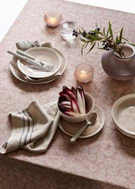
Pink is a colour that often divides opinion, probably because it’s become culturally the most gendered. Happily, that’s less and less the case these days, which is lucky for our interiors because pink is one of the most flattering shades you can adorn your walls with. Literally – gentle, warm pinks are some of the most universally flattering shades on all complexions. Between our two pink paint shades – Pink Peppercorn and Old Rose – and our rosy-hued fabrics (from pale Imogen Oyster Pink to our velvet Isla Old Rose) you’ll find plenty of opportunity to embrace a rose-tinted outlook with our collection. Here’s how you might go about it.
On walls
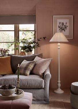
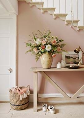
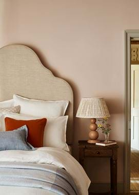
Old Rose is a shade that’s full of softness. If you use it on a wall, it won’t come across as sugary or sweet, but quiet and composed, which is thanks to the touch of grey in it. Pink Peppercorn is fresher and cleaner – a purer pink – although it’s still far from saccharine. In fact, neither shade painted wall to wall will likely cause you to walk in and think ‘pink room’, Old Rose because it’s so muted and Pink Peppercorn because it’s so pale. Think of them instead as warm neutrals.
As for where you might paint pink wall to wall? Because this is a colour that’s all about flattering, cossetting warmth, we’d suggest those spaces made for relaxation and low light – bathrooms, bedrooms and living rooms. We’re also partial to pink in a hallway though, where it would make for a very soothing welcome home.
On painted furniture
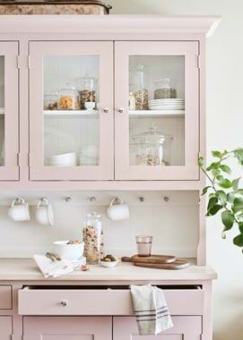
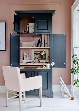
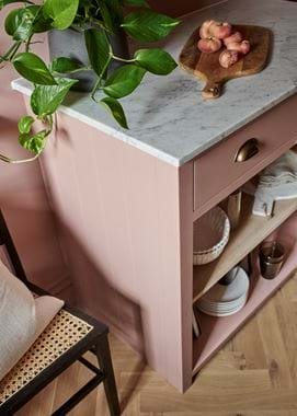
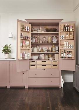
If painting the walls feels like too much scale for adding in pink, then furniture is another route you can take. Dining chairs painted in Old Rose mixed with ones in natural oak work together wonderfully. Or, choose even larger scale pieces, like a dresser in a dining room or larder in a kitchen. Both our pinks pair nicely with the likes of oak and marble work surfaces, as well as both chrome and brass hardware.
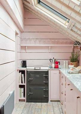
And speaking of kitchens, why not paint all your cabinetry in a shade of pink? Bear with us, we know it seems daring, but picture the calming, biophilic qualities of pink cabinetry, oak flooring, marble worktops, brass handles and green plants (or just take a look at the kitchens photographed here). And if it still feels like too much, you could use this colour scheme in an adjoining utility space instead, carrying just touches of pink through to the main kitchen. Pink is guaranteed to put some of the joy back into laundry.
With textiles
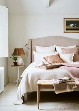
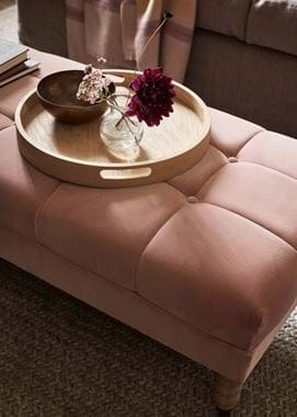
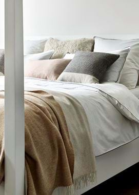
Don’t forget that paint isn’t the only way you can bring pink in with furniture. Upholstery definitely has a place too, and it can be a subtler option. Our Isla Old Rose fabric, as a velvet, isn’t a flat colour and will alter over the course of the day as it picks up on the light in a room. Imogen Oyster Pink is so pale it barely registers as pink. While patterned Francesca Old Rose is probably the most understated way to introduce pink with fabric, and is particularly suited to headboards.
Pink can also work just as well as an accent as it can the main event. And if you’re wary of too much pink, this is a good way to dip your toes. For the particularly wary, might we suggest choosing pinks that err on the side of peach?
Pink palettes
When it comes to the colours you might use alongside one of our pinks, there are a few directions you could head in – and our suggestions below are far from your only possibilities.
If it’s a neutral you’re looking for, we’d opt for Salt which is the white in our collection designed to complement the ‘Spice’ palette to which our warmest colours (including Pink Peppercorn) belong. Another option would be to go for a slightly darker neutral like Dove Grey, which looks particularly lovely with Old Rose because they both share the same earthy character.
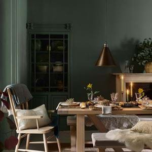
At the other end of the scale are dark greys and blues – Shale, Smoke, Charcoal and Ink – which will lend pink a more modern, more dramatic feel. Try these on woodwork such as skirting, doors and window frames alongside pink on the walls.
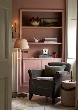
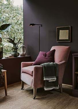
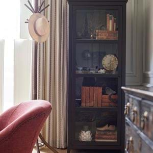
Similarly, we love the look of pink and purple together. That might sound like a recipe for a little girl’s bedroom, but not so when you choose shades that have complexity and depth to them. Our paint colour Clove, which is a purple-tinted brown, fits the bill. The living room corner shot where we’ve combined it with an Isla Old Rose armchair is case in point. With the addition of plenty of greenery, natural textures and modern black-bronze accents, it’s anything but juvenile.
