Behind the design: the Henley industrial kitchen
Behind the design: the Henley industrial kitchen
Our Henley kitchen is loved for its use of oak, inside and out. Words like stately, traditional, and even regal are often used to describe it. But at our autumn/winter preview event in 2016, it did something rather unexpected. So, we interviewed Fred Horlock, the designer behind Henley’s modern-industrial makeover, to find out what inspired the look, discover all the details, and fuel your imagination.
Fred. In brief.
Fred. Heads up our team of retail designers (the people who transform often derelict buildings into our beautiful stores). He’s been at Neptune for four years, and previously has worked at a number of design consultancies. He even designed the bar at the Royal Opera House.
On design. Bauhaus is his favourite design movement. One day he hopes to have a home large enough to fit many-a trendy chair.
On home. Is married to Annie who works for the National Trust. They live in Cirencester with their baby girl, Isabella.
The interview
We opened by asking about his inspiration for Henley.
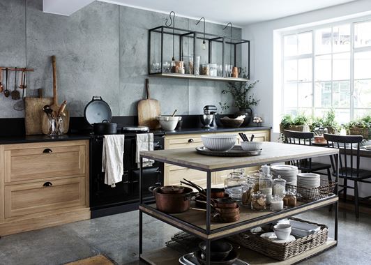
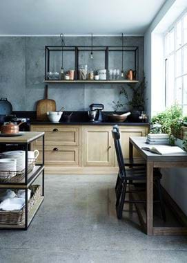
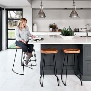
“We wanted to turn Henley upside down. We did that quite literally in some parts where we upturned consoles and re-imagined coffee tables from our Carter collection to create new elements of furniture within the Henley like a kitchen island and wall cabinets.
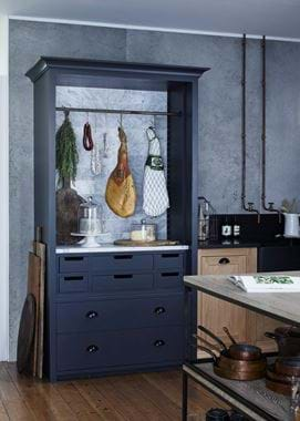
Industrial with a contemporary spin was what we were trying to achieve. Think barn conversion meets industrial loft, all designed around a person who really enjoys their kitchen and appreciates good food, hence why we took the doors off the larder so it became a showcase for delicious ingredients. We also backed the larder with marble so it became a more usable space, like a fancy meat curing area as we did for our press event. It’s very much a cook’s kitchen.”
Fred explained how this kitchen isn’t all about looks. The design actually pivots around practicality.
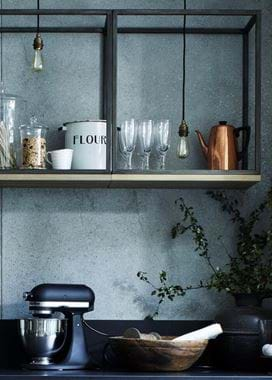
“We wanted to create the most practical wall cabinets we could. Ones that can be accessed really easily. So we used the small Carter consoles and turned them into cabinets-come-shelves. The island was a little bit accidental. At first we were thinking more along the lines of country kitchen table on which you can prepare food. It was actually Jess’s idea [one of the ever-so-stylish designers in Fred’s team] to take the Carter coffee tables and stack them to make an open-aired kitchen island. It’s all about clever functionality that has the added benefit of looking pretty funky too.” The wall cabinets and island are now both available as specially-designed pieces within the Carter collection.
Next, we talked work surfaces.
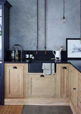
“The Carter had become an integral part to the industrial Henley and so it made sense to emphasise the Crittall-style black lines for design continuity. That’s why we opted for black granite for the worktop. It’s much denser than many natural stones, marble for example, so it’s massively functional. And again, because we had real foodies in mind when designing this kitchen, granite was perfect because it stays cool, which is ideal when rolling out pastry and dough. The finish is honed which requires less maintenance than polished. It’s as close to matte as you can get with a natural stone, but not completely flat in tone. Honed feels a little more artisanal too.”
The concrete back wall has attracted a lot of attention. How would we go about recreating that?
“Concrete adds even more industrial edge to a scheme. We actually used it in our Wimbledon store too. If you’re fortunate to have existing concrete in your home, be it under the floor or behind plasterboard walls, make the most of it by having it polished. Otherwise, we suggest going for a specialist concrete render which is much more practical in the everyday home. It’s a bit like plastering and ends up being about 3–4mm thick so it doesn’t add too much weight to the wall. We use a three-layer render. It’s best to get experts in to do this for you so you get a high-end finish.”
While we were on the subject of the black work surface, we brought up the statement black sink.
“A sink made from the same, or similar, material as the work surface looks really smart. Plus, black offsets copper really well. We used a traditional Belfast so there’s still a touch of rural country, and modernised it by spraying it matte black. At home we’d recommend you buy one in a black finish rather than taking the DIY approach.”
And the copper pipes?
“Copper pipes are pretty easy to sort out. They lend a room a sort of ‘no nonsense’ demeanour. It’s all about the raw and the rustic. You can expose existing pipes or use new ones, whatever your builder advises. Take a look at Pinterest to get even more ideas.”
We ended by talking about lighting.
“Edison-style filament bulbs are also really easy to source and they look really smart in any room. They work particularly well with industrial design though. We paired them with an antiqued brass fitting and a braided black cable to suspend them at the height we wanted. It feels quite back to basics in a sense. Concrete, black granite, aged metallics, raw timber, who knew the Henley had the ability to look so...rugged?”
