Jameson & his Henley kitchen
Jameson & his Henley kitchen
Using one of our darkest paint colours, Ink, as a focal point for his Henley kitchen, Jameson has created a confident space that’s at once deeply impactful and light and bright.
Home profile
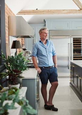
Jameson bought his Georgian detached home in a picturesque village in the Essex countryside eight years ago. He’s since set about a complete top-to-bottom (or in his case, bottom-to-top) renovation, comprising both cosmetic and structural changes. As part of the project, a single-storey extension has been created to join the back of the house to a large square barn in the courtyard behind. The function of the newly created open-plan layout? To house a generous and convivial kitchen space.
The project
Jameson was already familiar with Neptune when he moved into his new home. Faced with a ‘shoebox-sized pine kitchen with tiled work surfaces’, he sought the guidance of Neptune Colchester’s design team to help create the kitchen he truly wanted for the renovated space. ‘As the new area is essentially a large rectangle, it was a really straightforward design process,’ Jameson explains.
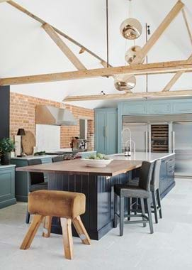
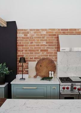
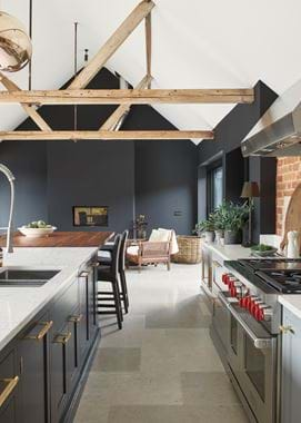
He decided on a Henley kitchen, painted in two complementary shades: deep, dark Ink and smoky, steel grey Fog. A mix of exposed brick and a warm black hue on the walls are offset by a white vaulted ceiling and original wood beams. The outcome is both cosseting and airy. And at night, Jameson says, ‘with the fire lit, the colours really come into their own’.
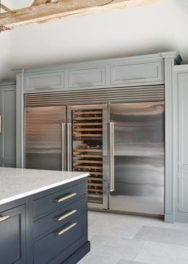
Working with the bespoke team, a custom surround has been crafted to house Jameson’s carefully chosen Sub Zero fridge, along with two tall cabinets designed to flank the fridge on either side. ‘The fridge was on my list for the kitchen from the off. And the tall cupboards are so useful: one functions as a drinks cabinet and the other’s for storing all the crockery and glassware,’ he adds.
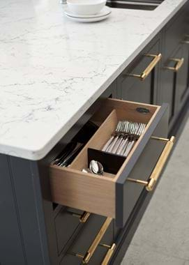
Other than the generous space itself, and the statement fridge and its surround, a large multipurpose island was a design prerequisite. Not only does its presence ensure the room doesn’t feel too large or empty, but it's created an area for eating and entertaining, and a wealth of storage. ‘I opted to use two contrasting materials for the island’s surface – quartz for the food preparation area, and a walnut timber for the breakfast bar. It’s the same timber used around the pool outside, so it creates a really nice flow between the indoors and out,’ Jameson concludes.
Life in his new kitchen
What’s your favourite thing to do in your new kitchen?
'I love to unwind and entertain in the space – I created the seating area positioned between the two sets of patio doors before the kitchen was even designed and fitted!'
What could you now not live without?
'The wonderful sense of space that’s been gained by joining the main house with the barn. And the flow that’s been created between the kitchen and the outside areas by incorporating lots of glass, and some of the same materials.'
What’s next?
'The upstairs rooms are still a work in progress, though the changes are largely cosmetic rather than structural.'
If you’re ready to embark on a kitchen renovation (or revamp) project of your own, you can find out more about our Kitchen Design Service and book your first, free design consultation here.
