Nigel & his Suffolk kitchen
Nigel & his Suffolk kitchen
Designer Nigel, an experienced renovator, set about revamping his London pied-à-terre ready to sell or rent out. Having used Neptune kitchens for past projects, Nigel’s familiarity with the collections meant he was confident enough to hand pick his cabinetry from our outlet store in Wiltshire.
Home profile
Australian-born Nigel bought his one-bedroom flat in central London over twenty years ago, sold primarily on its location. Situated on the fourth floor of a prestigious Victorian mansion block which was once home to George Orwell, the flat is flooded with natural light and has ‘Mary Poppins’ views across the red-tiled roofs and chimneys of Notting Hill and Kensington.
The project
For Nigel, the biggest challenge for this renovation was always going to be the flat’s size. Rather than reconfigure the floorplan to create a second bedroom and introduce an open-plan kitchen into the sitting room, Nigel opted to retain a separate eat-in kitchen. ‘The kitchen is actually large in proportion to the overall space,’ he explains. ‘I wanted it to feel like a proper cook’s kitchen – a real luxury in a London pied-à-terre – so I kept the original floorplan and installed a full-size fridge and range stove.’
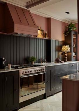
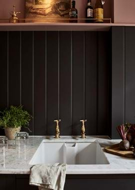
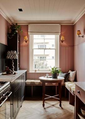
When it came to the design, Nigel chose the Suffolk collection in order to blend with the classic proportions and finishes of the historic building. ‘I kept the space pared-back, authentic to its origins, but with a few Victorian embellishments like plaster coving and panelling,’ he says. The single run of cabinetry has been painted in Zoffany’s Bone Black (‘a gorgeous off-black with a red-pink base’) and the walls and tongue-and-groove panelling in Zoffany’s warm Tuscan Pink.
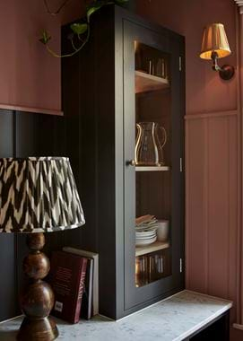
To retain a sense of openness, Nigel only installed one tall wall cabinet, tucking it into the corner by the window where it wouldn’t block any light. At the top of the panelling, a narrow shelf provides further storage, fitted with a pretty, slim brass rail sourced from a commercial display company.
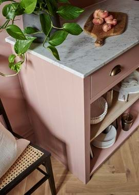
On the empty, opposite wall, Nigel was keen to create more storage, but was nervous about the galley kitchen feeling cramped. A solution came during a trip to the outlet store, where he spotted a Suffolk floor cabinet without doors. ‘I combined it with a plate rack above to create a bespoke dresser,’ says Nigel. ‘It turned out really well. A standard dresser would’ve felt too bulky and heavy, but by painting the cabinets the same colour as the walls and panelling, it feels light and open but gives some very useful extra storage.’
Nigel also knew that good lighting could make or break the feeling of space in the narrow kitchen. He installed smart recessed halogens in the ceiling but also introduced pretty, brass wall lights from Pooky, meanwhile ensuring the glazed wall cabinet had backlighting in it. Finally, he built an L-shaped seating area under the original sash window, big enough to host a cosy dinner party for six. ‘It’s turned the flat from a bit of a crash pad into a lovely entertaining space,’ adds Nigel.
Life in his new kitchen
What’s your favourite part of the space?
The narrow cabinet which holds the chopping blocks and wooden trays. They’re so easy to access which is very helpful when trying to protect the Carrara marble worktop.
What was your best design decision?
I created an extra deep worktop by pulling out all the cabinets and having a 700mm deep marble work surface. It feels expansive and luxurious and makes prepping and cooking much easier.
You’ve since sold the flat?
Yes, and I really hope the new owners are enjoying cooking and hosting in a kitchen that looks lovely but also works hard.
If you’re thinking about fitting a new kitchen, our kitchen inspiration book and stores are a great place to start.
