Ways with blue: singing the praises of blue in interiors
Ways with blue: singing the praises of blue in interiors
Blue is, supposedly, the world’s favourite colour. Time and again in opinion polls, it emerges as our most popular shade. Which is no surprise really. Blue is the eternally optimistic hue of clear skies and of peaceful bodies of water, while navy is as timeless and reliable as a Breton shirt. In interiors, blue can create a room that’s calming and soothing or fresh and invigorating (or both within one day). Here’s how you might go about harnessing its possibilities at home – including how to avoid straying into the cold and clinical territory.
An ‘all blue’ scheme
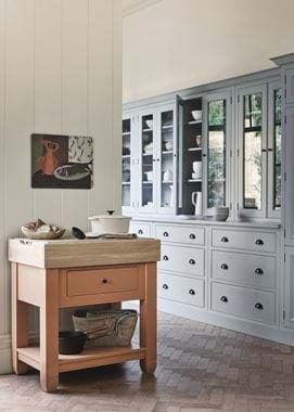
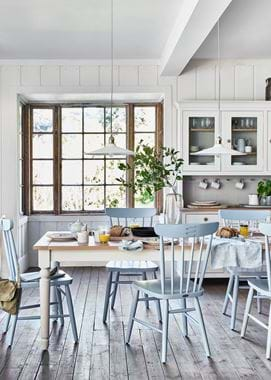
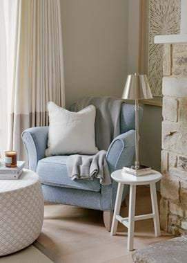
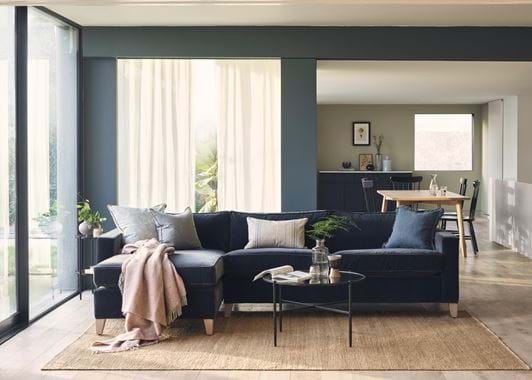
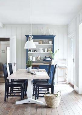
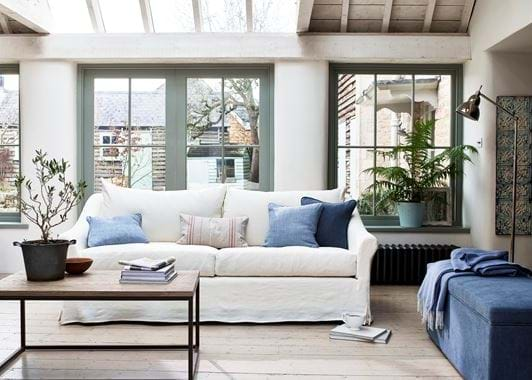
Decorating your room in a monochromatic scheme, be it blue or any other colour, sounds like a potentially bold move, but that needn’t be the case. And especially not with blue – a hue so classic it’s practically a neutral. In fact, layering shades, tints and tones of just one colour can create a distinctly calming space.
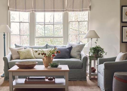
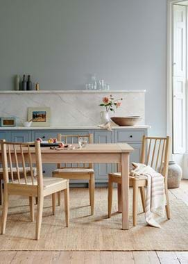
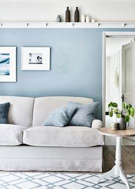
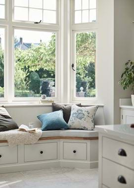
The trick, of course, is that the room won’t actually be all in one colour. Neutrals are bound to play a part, whether it’s off-white walls or the honey tones of oak flooring. Many of the rooms pictured feature no other ‘colourful colour’ than blue, and yet each is entirely liveable. That’s because these ‘non-colours’ – which don’t compete with the blue, and ensure it’s definitely still a blue room – provide the visual difference needed to make the scheme comfortable not overwhelming.
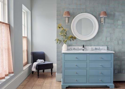
The other trick is to vary the depth of the blues. Some dark, some mid-tones, and some light (even if it’s just a couple of dark blue cushions in a predominantly light scheme) will head off any concerns about the room being one-dimensional.
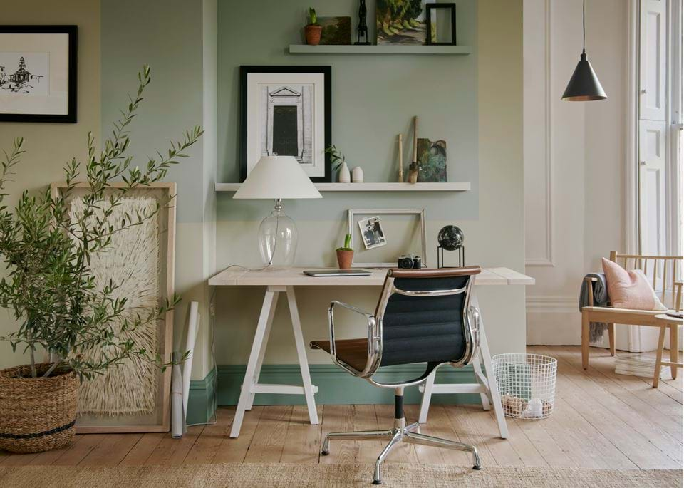
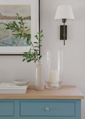
Remember also that there are variations on blue: green-blues (such as those in our Nordic paint palette, our Harry and Chloe fabrics in Mineral, and any of the textiles in Teal); grey-blues (try the Smoke palette and our Isla Steel, Samuel Dove and Linara Smoke fabrics); and true blues (think Navy, Blakeney Blue and Ink paint, Chloe Denim, Isla Swallow and Harris Tweed Bilberry fabrics, and Flax Blue in both paint and textiles). You don’t have to mix these, but a combination of a couple will, again, help to create interest.
A little less blue (aka, how to avoid cold and clinical)
While an all-blue palette in a south-facing room will feel fresh, try it in a north-facing space (and, indeed, east and west-facing rooms, and any without much natural light) and fresh turns to frigid. But, you can still benefit from blue’s soothing influence here, you’ll just need a lot less of it.
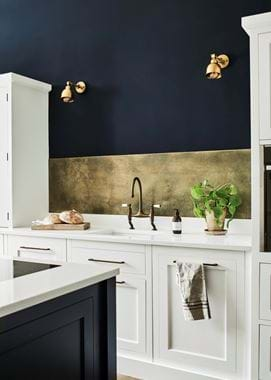
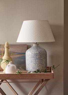
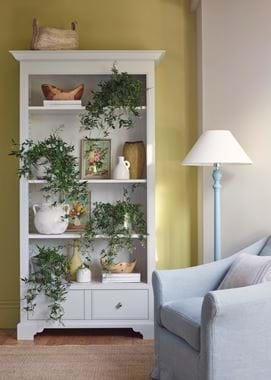
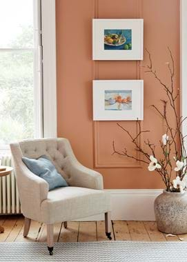
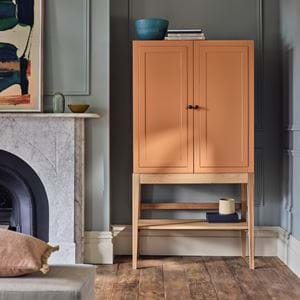
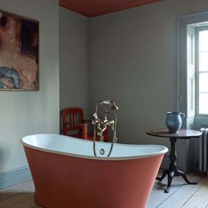
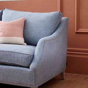
Blue is an excellent partner for all the warm colours on the spectrum (opposite sides of the colour wheel definitely do attract). A small amount added to oranges, yellows, reds, and pinks will enliven and uplift, making your palette a more dynamic one. It’s a little like serving cool yoghurt alongside a spicy dish. Include a handful of pieces in blue – cushions, our Chedworth rug, a Helmshore throw, and the Olney Flax Blue lamp – so it’s a cohesive part of the palette.
For more blue room inspiration, head on over to the ‘your stories’ section of our journal, where you’ll find ideas from our customers and their homes, including Wendy and her Suffolk kitchen, Jo and her living space, and Sarah and her Henley kitchen.
