Spotlight on our Barbury tiles
Spotlight on our Barbury tiles
Like everything we make, our tile collection is a small and edited affair. Why? There’s so much choice out there that it can become quite overwhelming. Especially if you’re tackling a big renovation project. We wanted our collection to be somewhere you could come where you’d know that each option was a timeless one, and where you’d have enough choice so you wouldn’t feel limited, but not so much that choosing became a chore. So needless to say, we thought long and hard about adding a new family of designs to our tile selection. We did feel that there was a gap to be filled though – a bit more colour, a touch more texture, and a different shape – alongside our existing Elcot and Kennet designs. Here’s how Barbury slotted into that spot – and how you might go about using it in your home.
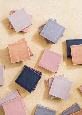
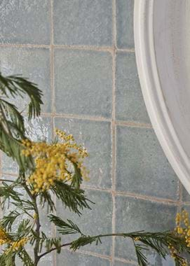
Barbury is all about texture, first and foremost. It’s our second design made in collaboration with Wiltshire-based Marlborough Tiles (read more about them on our journal here), the first being Elcot. But while the Elcot tiles have a subtle amount of texture and shape variation, they’re shaped by a machine which, naturally, produces more uniformity, whereas Barbury, with its distinctly undulating surfaces, is hand-pressed into moulds. On the wall, the tiles won’t sit perfectly flush with each other (rather like the popular Moroccan ‘zellige’ tiles), and you’ll even notice that some will have small chips on corners and edges. These are all part of Barbury’s look though, and together with the glaze, give the tiles the feeling of being much older than they actually are – particularly perfect for older homes needing sympathetic modernisation.
And speaking of the glaze, that’s Barbury’s other defining feature. Marlborough Tiles are justly famed for their glazing prowess – they’ve been honing it since the 1930s, after all. Barbury’s is a three-step process: first, an engobe glaze, which is like the tile’s undergarments, and helps protect it against moisture and staining; then the coloured glazes, which Marlborough Tiles meticulously mix by hand using raw powdered pigments, and which are traditionally ground by porcelain stones in a ball mill; and finally the transparent crackle glaze, to add to those layers of all-important texture. The crackles are formed when the glaze cools at a slower rate than the body of the tile, and is a technique all about delicate balance because, if the cracks are too large, the tile can be unsafe to use. The crackle continues to form (or ‘craze’, as the process is known) for some time after the tiles are fired, which is why Marlborough Tiles often get messages from customers saying that their tiles are ‘singing’ – you might notice a gentle pinging noise initially, but this is completely harmless. One last thing to note about the glaze on Barbury is that, if left unprotected, the grout colour and other substances can get into the crackle lines and discolour them, which is why we’ve also included a sealant alongside this collection.
Then there are the colours. While Elcot comes in a versatile tonal palette of whites and soft greys – as does natural marble Kennet – we knew we wanted to incorporate some more pigmented hues into the Barbury collection. Over the years since we first dipped our toes in tiles, we’ve added a number of bolder, brighter shades to our paint library through our seasonal colours, while decorating in general has become more confident with colour, and we wanted to reflect this. Of Barbury’s five shades, four are drawn straight from our archive of seasonal hues – Flax Blue, Blakeney Blue, Old Rose and Saffron – with core colour Shingle as a more muted foil. Marlborough Tiles spent hours in their lab perfecting the colours so they’re as close a match to their corresponding paint as possible, although the way the glaze pools in the tiles’ undulating surfaces means there’s still a degree of organic variation in tone, a little like watercolour paint. Altogether, the palette is quite a coastal one, but without being quintessentially so. Instead, it’s more about evoking the natural colours of a seaside setting, from the water and shoreline to dramatic skyscapes.
So, how can you use Barbury in your home?
We asked our stylist Meaghan to share her favourite looks.
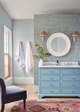
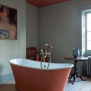
Tonal bathroom: ‘A bathroom’s all about relaxing, so a tone on tone palette is perfect, and Barbury is ideal for that because it coordinates so well with our paints. In ours, we’ve used Barbury in Flax Blue behind the washstand, which is painted in Aqua Blue, and Alpine on the walls.’
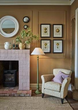
Fireplace surround: ‘It’s a slightly more unusual look, but if you’re in need of a fireplace surround that’s quite a statement, try covering a (fireproof) frame in tiles. Barbury’s square shape makes it really easy to arrange in this way, and has a bold simplicity. We’ve gone for Old Rose on ours which adds just the right amount of prettiness to the Mustard walls. And don’t worry about the tiles getting hot – they were fired at much hotter temperatures than your log burner will get to!’
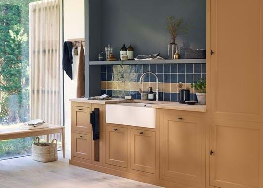
Mix and match: ‘Combining multiple tile colours in one spot is definitely a style that’s back, and we’re definitely all for it. Doing so is a way to add personality, depth and interest without using patterned or decorated tiles if you feel these are too busy for your room. One way we did this is to combine the Blakeney Blue Barbury with a single stripe of the Saffron ones in a utility room, which is simple but a little fun too. Or, you could try Shingle and Flax Blue together in an alternating grid for a subtler take.’
See more of Barbury and all our wall coverings online here.
