Renovation rumours: dispelling the design myths
Renovation rumours: dispelling the design myths
Decorating myths put to bed and a handful of home truths confirmed, interiors expert and former Livingetc editor Suzanne Imre reveals what to believe when it comes to interior design.
Myth: ceilings must be white
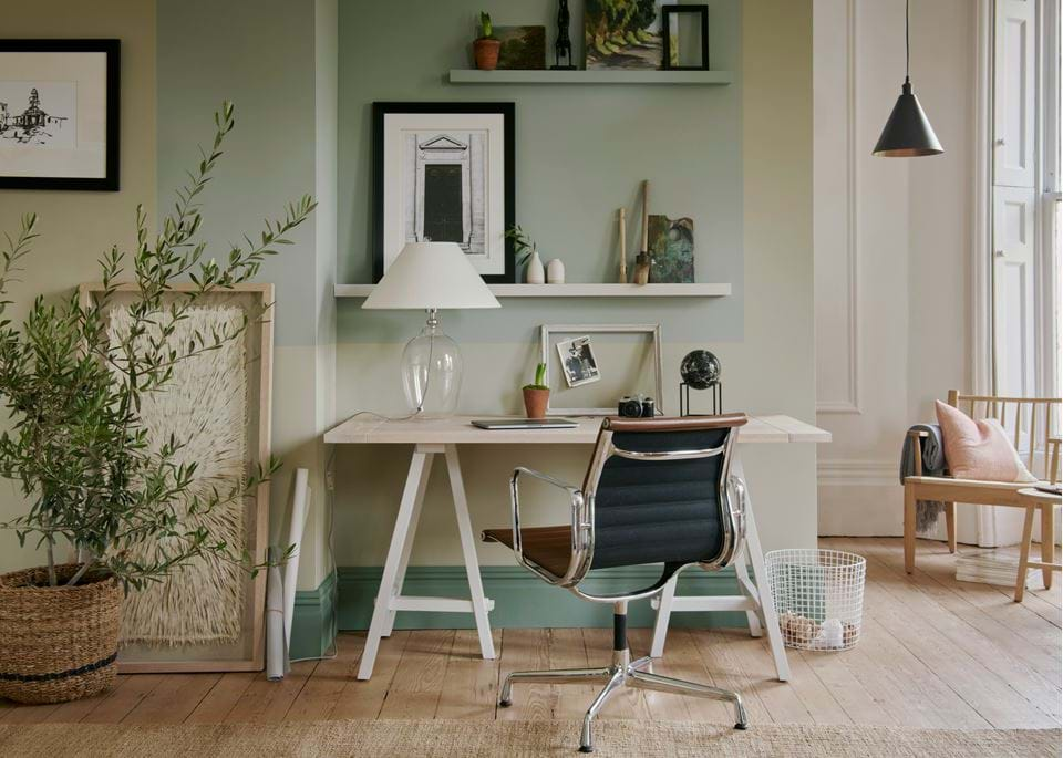
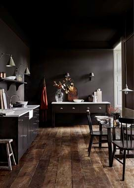
Most of us grew up with white ceilings as the norm but they don’t have to be. Carrying colour from the walls up onto the ceiling, especially when using dark colours, can actually make a room feel bigger because the edges are lost, creating a sense of limitless space rather like the night sky. Of course, white ceilings will make a room feel brighter and can open up the space, but try reversing the balance with colour on the ceiling and white walls, or using a complementary colour on the ceiling to that on the walls for a softer scheme.
Truth: the 60:30:10 colour ratio works
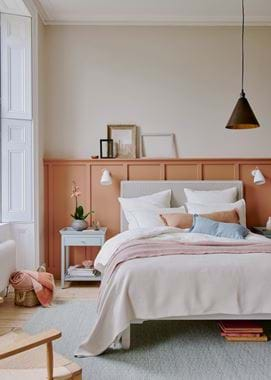
So much of interior design is about proportions, and colour balance in a room is no exception. To achieve a harmonious scheme, stick to the 60:30:10 rule where you have a dominant shade, a secondary shade and an accent colour. The 60% shade will cover the largest expanse of the room including walls, ceilings and floors and is usually a neutral, including dark neutrals such as navy or grey. The secondary colour can be stronger and used for furniture (think mid-tones), while the boldest 10% is great for strong-coloured accessories or, if the dominant shade is dark, introducing pale hues to balance the scheme.
Truth: paint your radiators to hide them
Rarely do we wish that our radiators were more conspicuous (unless you’re lucky enough to have decorative, cast iron beauties) so the best solution is to let them fade into the background by painting them the same colour as your walls. That said, for a polished look on a wallpapered wall, pick out one colour within the paper design and paint the radiator in front in that shade.
Myth: underfloor heating can’t be used with wooden floors
Never discount the indulgence of toe-warming underfloor heating just because you’ve got wooden floors. It’s perfectly do-able but some options are better than others. Engineered wooden floors are generally best as they’re designed to expand and contract with heat and still stay strong, but you can also use solid wood, it just might not be quite as toasty underfoot and can cause a little board movement. The only flooring to really avoid is laminate planks. The good news is that, because underfloor heating keeps the whole floor at a uniform temperature, it can actually benefit floorboards which might warp if exposed to rapid temperature variations or hotspots.
Truth: small bathrooms need big tiles
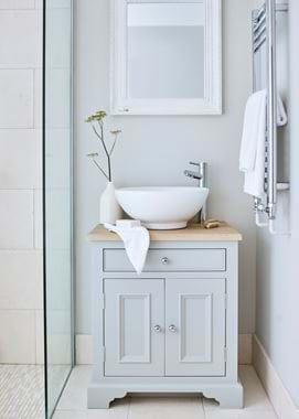
It might feel counter-intuitive, but it’s a good idea to use large tiles in small bathrooms and keep small tiles (like mosaics) for compact areas such as basin splash backs. That’s because smaller tiles (and all that necessary grouting) can look very busy in a small bathroom, while bigger tiles need less grouting therefore creating fewer fussy lines on an expanse of wall.
Myth: never mix old and new
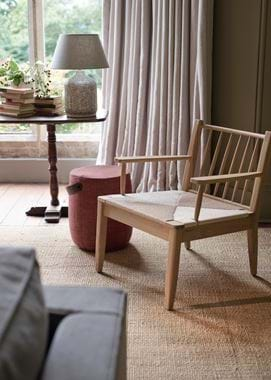
Some of the most successful interiors are a careful edit of old and new. It’s just a matter of ensuring the proportions, shapes, and finishes hang together comfortably, so try juxtaposing modern quartz worktops with crackle-glazed pottery, or crisp cotton bedlinen with ornate gilded mirrors, and pair an antique side table with a modern lamp or a low-slung modular sofa with a vintage tapestry throw – opposites do attract. And while it might feel easier to slip contemporary pieces into a classic room, don’t be afraid to throw vintage pieces into an ultra-modern space – they will soften the scheme and add depth, personality and history.
Myth: dining room tables and chairs must match
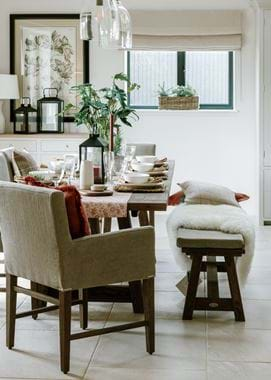
Dining areas are often informal these days so it’s almost de rigueur to avoid the matchy-matchy look of a dining set, unless of course, you’re planning a formal dining room where uniformity is king. Instead, try mixing up chair styles: two grand carver chairs at either end of a table; a couple of tall dining chairs topping-and-tailing two trestle benches, or a mish-mash of wooden chairs. The trick is to stick to a common colour or finish – keep wood stains light or dark, paint mis-matched chairs in the same shade or select upholstery or seat cushions in a unifying fabric.
Truth: mixing patterns works
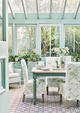
It’s easy to mix patterns in a scheme as long as you stick to a few basics. The key is to only mix large scale pattern with medium, or medium scale with small. The balance looks off when you try to mix large scale pattern with small. Add one common colour running through the scheme to ensure the patterns hang together harmoniously.
Still in the dark about what you should and shouldn’t do when it comes to interior design? Perhaps one of our home designers can help? You can find out more about our Home Design Service online here.
