Goes well with – pairing pieces from our new autumn collection
Goes well with – pairing pieces from our new autumn collection
With the arrival of each new collection at Neptune (we launch two a year – one in spring and the other in autumn), our design team is always seeking to embrace fresh ideas while ensuring whatever is new is sympathetic to our existing designs. Our philosophy around effortlessness means that every Neptune piece should pair beautifully with another – a design from autumn 2016, for example, should work just as well aside a new creation from spring 2018. Here, they pick four statement additions from our autumn 2019 collection to perfectly prove that point.
Isla Swallow meets Amelia
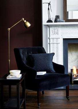
Our decadent Isla velvet fabric has been a mainstay in our collection for many years. We always take our seasonal shade and apply is to Isla because it takes colour so well, bringing out the underlying richness in even the most muted of tones.
Velvet does carry the connotation of glamour, and this is especially true with navy blue velvets. Our Ink colourway has such depth of colour though that it avoids the stereotype. Luxurious yes, but it’s also surprisingly understated.
Use it on a design like Amelia and you see how well Isla Swallow takes to more traditionally shaped pieces. Its tufted back alongside Isla upholstery hints at velvet’s glamorous pedigree, but otherwise, the pairing is a prime example of how a classic silhouette can be made ever so slightly more contemporary thanks to fabric.
Sketch artwork meets Rupert
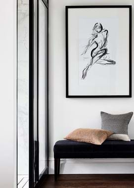
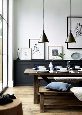
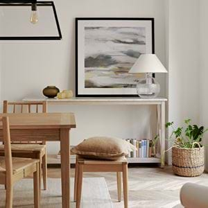
New to our wall art series this autumn is a group of expressive inks encased in a black wooden frame. Entirely different in character to many of the pieces in our collection with their distinctly minimal, contemporary perspective, you might think they'd be hard to blend into a more traditional interior.
Not so. In the second image pictured, you see one of the nudes positioned over the timeless Rupert stool – a design that’s similarly clean-lined and uncomplicated, and therefore a happy match. So seek out other like-minded designs like Arundel (scroll to our final image to see this combination) and George for a similar look and feel, or pair the Sketch series with more detailed pieces like Blenheim and Turnberry to evidence how opposites attract just as much.
And don’t forget that the law of opposites rings true for hanging such wall art next to rich oils of countryside scapes and portraits – the contrast is welcomed with open arms.
Beswick meets Caspar (and our life-like flowers)
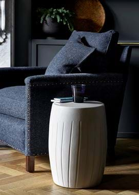
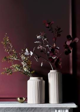
Ceramic, crackle-glazed Beswick comes in side-table, vase and lamp-base form. Sophisticated and sculptural it might be, but it gladly suits designs that have a stronger shape, like Caspar. We love how its boxy, squared frame is softened and made more elegant when the side table version of Beswick is at its side.
Being crafted from ceramic with a glazed finish means that Beswick will always stand out in a room, but that doesn’t mean you can’t use two of the same design in the same space. While the vases can easily be used as an ornament in their own right, they naturally lend themselves to being filled with a stem or two. We particularly like the combination for autumn of Beswick with golden and russet-toned leaves.
Arundel meets Savernake
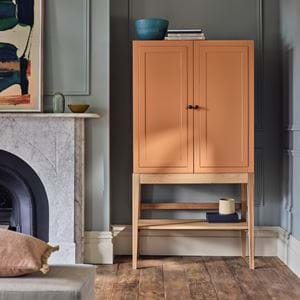
And finally to one of the biggest statements from this collection – a long-established favourite, Arundel, in its new dark wood finish. Loved for its solid oak substance and ease at working in every style of interior from country cottage to chic townhouse, the deep and dark wood stain seamlessly slips in to schemes where there are timber tones both lighter and darker.
One of our favourite pairings for Arundel is our Savernake flooring. Arundel’s strong, crisp angles means that it suits all three of Savernake’s styles – plank, chevron and herringbone parquet – and the dark tone also matches all three floor finishes with ease, from chalked to dark vintage.
For us, this duo provides the reassurance sometimes needed that it’s more than okay to have multiple wooden tones in the same scheme. And if this is your first dark wood statement piece, that reassurance is what can help you to take the plunge and step over into the dark side…
