Three moodboards to inspire autumn schemes
Three moodboards to inspire autumn schemes
Throughout spring and summer, we spoke a lot of moodboards – how to use them and why to use them when decorating your home. While Pinterest, interiors blogs and Instagram are ripe for images to inspire a scheme, what they lack is the tactility of a traditional, physical moodboard where everything from fabric swatches to licks of paint can be handled, inspected up close and properly pinned. Your moodboard is a place to explore and experiment, for trial and error, and to edit down your options until what you see before you is a collection of ideas that hang together just as you’d hoped. Your moodboard is there to give you confidence that your end scheme is what you’d envisaged all along. Read on to see the mood boards curated by our stylist, Meaghan, that lead to three of the looks from our new autumn collection photoshoot.
The minimalist home office
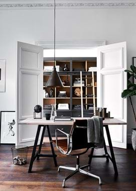
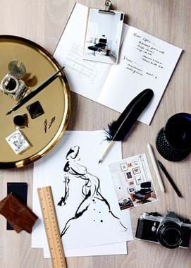
This board began with a pale oak backdrop onto which we overlaid a primary colour of white and accents of aged leather and brass. As we played with the sizes of leather swatch however, we came to the conclusion that we wanted the leather aspect to be kept small because it quickly seemed to take over. That’s one of the beauties of a moodboard; it lets you get a feel for scale and proportion.
This decision led to us realising that we liked the depth of tone the leather was bringing, which is how the dark-stained wooden floor came about. Leather desk chair settled on, we drew inspiration from its depth of tone and took that to the floorboards, keeping the original paler oak to the Hebden desktop and through to the flashes of oak in the adjoining room, such as on the Chawton’s oak ladder and shelving.
Also featured on the moodboard were tears from magazines where we’d seen chair shapes we were drawn to as well as the colour groupings of white, dark brown and golden brown, and navy blue. We looked on those to not only narrow down the choices of desk chair that we were looking at (another moodboard plus – it gives you direction so you don’t end up falling down the furniture rabbit hole) but to bring in our other key colour – Ink. White needed to remain one of the feature colours along with the leather hues, so we added dashes of Ink to our moodboard to find the right balance, and then used that to help us figure out where in the room in would feature best. We opted for putting it on the Hebden table’s legs and then hinting at the same tone in desk accessories, lamp shades and picture frames.
The crisp-yet-comforting sitting room
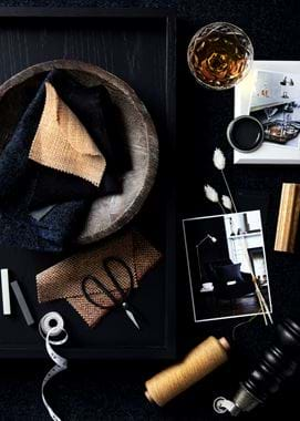
We rarely use a white board for our mood boards, because you’re losing a surface that’s hugely helpful in shaping your scheme. Make the most of every scrap of space of your moodboard and you’ll find how that backdrop guides you to big room decisions, be it the fabric for your upholstery, the primary colour in your palette or even the accent if you cover up most of the board so just a few pops of that backdrop shade peep through. In this example, we draped different fabrics over to see which suited our other points of inspiration most. It’s best not to waste time pinning down your other images, swatches and paint samples because you’re only going to need to move them again when you try a different fabric sample. Wait until you’re confident you’ve found the one.
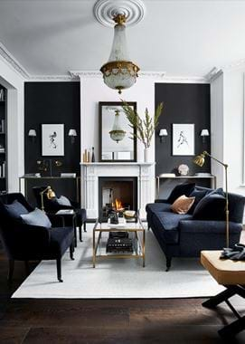
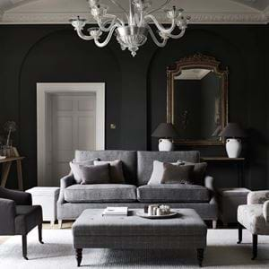
With our Harris Tweed Bilberry Ink fabric chosen, we felt quite quickly that all upholstery in that same textile would be a bit much, so we looked through the fabric books and found us warming to ember-like shades of orange and yellow. Had we looked at colour alone or images of fabric, we wouldn’t have been able to appreciate just how classic the character is in the wool and how that tempers the strong contrast in colour and stops it becoming too contemporary. In moodboards, texture is paramount. Cuttings of various fabrics in front of us, we found a combination of colour, texture and tone that would achieve our vision – a sitting room that has a crispness and confidence to it but still feels suitably warming and comforting for the seasons ahead.
Another moodboard tip to achieve consistency in your home’s styling and scheming is to not just include images of decor you hope to emulate, but that of what already exists in neighbouring rooms. Look closely and you’ll see two images of other rooms – a hallway and a dining room. You might prefer to build your moodboard and simply be mindful of what decor already exists, or to take your moodboard and stand in such spaces to gauge if you’re happy with the connection between them. Or, taking a photo, printing it off, and pinning it on your board is another approach that guides you to developing a scheme with a shared source of inspiration. Your other images can be of specific detail, such as the crystal tumblers and drinks trolley that we stuck down to remind us that we wanted at least one element in the room that was a touch glamorous and Art Deco – that’s what encouraged us to go for the statement chandelier.
Don’t forget too that a moodboard is there to give structure to your accessory choices. For example in this board, the texture in the wool made us realise that same richness was needed elsewhere, which is where the idea for dried stems and rushes came from.
The Mustard downstairs loo
Not every room has to have a moodboard. Some people prefer to use them for every project, whereas others like to lean on them for the home’s main rooms, such as the kitchen, sitting room and master bedroom. A moodboard can also be helpful if you’re considering doing something a bit daring and want that touch of reassurance beforehand that you’re moving in the right direction with your selections. That’s what we did with our third and final board.
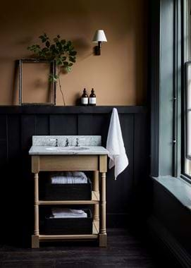
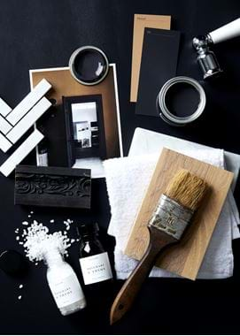
Having already explored in our earlier moodboards the fact that Mustard and Ink create quite the compelling contrast, we went into this scheme knowing it was a match made well. But because the colours cause quite a stir, we took the time to gather examples of other schemes that used the same duo. Not only is that research exercise a useful one to confirm with yourself that those are the tones you want to pair, but it gives you the opportunity to explore how much of one colour you prefer versus the other. Due diligence done, print off the one that’s perfectly in balance for you and position it at the heart of your board – this is too important to put on the periphery.
Colour weighting considered, follow the steps of editing down material choices (we went with our oak finish as we liked the hints of golden brown that related to the Mustard paint) and furniture shapes, but also use your moodboard to define the tone of the room. And by that, we don’t mean colour and level of light, but the atmosphere you want to create. The downstairs loo is often a busy, bustling environment but we wanted to give it an aspect of calmness and escape. By including our Rosemary & Thyme bath salts and hand wash alongside fluffy white facecloths, the sense of serenity and quiet luxury won’t be forgotten amongst thoughts on tiling and taps.
Moodboard making
Read our other article for advice on how to build your own moodboard
