Behind the design: Holborn
Behind the design: Holborn
Why? That’s what drives the design process at Neptune. Because when we create pieces with a genuine, compelling why at their core, they have more relevance to your home and your life. Here, our co-founder John Sims-Hilditch shares the why behind one of the new pieces in our spring 2019 collection. This is the story of the Holborn dresser and sideboard.
The original inspiration
Interestingly, it was our classic English Chichester that inspired contemporary Holborn. The roots of Holborn’s why lie in our history of indoor furniture. One of the first pieces that we ever designed was the Chichester dresser, and it fast became a bit of an icon for us. We loved it then and we love it just as much, if not more, now. As we developed over the years, sideboards and dressers cemented themselves as a standout area, a keystone in our collection. When the time for designing the spring 2019 collection came about, we all had this shared feeling of needing a new coupling that would bring a contemporary character to this section of furniture. We knew there was more exploring to be done that would bring both dressers and sideboards into homes that sought something different to Chichester and Suffolk.
Developing the design
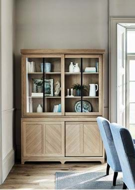
With that why in mind, we were able to begin considering which materials, which finishes and which details in the design would fulfil it. Examples of timber flooring came to mind, like herringbone parquet, though we felt that configuration would be too fussy and costly to replicate on any door panels. That’s what navigated us to our chevron layout instead – more of that later. We also very much liked the idea of a sliding door as that was new for us and would potentially make Holborn feasible in homes with less square meterage because it removed the requirement for space to open the cabinet doors. Black-bronze stiles to make a bold statement as opposed to something subtler like a hinge or handle appealed too.
Fundamentally, it was about stripping away all of the frills to take a concept to its most basic form, leaving a box that would encourage ingenuity and new ideas. We took this box and asked ourselves, what can we do to it so that it emerges as a contemporary design that is also classic and will remain beautiful for a hundred years and more?
Finding a focus
This stripped-back thought process brought us to two areas of design that we know intimately – oak and craftsmanship. It’s highly rewarding to walk into a room every day and to be able to see and appreciate how serenely and subtly something works.
Ironically, contemporary design can be captured through traditional materials and time-honoured engineering, and this is what we felt was the natural course for us to take. Holborn is pared-back enough to celebrate the intricacy and crisp execution of mortise & tenon joints. You look at it and think there’s so little going on. It’s a strikingly simple design that isn’t about bells and whistles. But look closer and you find so much in terms of quality and craft.
Choosing a finish
In terms of affordability, the painted route is appealing, but once we did our prototype in oak with the chevron front, we loved it and couldn’t imagine having Holborn any other way. We’re always careful to not add unnecessary cost, but also believe in designing pieces that will live on. It’s a case of real lifetime value. Had Holborn been in painted tulipwood, the buying price might’ve been less, but we didn’t foresee that it would endure in the same way that oak will. Oak was its calling and to ignore that would’ve meant compromising our design principle of creating pieces to stand the test of time.
Every last detail
Part of Holborn’s vision looked to the future too. We wanted to picture how it might grow as a collection and how every attribute would transfer to a 3ft or 4ft dresser for example. That informed aspects such as whether it would be a two- or three-door design. We felt a three-door would over complicate the aesthetic and the sliding door mechanism on a smaller piece, which is why we decided to stick to just two. Other conversations included whether the chevron should be portrait or not, and how the direction can influence the atmosphere of the room it’s in. This is why we added the central section so that each door panel is completely symmetrical. There were also considerations in the lower plinth and how to create a look that was lighter than a solid structure which might’ve given it a monolithic look without the level of Chichester’s ornamentation. And the plinth in turn influenced the cornice, where we wanted the same simple step detail and curve rather than Chichester’s protruding flare.
120 days of design
Interestingly, almost nothing has changed since the first Holborn prototype. The why that drove the design came through immediately and the simplicity was as appealing as we’d hoped. In fact, the only difference was an accidental one. We’d requested both horizontal and vertical Black-bronze stiles on the glazed dresser top, but when the prototype arrived, they’d mistakenly missed the horizontal one off. But we realised it was to our good fortune, because it just wasn’t necessary. It was yet more evidence that Holborn could be a champion of less-is-more.
Days and decades to come
For me personally, I’d describe Holborn as an icon and an investment for your home. Its heritage core means that it suits homes of every style, but most importantly, it’s given us the ability to provide more contemporary interiors with a statement piece of furniture that was previously missing from our collection.
I’m excited to keep looking at it for decades and decades to come.
