Teal appeal
Teal appeal
Run an online search for images matching the word ‘teal’ and you’ll turn up a surprising variety of shades, from marine blues to deep greens tinged with indigo. Teal’s one of those shades that people can’t quite agree on: hovering on the spectrum between blue and green, it has a slightly elusive quality. That’s one of the things that makes it so right for today’s mood, when we much prefer ‘non-colours’ such as pinky nudes and lavender greys to more obvious shades. Try them and you’ll quickly see why: the more complex a colour is, the less easily it dates.
The word teal comes from the bird of the same name, a small breed of duck known for the iridescent blue stripes on either side of its head. However, it wasn’t until the late 1920s that we first used the term to describe a colour, when it appeared in an advert for clothing. Historically, teal’s closest relative is probably verdigris, a bluish-green carbonate that forms on the surface of copper and bronze as they oxidise (think the Statue of Liberty). Artists used verdigris as a green pigment throughout the Renaissance, although its tendency to fade to brown when painted on to canvas, like a withering autumn leaf, eventually resulted in the invention of synthetic alternatives.
Teal’s also closely allied to Prussian blue, created by accident during an 18th-century chemical experiment, and indigo, a centuries-old natural dye from the woad plant, whose inky tint resembles teal at its darkest. It wasn’t until teal got a name of its own, though, that people developed an obsession with it. In 1948, a Los Angeles couple named Gladys and Gustave Plochere developed the Plochere Colour System – around the same time that Pantone was starting life in New York – to promote colours for their interior decorating business. Teal was one of the shades they chose, and as a result it had its first taste of fashion status during the 1950s and 60s. The novelist Truman Capote stained the wooden floors of his Long Island home a rich teal shade, contrasting it with honey-coloured wooden wall panelling, tan leather sofas and white accents for an original take on coastal style.
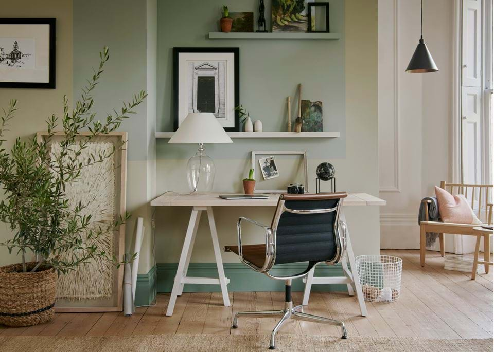
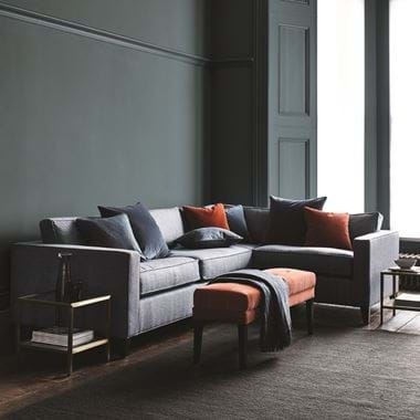
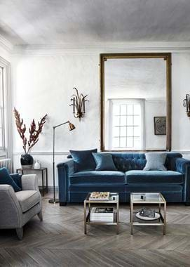
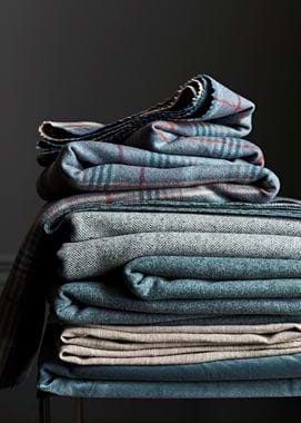
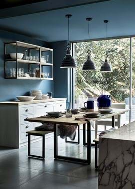
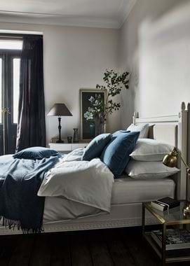
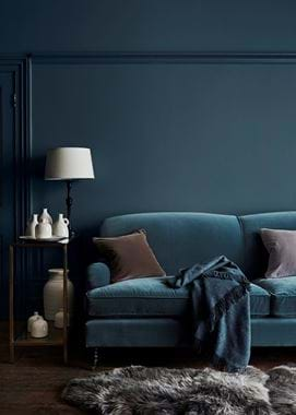
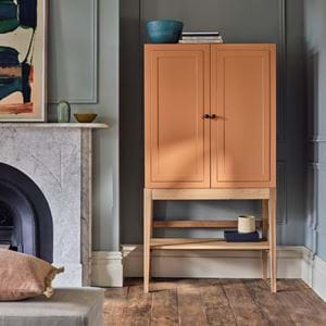
Today, teal’s time has come again, and it was the key colour in our autumn 2017 collection. “We’ve had teal in mind for a long time as a colour we wanted to work with,” says Rebecca Malyon, head of design and product development. “We felt this shade was really versatile – it works beautifully with a darker contrasting colour, such as Charcoal, and with paler tones, too. It’s softer than navy blue and takes you from summer to winter really well.” We used the shade on upholstery and as a new paint shade for walls and woodwork, complementing it with terracotta and stone hues. “You’ve loved our Fox velvet – a rich brown-orange – since we first introduced it in 2015, so it’s what we chose to pair teal with,” explains Rebecca. “A stone-coloured plaid and a teal floral print on natural linen give it even more character. We’ve also included a teal velvet, because velvet sums up the winter season like no other fabric can, although wool comes in a close second so we’ve developed two teal-based wools too. It’s a rich palette that you can make prettier with lighter colours, or play up to be more dark and intense.”
There are other, more scientific reasons why we should embrace teal for our homes. Blue and green light wavelengths are very short, which means our eyes have to make only a tiny adjustment to process them; which is partly why these shades feel restful and balanced. We also use blue light in therapy for SAD (Seasonal Affective Disorder) because the colour helps to regulate the body’s circadian rhythm, or natural cycle of sleep and wakefulness.
It’s things like these that do a lot to change our perception of blue as a cold colour, but what about the widely-held belief that dark hues make rooms dingy? Well, it doesn’t have to be that way. The principle of sympathetic colours is important: if you have dark walls, don’t paint the ceiling bright white because it’ll look lower; a softer white works better (in years gone by, before the days of tonal palettes, decorators would mix a small amount of the wall colour into white ceiling paint to get this effect).
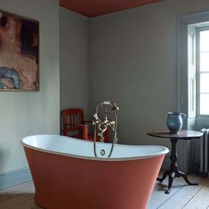
Finishes matter too. Matte teal walls will absorb light, but velvet upholstery or eggshell paint in the same colour will gently reflect it. By night, teal will appear warmer under yellow-toned halogen bulbs or in candlelight, but chillier under blue-toned LED lights. Adding warm grey or terracotta shades on floors or with accessories helps teal to look its inviting best (as does wood; take a tip from Truman Capote). And there’s no reason to shy away from using dark shades in small spaces: sometimes the best thing you can possibly do is make the most of this defining feature rather than trying to hide it. You can camouflage awkward wall and ceiling angles by using the same dark colour all over. Painting a tiny guest bathroom in teal, maybe with brass lighting to give it a golden glow, can make it memorable for all the right reasons. And, in a kitchen, having both walls and cabinetry in teal makes everything feel connected. It feels daring to do, but in reality, it all feels rather dulcet. Plus, teal in the kitchen is a welcome change to the dark palettes we’ve been seeing lately.
Bathrooms and bedrooms are natural settings for relaxing, restorative teal shades. They’re conducive to winding down, to evening bathing rituals and to drifting off to sleep. But there are other possibilities too. Dark blues make a strong statement in a hallway, and using them here can have the added advantage of making the rooms leading off the entrance feel bigger and more spacious in comparison. Comforting, cocooning and boasting endless potential, there’s really no end to teal’s charm.
Amy Bradford is the former features director of ELLE Decoration. She’s now a contributing editor at the title and also writes on interiors for The Telegraph Magazine and Stella.
