A brief history of pattern
A brief history of pattern
Since the dawn of time, humans have sought to decorate their spaces with mark-making: inscriptions and pictures to tell their stories. Whether these were early cave paintings, Egyptian hieroglyphics or the traditional wall art of Burkina Faso, they were also a notation of belonging: ‘patterns’ to signify ownership – a statement from the scribe that ‘this place is mine’. Simultaneously, the art of patterning has held up a mirror to society, offering its own unique interpretation of the prevailing zeitgeist. So, are you sitting comfortably? Let’s take a dash through history to track the trail of pattern to date.
Until mankind lived longer than the medieval average of 30 years, decoration within a dwelling wasn’t exactly a priority. However, by the 17th and 18th centuries, this had started to shift, with ornamentation becoming a status symbol. Decoration was a means to show off, of literally having enough wealth to paper your walls with it (consider the Palace of Versailles), and the patterns themselves were determinedly emblematic of pomp and prestige: crests, laurels, crowns and other such representations of heightened hierarchy.
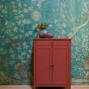
Designers also increasingly borrowed inspiration from anything and everything regardless of provenance or context, a look which persisted right into the early 19th century. From chinoiserie to cherubs and ancient urns, all alongside gilding, ribbons, swirls, scrolls and flowers.
But then, fashions swing from one to the next with the regularity of a pendulum, and this eclectic madness was inevitably followed by a period of renewed reverence for classical forms: neoclassicism. The grand tour became a rite of passage for the youth of the well-to-do seeking enlightenment, and the calming influences of Greek and Roman-inspired motifs were felt worldwide. In short, everything got a bit more pared back.
This, in turn, paved the way for the Industrial Revolution, with the advent of mass production enabling its own new styles. With the ability to sew, print and craft that much faster, perhaps unsurprisingly, excess, heavy ornamentation and patterns that were distinctly florid in style became de rigueur. An Italian art critic of the time, Mario Praz, rather aptly used the term horror vacui, a fear of empty space, to describe the suffocating clutter of Victorian homes of the day.
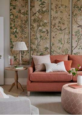
Thankfully, by the late 19th century, the winds of change blew in the Arts and Crafts Movement, which favoured a more delicate, respectful use of ornamentation firmly rooted in romantic visions of rural idylls, with man and nature in perfect accord. This was decoration as salvation for the soul and design with a moral compass, and it exuded a homely, domestic simplicity that was in stark contrast to the overt fussiness that preceded it. Former theology student William Morris was duly galvanised by this search for ‘art with meaning’ and set about crafting his marital home, Red House in Bexleyheath, as a personal paean to his views against the abundant use of fabric, texture and colour. The enthusiasm with which it was received led to the 1861 formation of his eponymous manufacturing company (testament to its enduring power, archive designs, recoloured for the 21st century in sedate shades of cream and gold, have been enthusiastically received by contemporary pattern lovers).
However, this gilded age came screeching to a halt with the horror of the First World War. And afterwards, the gentle swoops and swirls of 1920s art deco found an appreciative audience desperate for escapism, as did the oceanic themes that expressed the new glamour of travel by train and luxury liner ten years later. Additionally, the lingering solemnity of post-war austerity meant that ideas of ‘design’ overtook ‘decoration’, with the latter being shunned for its perceived frivolity. Modernism of the 1930s had no place for pretty.
Such a functional bias pre-empted the Second World War, and yet again, the aftermath was ‘New Look’ reactive. And with the space race waging between Russia and America, designers looked skywards for inspiration, using abstract art, rings and dots suggestive of the cosmos to adorn key pieces.
But this was mere black and white compared to the technicolour of the 1960s, when fun, freedom, pop, plastic, and psychedelia reigned. Simple geometrics and primary colours ruled, before whoosh went that style pendulum and in came the beige decade.
If ever there was a moment when politics dictated pattern, it was the oil crisis of 1973. The ensuing global recession replaced the optimism of the swinging 60s with a national lack of confidence in a single left swipe. As viewed through the medium of print and pattern, the painterly, interpretative designs that had evolved through the previous two decades were instantly jettisoned in favour of warm, cosy prints which reeked of nostalgia. For many Brits, the 1970s are indelibly associated with brands like Sanderson and Laura Ashley, purveyors of quiet, tasteful designs that leaned heavily on historical detail and traditional florals.
But it didn’t have to be this way. In Sweden, design groups like Marimekko, Tio Gruppen and Svenskt Tenn rebelled, producing resolutely happy, bold, primary-coloured prints. Ever ahead of the curve, the young Terence Conran stocked them all in his newly-launched Habitat, but beyond the avant-garde hipsters of Kings Road, they didn’t find a particularly warm reception. After all, decades of indoctrination had instilled calculated coordination as the British decorating default and, adding to the general theme of inertia, the English home was typically furnished with heirlooms and hand-me-downs; hardly a climate in which the stripes and squiggles seen in Sweden would find mainstream approval.
And then came IKEA. Although it officially launched in the UK in 1987, it only really hit home with a provocative series of TV adverts that ran in the late 1990s. These campaigns variously entreated us to ‘chuck out the chintz!’ and ‘stop being so English!’ They stuck a knife into the heart of the British malaise. There’s no doubt that IKEA’s subsequent rapid expansion exerted a huge influence in promoting the upbeat ideals of Swedish design, not least the uplifting power of its textiles.
And yet this might imply that Britain has been something of a slouch on the professional pattern-making front. Not so. Designers Guild, established by Tricia Guild in 1970, is globally famed for its confident, jolly florals; and let’s not forget Cole & Son, a company founded in 1873, a maker of papers for Buckingham Palace and going from strength to strength today with inspired new collections produced in collaboration with brands like Milan-based Fornasetti, distinctive for its playful, allegorical prints. The key is that both companies manage to meld the weighty legacy of their British heritage with innovation, evolution and creativity.
But crucially, in tandem with this, we’ve individually, step by baby step, become braver in our tastes, and consequently the use and enjoyment of pattern has proliferated. Today, the most interesting homes are a blend of styles that reference different eras and cultures in a glorious mix and mismatch; think English cabbage rose blooms rendered modern in new neutrals, alongside inky ikat prints, nautical stripes, Scottish plaids, Aztec abstracts and modernist geometrics. It’s a reflection of our increasingly cosmopolitan outlook. A new, more considered eclecticism, if you will, and one that, stylistically at least, reflects a dissolution of national borders. Pattern as universal peace-keeper, who knew!
Michelle Ogundehin is a thought-leader on trends, colour and style. She is the lead judge on the BBC2/Netflix series Interior Design Masters, and author of Happy Inside: How to Harness the Power of Home for Health and Happiness. @michelleogundehin
